Standout Features:
- Juicy, hand-painted visuals
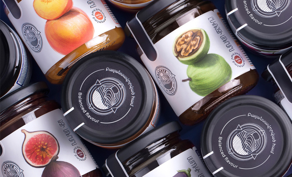
- Balanced flavor – balanced design
- Illustrative logo design
Every gourmand can tell you that the food tastes best when the ingredients are picked and appropriately mixed, as the slightest deviation from the recipe can affect the final taste. More often than not, it’s not a positive change.
Aragats Food brand takes pride in the carefully balanced flavor of its delicious products. Meticulous balance was the name of the game when Doping Creative Agency designed the packaging.
This concept of excellence and equilibrium was the foundation of Aragats preserved food. Each illustration looks as if it was “picked” right from one of Caravaggio's paintings. Rich and juicy colors especially stick out when placed on the white label; each brush stroke and realistic shadow guarantees customers’ attention.
To further balance the “Balanced flavour” tagline, the ingredients (fruits, nuts, and vegetables) are portrayed as vertically balancing on one another.


