Team Behind the Design
Packaging Design Analysis
In reviewing health and wellness packaging, I pay attention to whether the design encourages calm and trust rather than stimulation.
The ARLO system works for me because it presents cannabis as controlled and mindful, relying on restraint, structure, and physical detail instead of visual intensity.
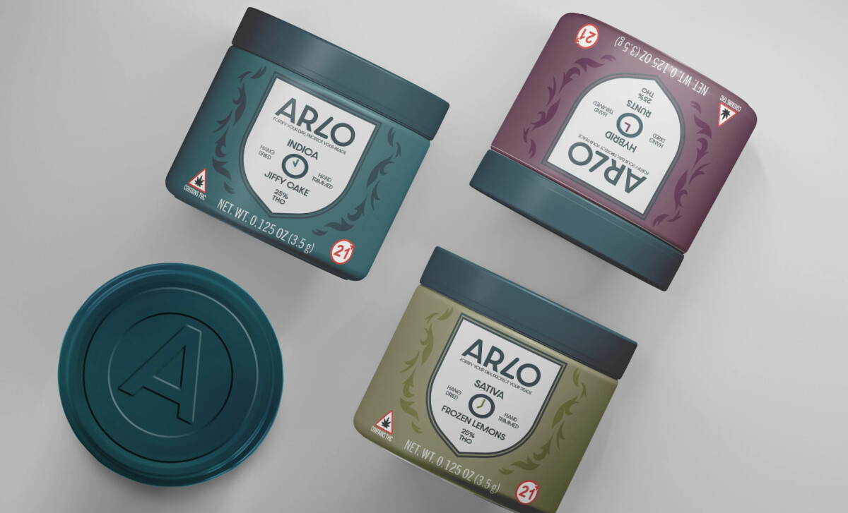
- Color System: Muted earth tones anchor the range, including deep teal, olive green, plum, and cool grey. I like how color works as a sorting tool here, helping distinguish strains while keeping the shelf presence cohesive and quiet.
- Label Structure: A centered, shield-style label sets a clear vertical order for the brand name, strain, and THC content. This layout feels protective and intentional to me, which fits ARLO’s focus on balance and everyday use.
- Tactile Branding: Embossed monograms on the lids add a physical layer to the identity. I’m drawn to how this detail makes the packaging recognizable through touch, even before the label comes into view.
- Compliance Integration: Regulatory symbols and warnings sit naturally within the system through consistent placement and icon style. I appreciate how this keeps everything clear and responsible without disrupting the overall calm of the design.
What Brands & Agencies Can Learn from ARLO
1. Restraint Can Be a Differentiator
In categories prone to visual excess, calm and controlled design choices can stand out more effectively than bold graphics. Restraint helps reposition products as intentional and trustworthy.
2. Design for Everyday Visibility
Packaging that feels appropriate in shared or professional spaces reduces friction for users. ARLO shows how aesthetics can support lifestyle integration, not just shelf appeal.
3. Tactility Strengthens Brand Memory
Small physical details, like embossed elements, add depth to the brand experience. These cues build recognition through touch, which is especially valuable in product categories centered on routine use.
About DesignRush Featured Designs
At DesignRush, we spotlight agency projects that push creative boundaries. The designs we feature reflect expert execution and highlight the trends shaping branding today.
Some of these standout projects later earn recognition in the Monthly Design Awards.
Explore more creative work here:
- Best Packaging Designs
- Best Website Designs
- Best App Designs
- Best Logo Designs
- Best Print Designs
- Best Video Designs
For a full list of design agencies and related services, see our Agency Directory.


