Standout Features:
- Vivid, nature-inspired color palettes
- Bold typography and strong branding
- Minimalist yet informative label design
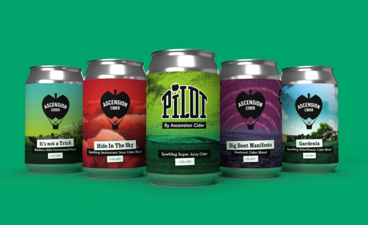
Hackney Design’s packaging for Ascension Cider takes craft beverage branding to new heights with a dynamic and visually engaging design. The cans feature a unique blend of natural landscapes and bold colors, reflecting the cider’s vibrant and adventurous flavors.
Each can in the lineup boasts a striking color gradient, seamlessly transitioning from lush greens to deep reds, purples, and blues. This nature-inspired palette not only differentiates each cider variety but also evokes a sense of freshness and authenticity, reinforcing the brand’s commitment to natural ingredients.
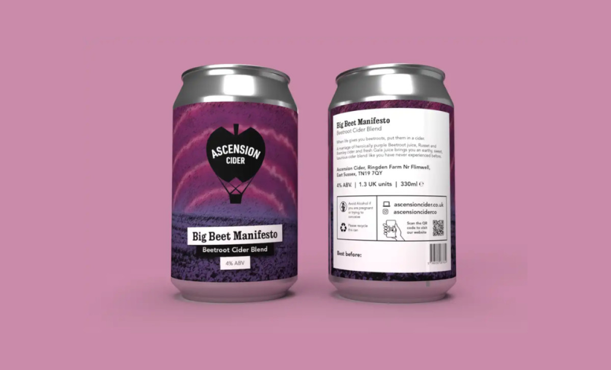
The Ascension Cider logo, a black hot air balloon incorporating an apple, is prominently displayed across all cans. This distinctive icon serves as an anchor for the brand’s identity, ensuring instant recognition. The strong, uppercase typography used for the cider names enhances readability while maintaining a modern, minimalist aesthetic.

Beyond aesthetics, the label design is both clean and functional. The back panel provides essential product information in a straightforward layout, incorporating a QR code for easy digital engagement. The balance between creative visuals and practical details makes this food and beverage packaging design not just eye-catching but also user-friendly.
Hackney Design has successfully crafted a bold, nature-infused, and contemporary look for Ascension Cider, making it an irresistible choice for consumers seeking a premium yet playful craft cider experience.

-preview.jpg)

-preview.jpg)