
Standout features:
- Integration of "D" and "L" initials
- Minimalist packaging with abstract illustrations
- Cohesive visual language
Deluca Coffee, a family-run gem in Sydney's coffee scene, exudes a refreshed brand identity that seamlessly merges heritage with contemporary design courtesy of the talents at Christopher Doyle & Co.
The heart of this transformation lies in a striking logomark. It is ingeniously crafted from the "D" and "L" of "Deluca," subtly echoing the silhouette of a coffee cup resting on a machine tray.
This clever motif is a nod to the brand's coffee-centric character. It artfully extends into a series of graphic illustrations that adorn coffee bags, marketing materials, and even the café's interior.
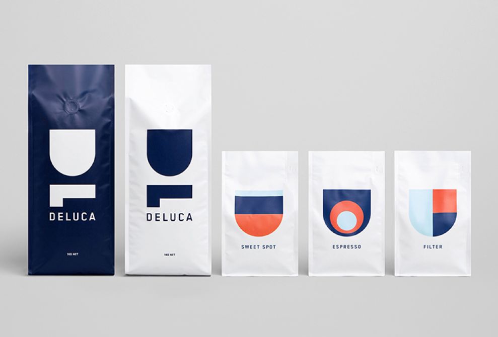
The minimalist design fuses navy blue and white to balance form and function. The Deluca logo, rendered in crisp white against a rich navy backdrop, anchors the design.
A series of abstract illustrations derived from the logomark subtly differentiates between coffee variants. Their geometric shapes form coffee beans or steam rising from a freshly brewed cup, adding a touch of whimsy and visual interest.
The clean typography and ample white space contribute to an uncluttered aesthetic. Its layout allows the coffee's quality to speak for itself.

This comprehensive rebranding effort, extending from the logo to the café's interior, culminates in a cohesive and iconic visual language that perfectly encapsulates the Deluca brand.

-preview.jpg)
-preview.jpg)
