- Agency: Grace Garlesky
- Client: Avon
- Category: Packaging - Fashion & Beauty
- Location: St. Augustine, Florida, United States
- Project Brief: Design a fashion and beauty packaging system that modernizes Avon’s visual identity while retaining nostalgic appeal to reach a younger demographic.
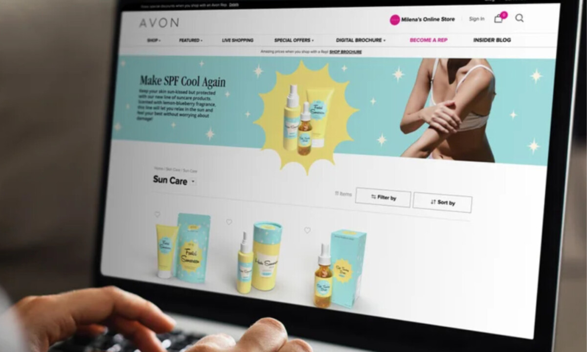
Effective beauty packaging should feel inviting before it feels informational.
The Avon packaging concept achieves this through soft color, playful detail, and disciplined layout.
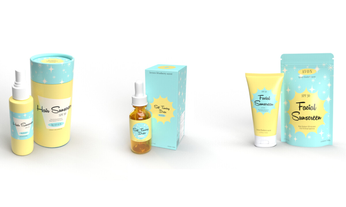
- Color Blocking & Shelf Presence: The packaging relies on pastel aqua and butter yellow as the primary container and label colors. I like how these large, uninterrupted color fields carry across bottles, tubes, cartons, and displays, making the products easy to spot and group together on shelf.
- Typography & Label Design: Product names use a casual, handwritten-style script, paired with simple sans-serif type for SPF, instructions, and details. I appreciate how hierarchy comes from size and placement instead of styling, which keeps names clear and supporting information readable.
- Pattern & Decorative Restraint: Starburst and sparkle motifs repeat across labels and cartons as background elements. I find this effective because the pattern adds texture and playfulness without interfering with legibility. The decorative layer stays secondary to the core information.
- System Consistency: The system carries cleanly across spray bottles, droppers, tubes, and outer cartons. I like how color use, label shapes, typography, and graphic elements stay consistent, helping the collection read as one unified line.
What Brands & Agencies Can Learn from Avon
1. Nostalgia Can Bridge Generations
Vintage-inspired visuals, when handled with restraint, can appeal to younger audiences while still resonating with long-time brand loyalists.
2. Limited Palettes Improve Recognition
Using a small, consistent color system helps packaging feel cohesive and recognizable across multiple SKUs and formats.
3. Systems Matter More Than Individual Packs
Designing with scalability in mind ensures packaging remains effective and consistent across a full product line.