Standout features:
- Visual cues from Hawaii’s cultural heritage
- A distinguishing bottle neckline
- Mutually contrasting colors for each flavor
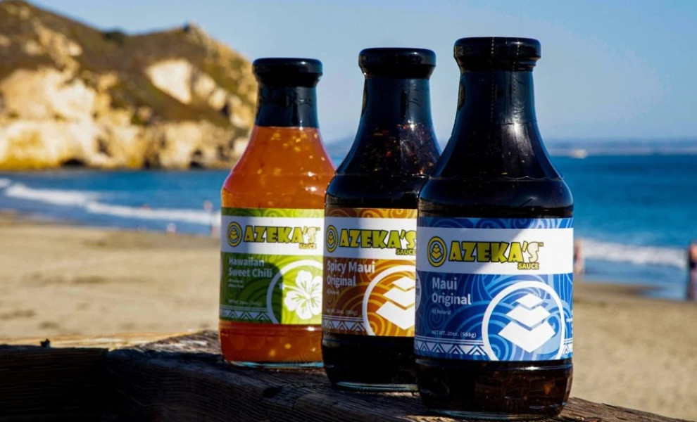
Azeka’s Sauce is a Hawaiian food brand with a longstanding tradition and reputation. Interestingly enough, it was a Kickstarter campaign that resuscitated this locally famous name. Their rebranding and package design efforts were aided by SCI Creations design agency that would emphasize the sauces' diverse applications in a variety of cuisines.
As per the agency’s admission, the “goal was to create a cohesive brand that was united in its look and appearance.” This effectively translates into the same layout for each bottle with certain distinctive elements that stand out in order to show off the unique character of each flavor. On top of that, the agency also wanted to imprint a recognizable Hawaiian identity upon the packaging.
From the very shape of the bottle featuring a distinguishing neckline to the color of each sauce giving the bottle its character, Azeka’s Sauce package design is much more than just a label – it is a synergy of the product, the shape of the container and the intricate design elements.
As is custom, each flavor comes with a distinctive color that is prevalent on the label. Geometrical patterns akin to the natives of these isles reveal the identity that is deeply rooted within greater areas of the Pacific since such patterns can be found in Micronesian and Polynesian cultures.
The brand name in electric yellow stands quite vividly against the label’s negative space. The rest of the lettering uses a very legible sans serif typography, also in white, to contrast the vibrant label color.