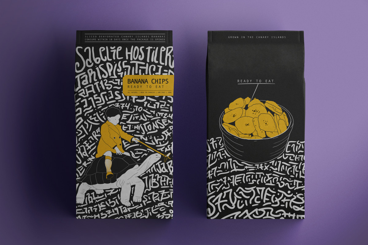
Standout Features:
- Humorous character illustration
- Artistic Canary typography
- Straightforward product details
Martin Merino's packaging design for Banana Chips is a playful and culturally rich presentation that blends humor and authenticity.
The centerpiece is a humorous illustration of a turtle carrying a child, playfully dangling a banana in front of the turtle's head. This whimsical image adds a lighthearted touch, making the packaging memorable and engaging. It captures imagination and subtly nods to the product's slow and steady journey.
In the background, the typography is inspired by the markings on pallets of bananas exported from the Canary Islands. This font style adds a sense of cultural identity. It pays homage to the product's origin, infusing it with a deep connection to its roots.
Lastly, a prominent “Ready to Eat” highlight informs consumers that the product requires no preparation. This practical element enhances the functionality, making the packaging informative and consumer-friendly.