Packaging Designed by
Green Duck Studio Green Duck Studio

Batson River Brewing & Distilling

Batson River Brewing Packaging Design
Batson River Brewing’s packaging system translates Maine’s landscapes and seasonal character into a unified visual identity. Designed by Green Duck Studio, the collection balances expressive illustration with structured typography to create “Maine in a can” across an expanding craft lineup.
Batson River Brewing Packaging Design
A cohesive system of structured type and Maine-inspired illustration
Batson River Brewing Packaging Design
Each can capture a unique regional story while maintaining a unified brand identity
This website uses a colour palette of 4 colours
  • #F6F1F0
  • #E7E8E7
  • #B3B2B0
  • #2D302A
Technologies & Tools
Description
Team Behind the Design
  • Agency: Green Duck Studio
  • Client: Batson River Brewing & Distilling
  • Category: Packaging Design — Food & Beverage
  • Location: Dover, New Hampshire, United States
  • Project Brief: Develop a cohesive brand strategy and scalable packaging system to support rapid growth while capturing the spirit, landscape, and character of Maine in every can.

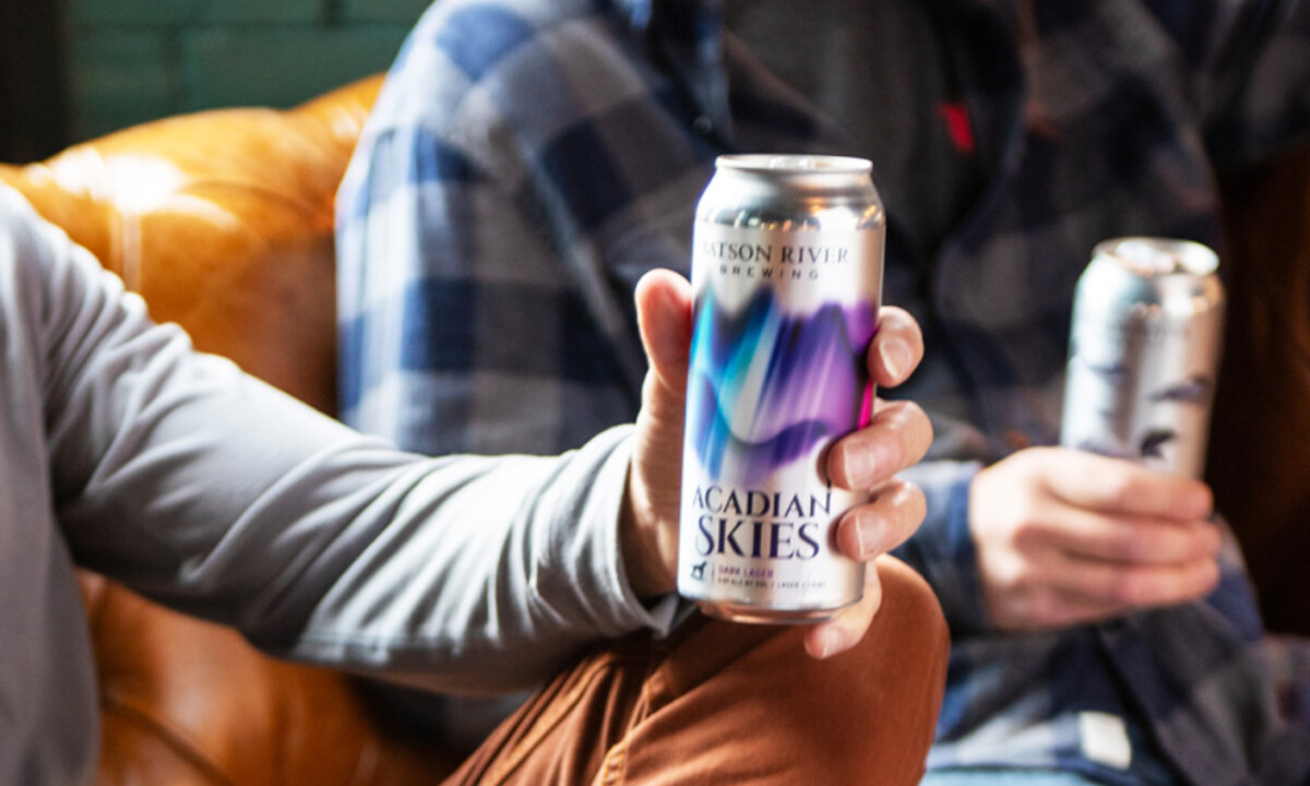
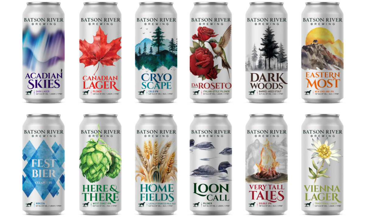
Appealing craft beverage packaging design must unify variety without losing distinctiveness. Batson River’s system achieves this by anchoring every can in a consistent typographic framework while allowing each brew to tell its own regional story through detailed, place-driven illustration.

Ready to elevate your designs?