Standout Features:
- Minimalist labeling with playful graphic symbolism
- Cohesive monochrome gift packaging system
- Architectural product stand with a built-in bottle display
For Bebek Stadtbrenner, a producer of fine brandies, Wie der Wind created a packaging system that’s best-in-class in atmospheric minimalism. It’s a thoughtfully crafted system that communicates the brand’s commitment to traditional methods, clarity, and a unique urban touch.
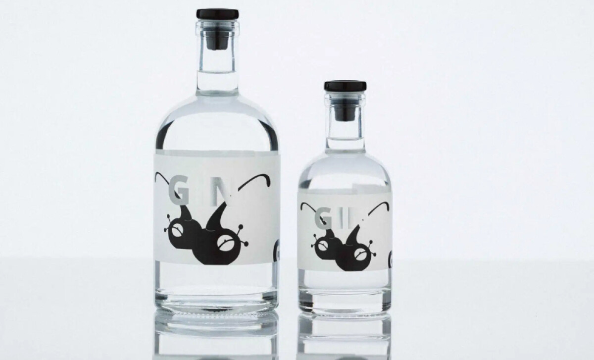
Minimalist labeling with an abstract black symbol is a standout feature. The icon can be seen either fully or semi opaque, creating a unique visual.
By reducing the design to essentials, the label captures the product’s philosophy of slow refinement with high visual economy, making it both memorable and meaningful.
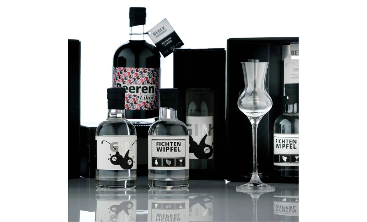
The gift packaging features a high-gloss black box with a precise cut-out interior for a bottle and glass. This museum-like display and its monochrome aesthetic strip away decorative excess.
The one colorful item, the "Beeren Likör," cleverly marks its deviation from the core line, cueing customers to its different character.
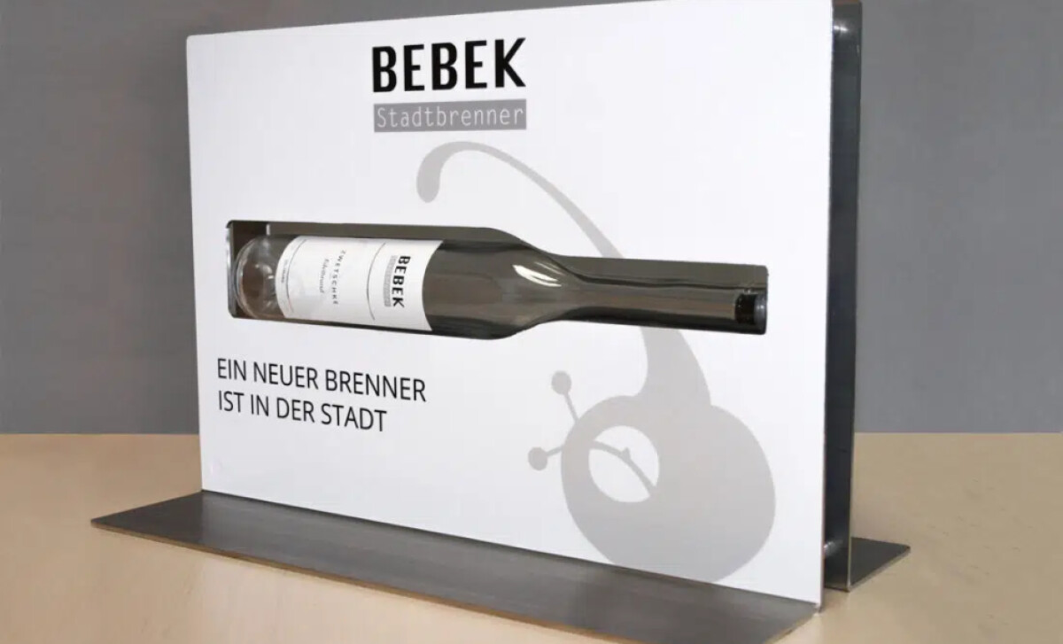
The brand uses an architectural product stand. A Bebek bottle is horizontally embedded in a white steel slab, accompanied by the bold black sans-serif phrase, “A new distiller is in town.”
This physical integration of the actual bottle transforms simple signage into a compelling installation, creating a strong presence in retail spaces.
This food and beverage packaging design system for Bebek Stadtbrenner is a masterclass in using restraint and spatial design to build a compelling brand. This level of care directly mitigates consumer frustration, seeing that consumers have abandoned products specifically because of poor packaging experiences.