Team Behind the Design
Packaging Design Analysis
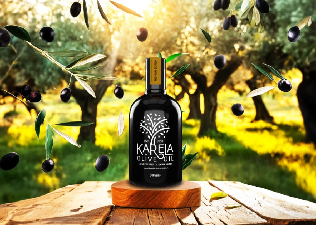
Strong food and beverage packaging often depends on confidence more than decoration.
In reviewing Karela olive oil packaging, I focus on how restraint, material contrast, and clear symbolism signal quality at shelf level.
- Shelf Impact: I like the choice of a near-black bottle paired with stark white markings. In a category crowded with green glass and rustic cues, this approach feels intentional and premium, setting Karela apart immediately.
- Iconography & Branding: The stylized olive tree emblem serves as a steady visual anchor. Its symmetry and abstraction suggest heritage and stability without leaning into nostalgia, keeping the brand both modern and enduring.
- Material Strategy: The contrast between glossy black glass and matte kraft refill pouches is especially effective. I appreciate how sustainability is implied through material choice rather than explained through copy.
- Variant Differentiation: Accent colors are used sparingly and with control. Small touches of olive green or warm red help distinguish products without disrupting the overall minimal system.
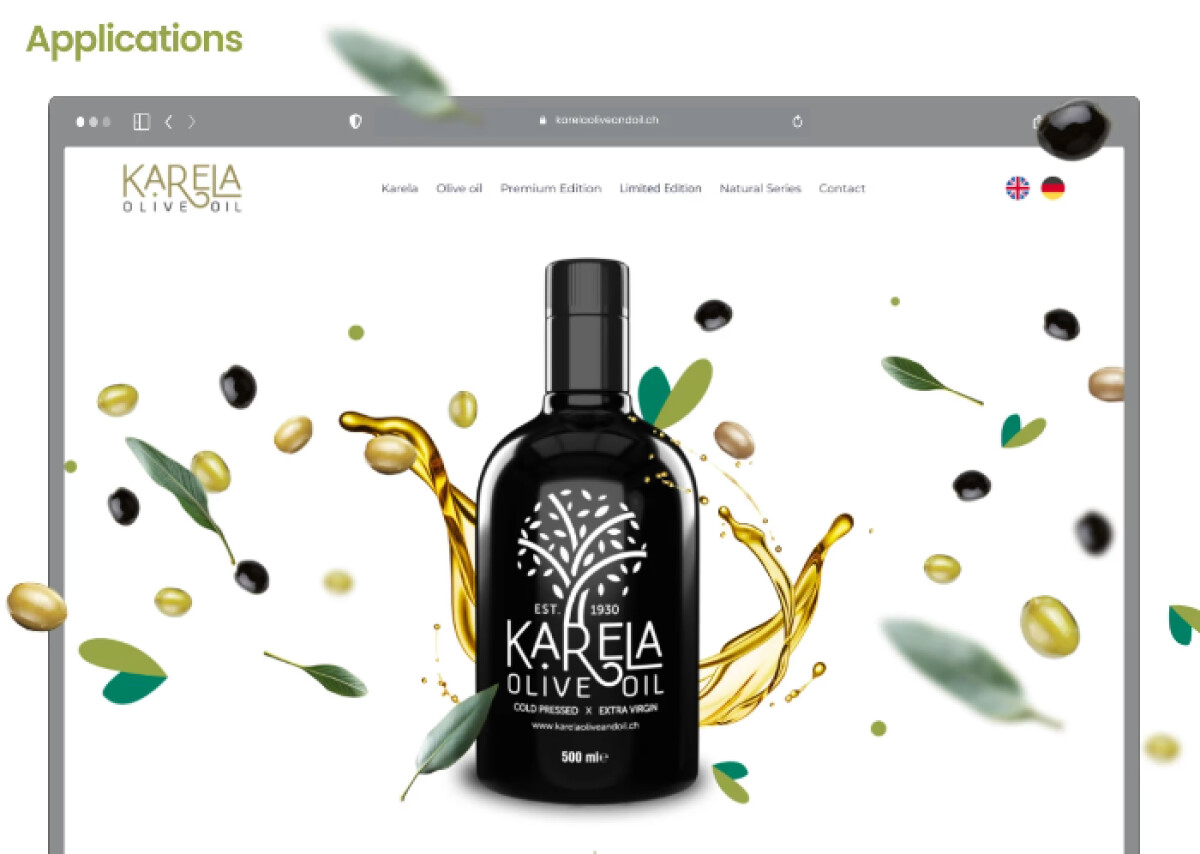
- System Consistency: Across bottles, pouches, and bags, the identity feels cohesive. Everything reads as part of a unified system, which supports scalability and long-term brand clarity.
What Brands and Agencies Can Learn from Karela
1. Use Restraint as a Premium Signal
Minimal palettes and reduced graphic noise can communicate confidence and quality more effectively.
2. Let Materials Do the Sustainability Work
Texture and substrate choices can suggest eco-conscious behavior without relying on overt messaging or badges.
3. Design Packaging as a Cohesive System
Maintaining consistent symbols, typography, and hierarchy across formats strengthens recognition and supports product expansion.
About DesignRush Featured Designs
At DesignRush, we spotlight agency projects that push creative boundaries. The designs we feature reflect expert execution and highlight the trends shaping branding today.
Some of these standout projects later earn recognition in the Monthly Design Awards.
Explore more creative work here:
- Best Packaging Designs
- Best Website Designs
- Best App Designs
- Best Logo Designs
- Best Print Designs
- Best Video Designs
For a full list of design agencies and related services, see our Agency Directory.


-preview.jpg)


-preview.jpg)
-preview.jpg)
-preview.jpg)