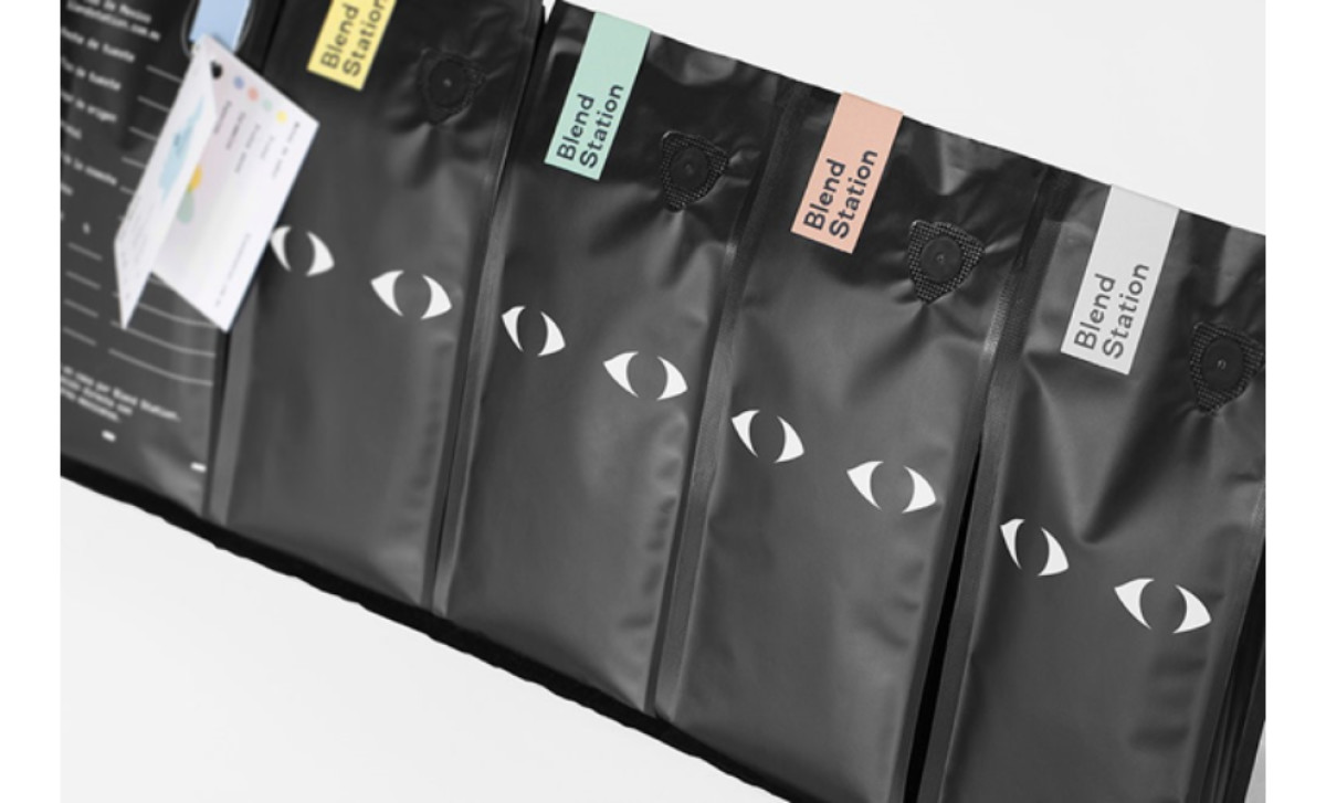
Standout Features:
- Flavor-marking, color-coded strips
- Creative, prominent logo placement
- Sleek, black-and-white foundation
Simple. Effective. Right in the center. Those are the words that describe Blend Station’s packaging design.
The creative, prominent logo placement is a defining feature — two wide-open eyes embedded seamlessly into the background without clear borders. Whether on cups or coffee bags, the logo appears to be staring at you, creating an engaging visual identity until you’ve had a sip and can stare right back.
The roast package itself features a sleek, black-and-white foundation that exudes modern minimalism. This refined base enhances the impact of the color-coded strips representing different flavors, adding just the right amount of vibrancy while maintaining a polished aesthetic.
Blend Station’s branding thrives on bold contrasts and fresh use of dark tones, ensuring strong visual appeal. Set against simple surroundings, the brand’s minimalist yet striking presence delivers a modern and memorable statement — wake up and smell the coffee.
-preview.jpg)