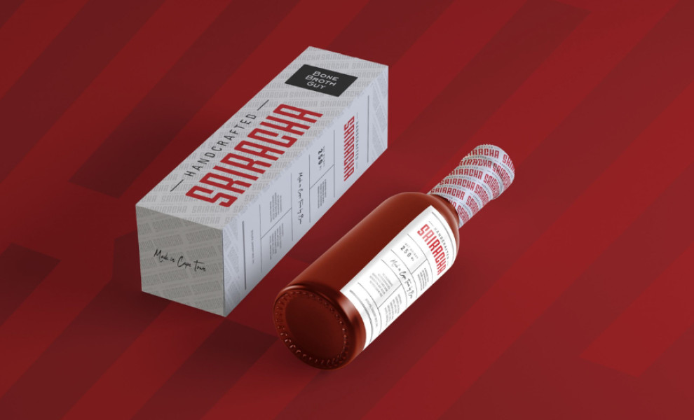
Standout Features:
- Vibrant red lettering
- Separation lines
- Sans-serif and cursive font styles
Sam van Straaten's packaging design for Bone Broth Guy's Sriracha Sauce combines bold visual elements with sans-serif and cursive typography, creating simple packaging with a modern twist.
The agency employed rich red lettering for "Sriracha," which occupies most of the packaging. This vibrant hue ensures the packaging stands out on the shelves, instantly capturing attention while communicating the sauce's spicy flavor.
The design incorporates sans-serif fonts for the main text, enhancing readability and giving the design a sleek, modern vibe. On the other hand, the cursive font style is used for the message "Made with love in Cape Town," adding variety and a personal touch.
Lastly, all text blocks are separated by thin lines, ensuring the layout remains organized and easy to read. This design element helps each piece of information stand independently, preventing clutter.
-preview.jpg)

-preview.jpg)