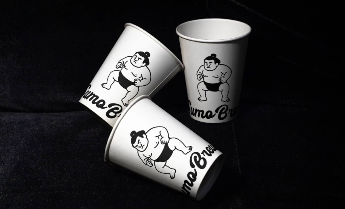
Sumo Brew is a modern coffee brand that embraces simplicity and humor in equal measure. Conceived by Attlas Design, the visual identity achieves this through black-and-white line illustrations of sumo wrestlers performing everyday coffee rituals, creating packaging that feels contemporary yet human.
Industry Insights: According to a 2023 ResearchGate study, 61% of shoppers are more likely to repurchase a product if it comes in premium packaging.
The Sumo Brew design puts this idea to work. Let’s look at how its charming mascot and simple black-and-white style create a premium feel that builds customer loyalty.
Key Insights for Brands:
- Use mascots to build a strong brand personality and make connections with consumers.
- Consider a strict monochrome palette to create a sophisticated, high-impact look while ensuring cost-effective packaging production.
- Balance playful illustrations with clean, minimalist layouts to create a brand that feels both fun and premium.
Attlas Design Uses a Playful Illustrative Identity
Each packaging piece by Attlas Design showcases a charming sumo figure rendered in clean black line art, captured mid-action.
These characters are strategically placed on cups and bags, often interacting with the product form itself in a playful and engaging way. You can see them drinking coffee, sitting, or balancing atop a bean.
The use of these illustrations is a great way to build a strong brand personality, which is a vital connection to make, as 42% of consumers cite personality as a key factor in their trust. Not to mention, the simple, black-and-white style is also very practical for printing.
"Fun with a variety of character illustrations for a happy, playful twist in the world of coffee. Simple black and white line art is perfect for cost-effective packaging and accessories.''
DesignRush Awards Jury Panel
With its witty, approachable vibe, the brand feels fresh and full of personality, while being instantly recognizable. Its these playful illustrations that turn what would have been a forgettable disposable coffee cup into a mini work of art, making it a great example of the best packaging designs.
The Sumo Brew Brand is Monochrome & Minimalist
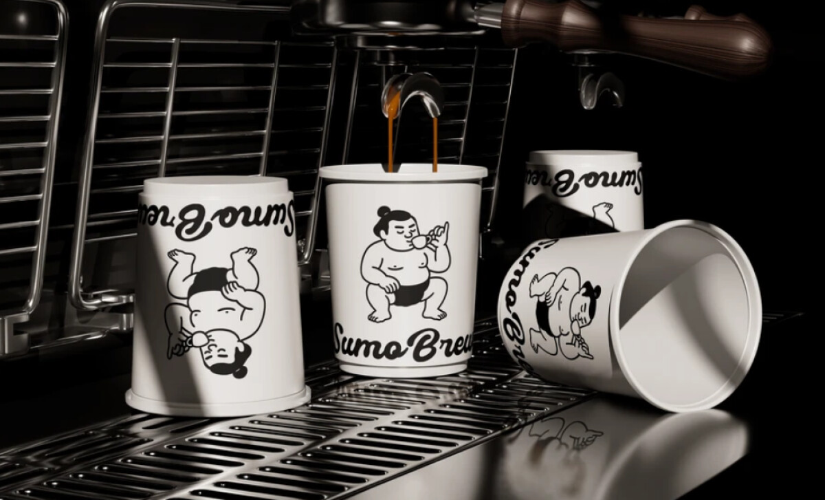
The brand's visual identity is defined by its simple, black-and-white color scheme, and it’s highly effective.
The stark contrast between the black ink and the white packaging creates a simple, but also bold and clean look.
By not using color, the designer forces you to focus on the shape of the illustrations and the overall composition. This makes the brand’s characters even more memorable. Plus, it helps to position the brand as modern and sophisticated.
By being so unique from other coffee branding designs, the design commands attention in café settings and online visuals alike.
These are qualities that resonate with coffee aficionados who appreciate uniqueness in both the product they consume and the design of the packaging it comes in.
The Agency Integrates Dynamic Typography into the Cups
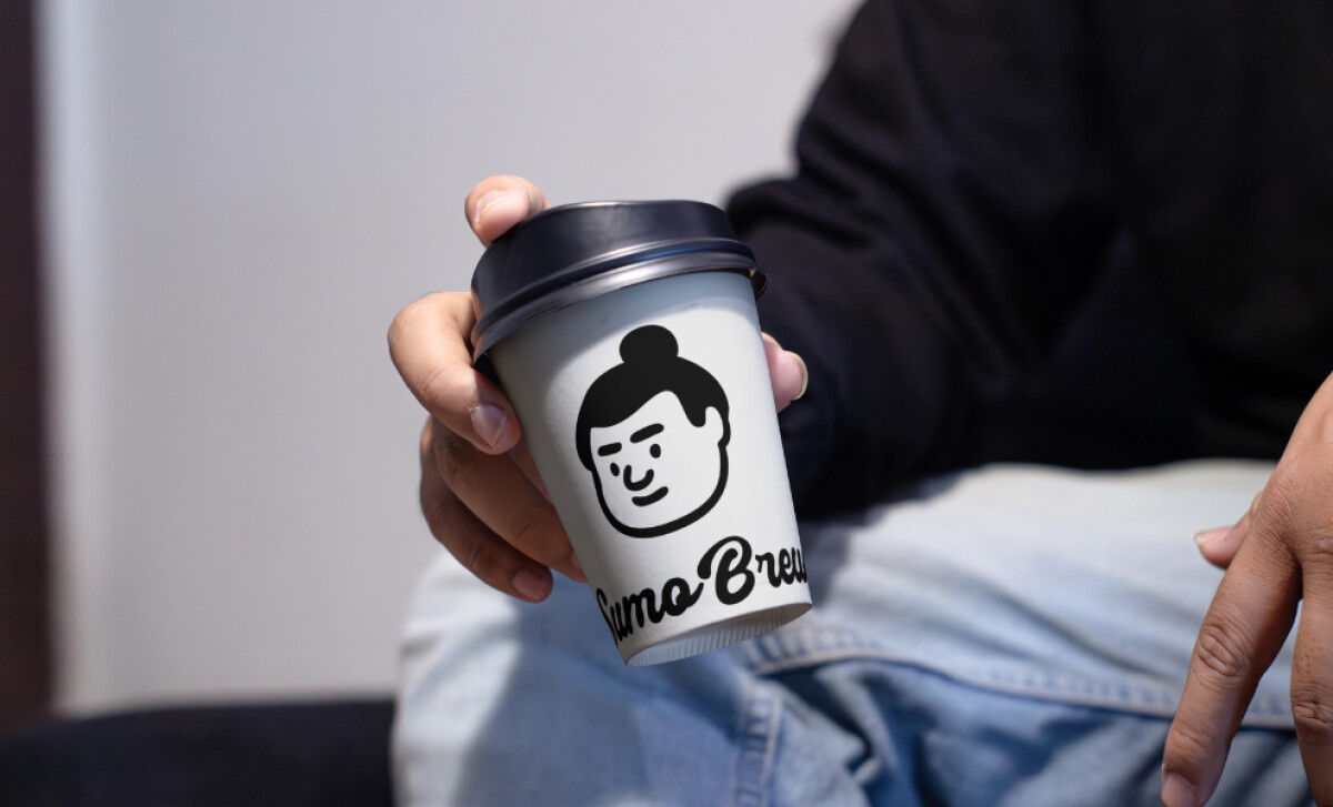
An expressive script font is used for the “Sumo Brew” brand name. It has a fluid, handwritten feel that works well with the charming illustrations.
This is a great example of using unique brand typography to add personality to a design. The bold, flowing letters add a layer of energy to the design that complements the rigid, blocky poses of the sumo characters. It also softens the minimalist, black-and-white aesthetic.
The authentic, human qualities of such fonts are a proven design principle. Given that studies on handwritten fonts confirm that such styles create a perceived human presence.
Without this element, the design might feel a bit too clean or stark, but Attlas Design’s choice makes for a brand that feels thoroughly genuine.
Product Differentiation Through Illustration Context
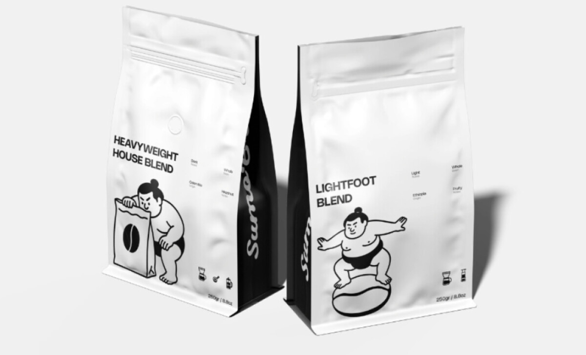
In this project, different coffee blends are represented through context-specific illustrations. For instance, the “Heavyweight House Blend” features a sumo inspecting a giant coffee sack.
The “Lightfoot Blend,” in contrast, depicts one balancing playfully atop a coffee bean. Each figure represents the roast’s character, robust or light, without relying on color.
This technique demonstrates intelligent storytelling through illustration, a strategy often seen from top packaging design agencies. It creates an immediate visual cue for the coffee’s personality and quality.
The impact of this is a much more engaging shopping experience. The different illustrations help you to remember the different blends and create a stronger first impression. It’s one of the best creative packaging design ideas that is both whimsical and smart, proving that a fun idea can also be a very effective one.
What Brands & Agencies Can Learn from Sumo Brew
This project gets to the heart of what packaging design is: building a brand people remember and want to pick up. Here’s what Sumo Brew teaches us.
1. Let a Character Tell Your Story
A strong character can turn a simple package into a conversation piece. Develop a persona that can be adapted into different poses. This allows each product variation to have its own unique personality.
2. Balance Minimalism with an Expressive Font
A minimalist design does not have to feel cold; you can add warmth and energy by pairing a clean layout with a single, expressive script font for the brand name.
3. Use High Contrast for Visibility
A simple black-and-white palette is a powerful tool for shelf presence. The high contrast ensures your product will stand out in a crowded retail environment.
About DesignRush Featured Designs
At DesignRush, we review hundreds of agency projects each month. The featured works highlight creativity, brand coherence, and craftsmanship across categories.
The most compelling designs advance to be recognized as Monthly Design Awards winners, earning distinction for originality and execution.
Looking for inspiration in food and beverage packaging design? Start here:
- Best Packaging Designs
- Best Website Designs
- Best App Designs
- Best Logo Designs
- Best Print Designs
- Best Video Designs
For a full list of design agencies and related services, see our Agency Directory.