Iryna Kram is a Germany-based graphic and digital designer specializing in branding, packaging, editorial, and digital experiences. Her work blends strategic thinking with imaginative visual storytelling, combining traditional design principles with experimental tools to create bold, meaningful identities.
Project Overview:
Kvass has almost zero brand recognition in Western markets. That is Bubble-Brot's real design problem, and the packaging solves it without explaining itself once.
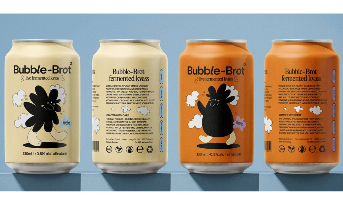
The character carries the load. A black daisy-flower creature with stubby legs and a bemused expression anchors each can, not as decoration but as the brand's personality proxy. Weird enough to stop a scroll, warm enough to not feel threatening.
In a refrigerated aisle full of clean logos and ingredient callouts, something that looks like it crawled out of a teenager's sketchbook wins the attention game. Bubble-Brot did not stumble into that. It chose naive design to manufacture memorability in a category with no existing visual language to compete against.
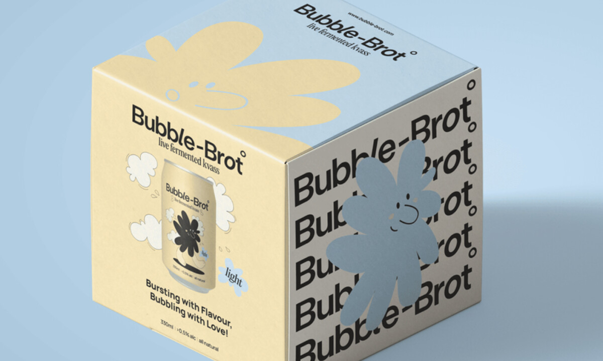
The secondary packaging pushes further. The box stacks the wordmark across one face while the character bleeds across adjacent panels, resolving into a complete image only when boxes sit together.
Most beverage packaging never attempts this because most beverage packaging expects no one to look twice. Bubble-Brot expects it.
The tagline earns its place too. "Bursting with Flavour, Bubbling with Love" works because the design already established a tone loose enough to carry it.
Fermented and functional do not have to mean serious. For a brand introducing an unfamiliar product to a skeptical market, that is not just a design position. It is the entire go-to-market argument expressed in two colors and a doodle.