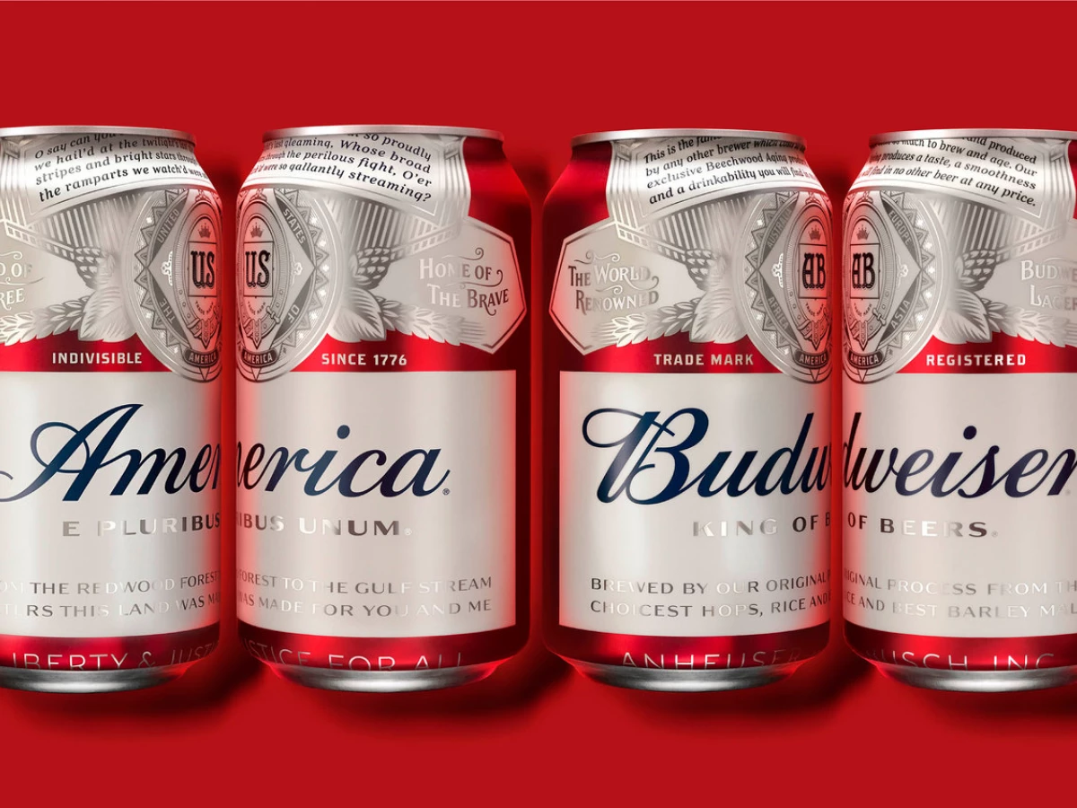
The “America Beer” design for Budweiser was done by jones knowles ritchie for launch in the summer of 2016. The idea behind the design was to celebrate the history of Budweiser as America’s Beer. The red, white, and blue colors are the first, most simple step in cementing the design in the minds of viewers as an American-focused design.
The design also uses the classic Budweiser logo and iconic typography and brings it all together in a modern, eye-catching look that still stays true to the history of the brand.

The design also appears on Budweiser’s bottles in addition to the cans. The American theme is further built on the use of copy like, “Liberty & Justice For All.” This simple copy, printed in a clean, easy-to-read text, just helps to add an extra layer of Americana to the design.
The silver accents add some flair to what is, otherwise, a simple, iconic design. The deep red and clean white contrast with each other very sharply while the silver pulls the viewer’s eye to certain areas of the packaging.
Overall, the best part of this design is that the packaging designers didn’t try to do too much. They knew they were working with an iconic, beloved brand and added enhancements to improve the existing design rather than attempt a complete overhaul. Sometimes the best skill a designer can have is to know when to hold back and let the brand speak for itself.
Budweiser is a cool packaging design in the Food & Beverage industry.
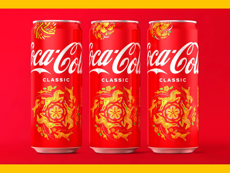
_f5ad76ff0087-preview.jpg)
_7dd0bb698e28-preview.jpg)