Team Behind the Design
Packaging Design Analysis
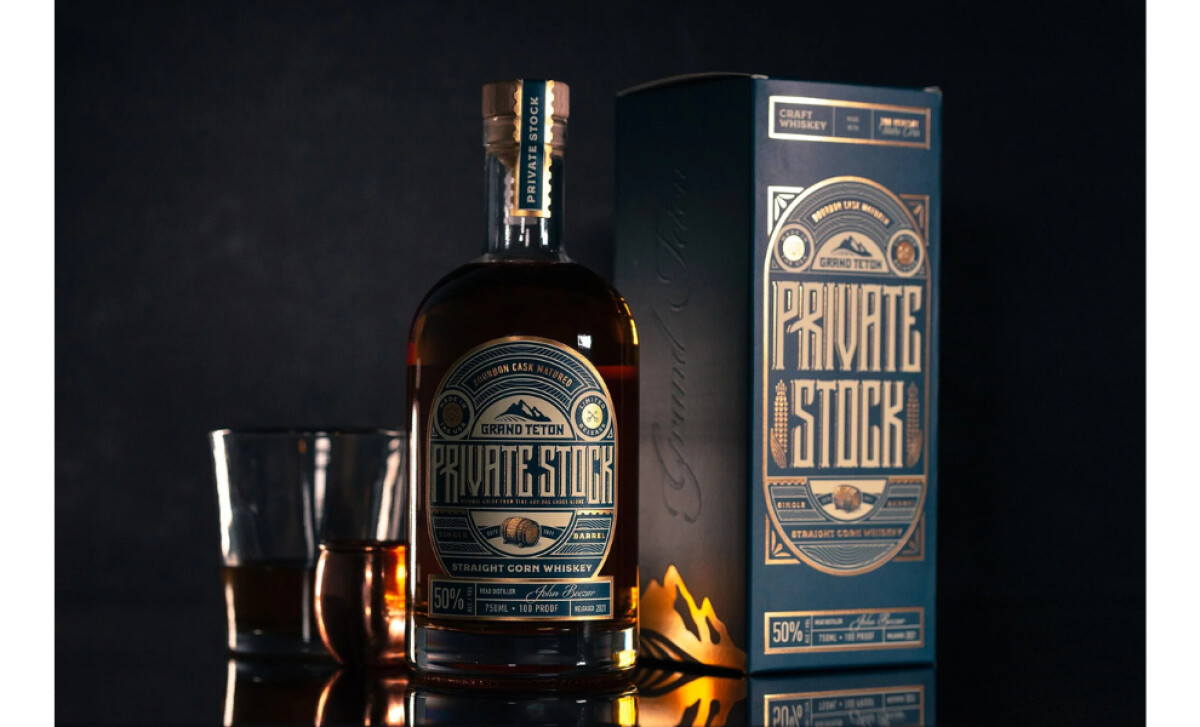
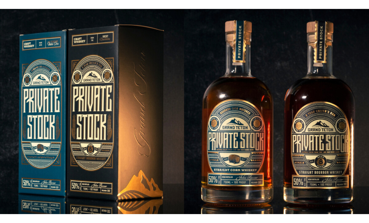
What immediately captured my attention in this redesign is how it reframes the western aesthetic.
Instead of relying on nostalgia, the packaging channels heritage through a sharper, more polished lens that feels crafted, confident, and unmistakably premium.
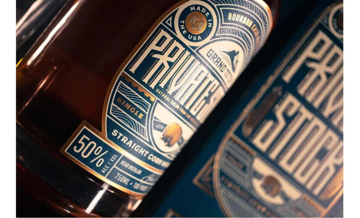
- Typography and Lettering: I appreciate how the tall, condensed type delivers presence without feeling heavy. The subtle ornamentation adds craft detail while keeping the layout clean and contemporary.
- Color and Material Choices: The deep blues and gold foils create a rich, high-end tone right away. These choices shift the brand from rugged to refined while still holding onto its western roots.
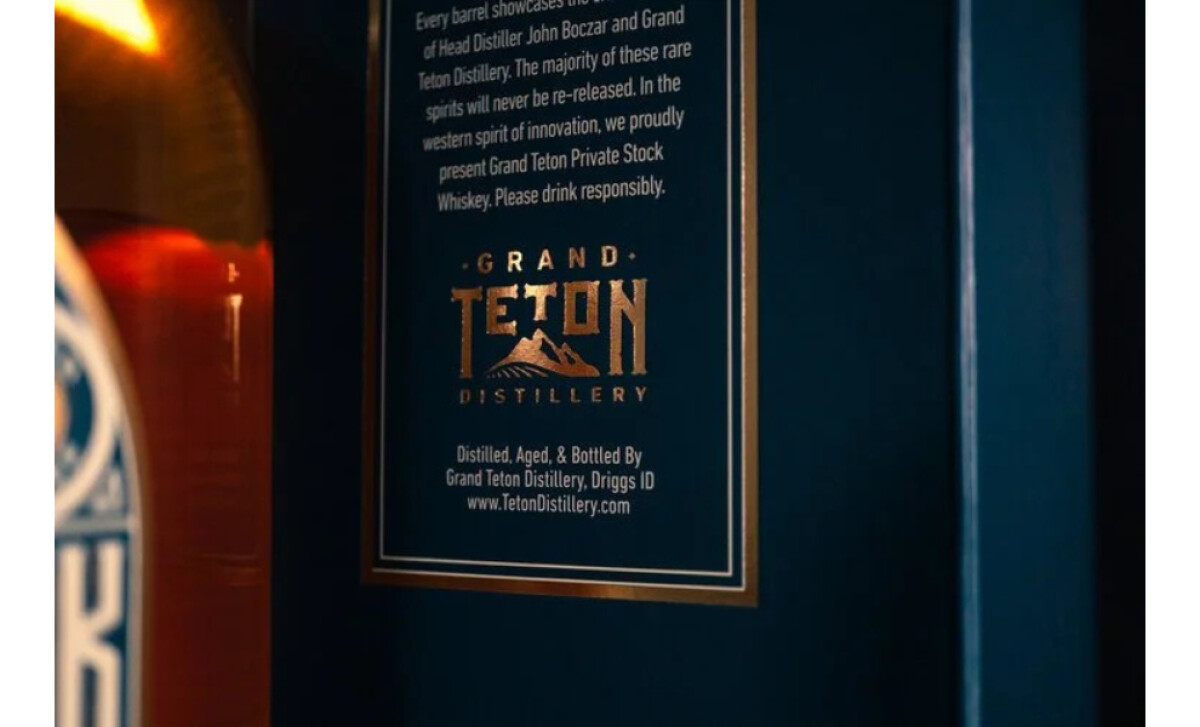
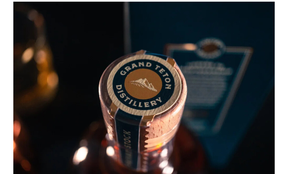
- Illustration and Symbolism: The mountain mark and grain motifs integrate naturally into the design, grounding the story in place and tradition. I like how they’re used sparingly, bringing meaning without overwhelming the label.
- Packaging Structure and Presentation: The pairing of the box and bottle feels cohesive and intentional. Each detail—from borders to foil accents—builds the sense of rarity and craft.
What Brands & Agencies Can Learn from Grand Teton Distillery
Grand Teton Distillery’s redesign shows how heritage can be elevated without losing its soul, using refined structure and premium cues to modernize a western-inspired brand.
1. Refine Tradition Instead of Repeating It
The design moves away from cliché rustic motifs and instead uses focused elements like the mountain mark and subtle grain illustrations to communicate place and craft in a more polished way.
2. Use Color and Materials to Shift Perception
Deep blues, rich neutrals, and gold foils instantly elevate the brand from rugged to premium. This proves how material choices can reposition a product while keeping its origin intact.
3. Let Typography Set the Tone
The tall, condensed letterforms and restrained ornamentation create a clean, confident voice. This approach shows how typography can capture history while still feeling modern and high-end.
About DesignRush Featured Designs
At DesignRush, we review hundreds of agency projects each month. The featured designs stand out for creativity, relevance, and execution.
Many go on to be recognized as winners of our Monthly Design Awards.
Explore more creative work here:
- Best Packaging Designs
- Best Website Designs
- Best App Designs
- Best Logo Designs
- Best Print Designs
- Best Video Designs
For a full list of design agencies and related services, see our Agency Directory.
-preview.jpg)
-preview.jpg)