Standout Features:
- Whimsical illustrations
- Soft pastel hues
- Bold visuals with refined typography
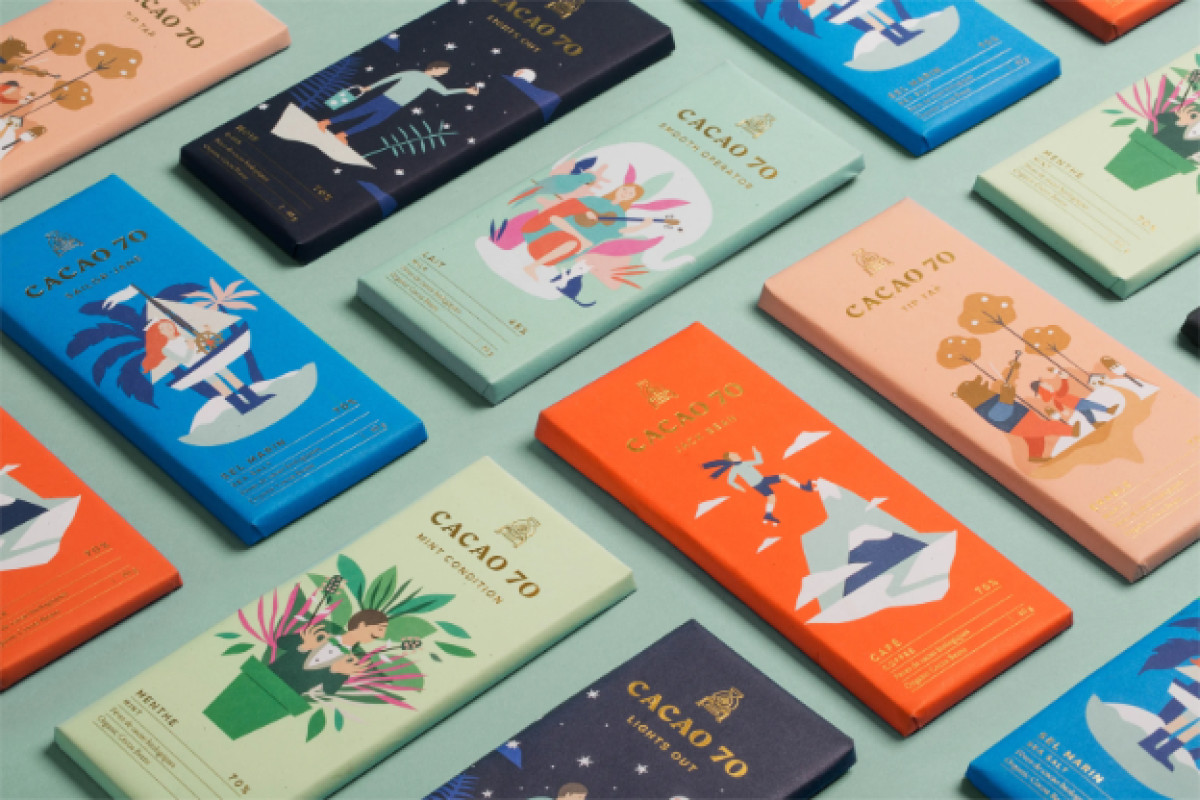
Cacao 70 is a bean-to-bar brand that infuses personality into every product, turning its packaging into a visual storybook that invites consumers to engage before they even take a bite. Rather than relying on conventional luxury cues, In Good Co.’s design approach to the packaging embraces warmth, humor, and creativity through its charming, illustrated designs.
Each wrapper features a unique character or scene that corresponds to the chocolate’s flavor, creating an instant connection between the product and the consumer. Whether it’s a mountaineer scaling a cocoa peak or a sailor floating in a sea of rich, velvety chocolate, these lighthearted narratives add an unexpected layer of joy to the packaging. The hand-drawn illustrations use soft, organic lines and a carefully curated color palette, making the design feel both modern and nostalgic.
The pastel tones provide a sense of calm and balance, complementing the vibrancy of the illustrations without overwhelming the minimalist layout. Gold-foil typography adds a subtle hint of sophistication, ensuring that the packaging retains a premium feel. Negative space is used masterfully, allowing the artwork to breathe while keeping the overall design clean and uncluttered.
Cacao 70 proves that chocolate packaging can be as playful as it is elegant. It doesn’t just showcase a product — it invites consumers into a world of imagination, delight, and indulgence.

-preview.jpg)
