Standout Features:
- Bold geometric design
- Strong typography and brand identity
- Clear, informative back panel
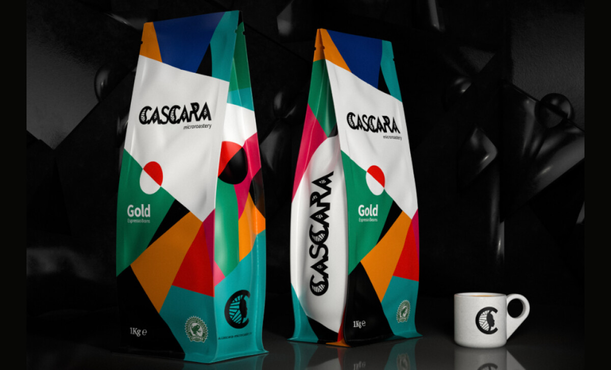
For Cascara Microroastery, every bag of their premium espresso beans makes a statement about quality and modern craftsmanship. This message is powerfully amplified by their packaging. The design by ID3A+ employs a dynamic visual language of color and shape, creating a distinctly unique product's image that appeals to discerning coffee lovers.
The first thing you'll notice about Cascara Microroastery's packaging is its dynamic and colorful geometric design. It uses a vibrant array of greens, reds, pinks, blues, and oranges in sharp, overlapping shapes. This composition creates a compelling sense of movement, immediately making the coffee bags visually distinctive and energetic on any shelf.
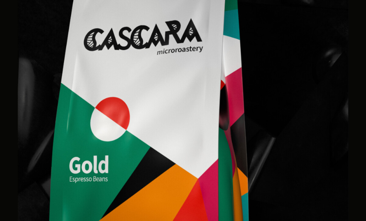
Strong typography plays a key role in establishing the brand's identity. The Cascara logo is prominently displayed in a highly stylized, uppercase font, which stands out effectively against the colorful patterns. Though it uses a very unique line art pattern, this typeface is still readable and helps reinforce the brand's high-quality product.
Turning the package over, you'll find a clear and informative back panel. This section provides detailed product specifics, including origin, tasting notes, and a helpful graph illustrating the coffee's flavor profile. ID3A+ structured this information with well-organized text and icons, making it easy for consumers to read and understand.
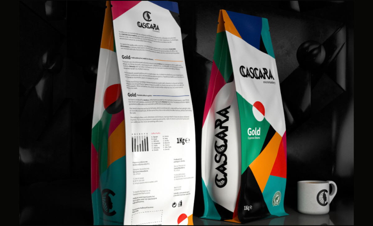
What ID3A+ achieved for Cascara Microroastery is a superb balance between eye-catching aesthetics and clear, accessible information. The energetic front draws you in, while the detailed back panel builds confidence. This dual approach is a winning strategy for premium coffee packaging design, satisfying both visual appeal and consumer curiosity.