


- Agency: Poppy Design
- Client: Numood
- Category: Packaging Design — Beverage
- Location: Yeovil, United Kingdom
- Project Brief: Design packaging that enhances shelf appeal and clarity through modern visuals and intuitive flavor communication.
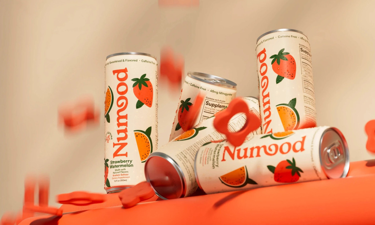
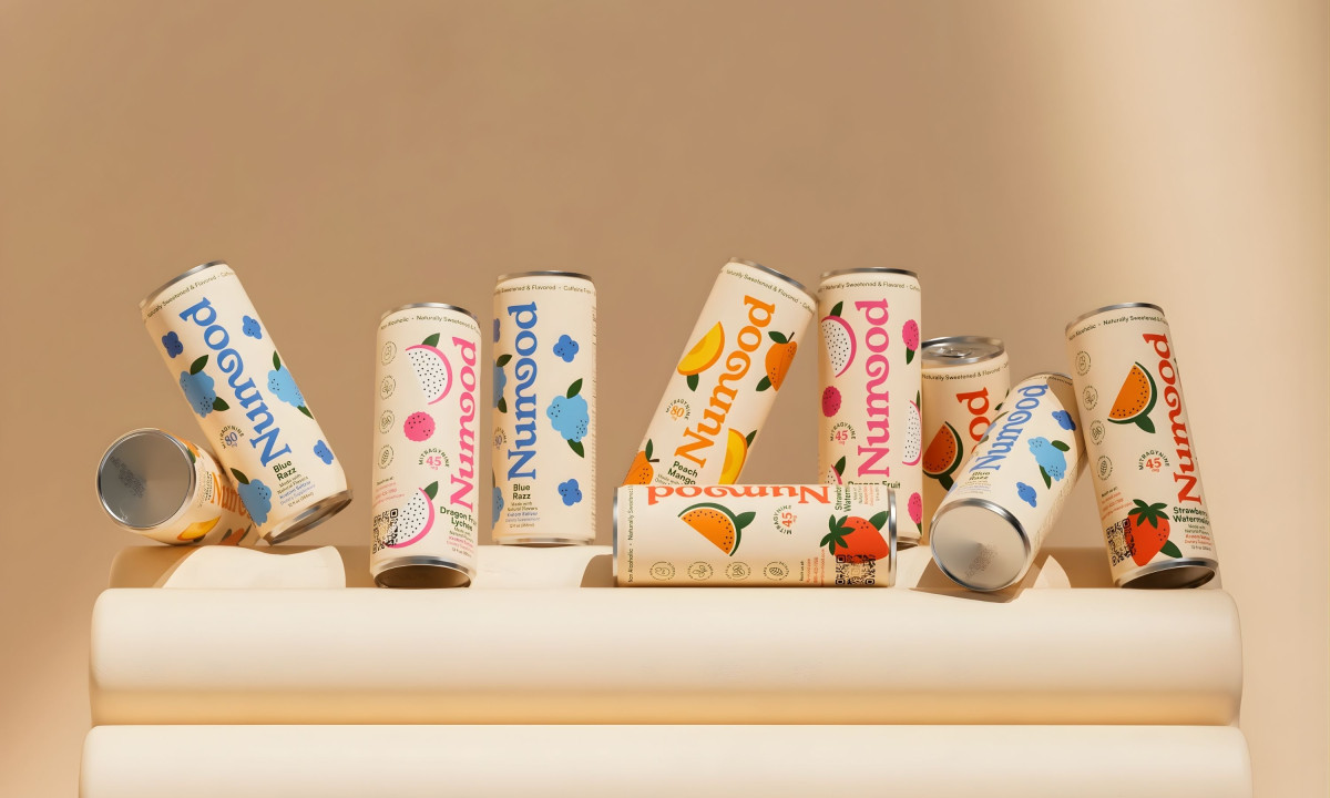
Numood elevates its packaging with a clean, contemporary system that moves away from the heritage-led cues common in the category.
This beverage packaging design uses modern fruit graphics, bright color accents, and a refined wordmark where the transition from the “m” to the “o” forms a subtle leaf in negative space, linking the brand to natural ingredients without relying on obvious visual clichés.
Juror Andrea Owsinek-Brucker noted the design’s capacity for immediate shelf-level impact:
“Vibrant bold graphics and pleasing color pallet create instant recognition of product and choices.”