
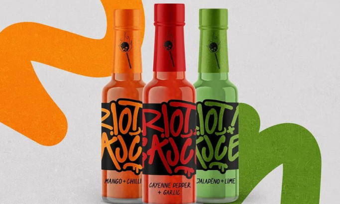
Standout features:
- Colorful packaging
- Different illustration styles
- Prominent logo
Caleya's story begins in 2001 when four friends united under the motto of "making delicious beer and not getting rich with beer." After many ups and downs, Caleya Beer came to light.
The first stage of Caleya was developed in the Rioseco factory, in the heart of the Redes Natural Park and Biosphere Reserve, for its impeccable quality of water.
The first produced brews were Asturies Pale Ale, then Mayuca Amber, and Goma 2, an IPA. The latter, without a doubt, became one of the most accepted and thriving in the market and is considered one of the best IPAs in Spain.
The Caleya’s commitment to the so-called “new renaissance”, or returning to the land with new production and returning to its strong and deep roots is the basis for their beer packaging. Created by Pixelbox Estudio Grafico, the packaging design offers a unique graphic style for each brew, while being inherently Spanish.
-image1-preview.jpg)
-preview.jpg)