Standout Features:
- Vibrant, eye-catching color scheme
- Japanese-inspired typography
- Playful illustrative elements
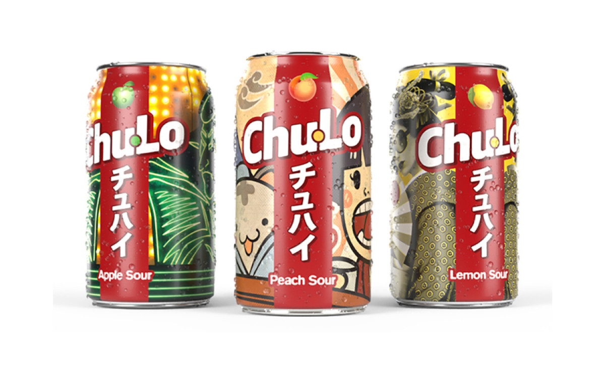
Chu-Lo Soft Drinks, a Manchester-based brand inspired by Japan's chūhai cocktails, offers a low-sugar, alcohol-free beverage with a bold, sour fizz. To capture these authentic Japanese flavors, Top League Creative developed a packaging design balancing traditional Japanese aesthetics with a contemporary look — positioning Chu-Lo as a culturally resonant choice in the competitive beverage market.
Chu-Lo’s packaging features a striking color palette that combines vibrant reds, blues, and greens, echoing Japanese pop culture's playful, energetic essence. This choice was likely intentional, as bright colors convey excitement and playfulness, ideal for a product designed to be visually appealing and flavorful.
These loud colors are complemented by the design’s typography. Inspired by Japanese aesthetics, the designers infused a bold typeface with clean characters, echoing the brand’s clear and sharp branding.
Moreover, the striking typeface ensures legibility while reinforcing the brand’s cultural influences. This typography captures the attention and communicates the brand’s homage to Japanese flavors and inspiration.
Alluding to its Japanese branding, Chu-Lo’s packaging design incorporates playful, illustrative elements reminiscent of manga and pop art. These illustrations add personality to the design, making each can feel lively and interactive. For a brand aiming to be unique and culturally expressive, these illustrations provide a compelling way to draw consumers into the brand narrative.

-preview.jpg)