- Agency: Elmwood
- Client: Coca-Cola
- Category: Packaging Design — Beverage
- Location: London, United Kingdom
- Project Brief: Design a Lunar New Year packaging system that unifies Vietnam, Singapore, and Malaysia under one visual language while reflecting local cultural symbols and driving seasonal retail impact.
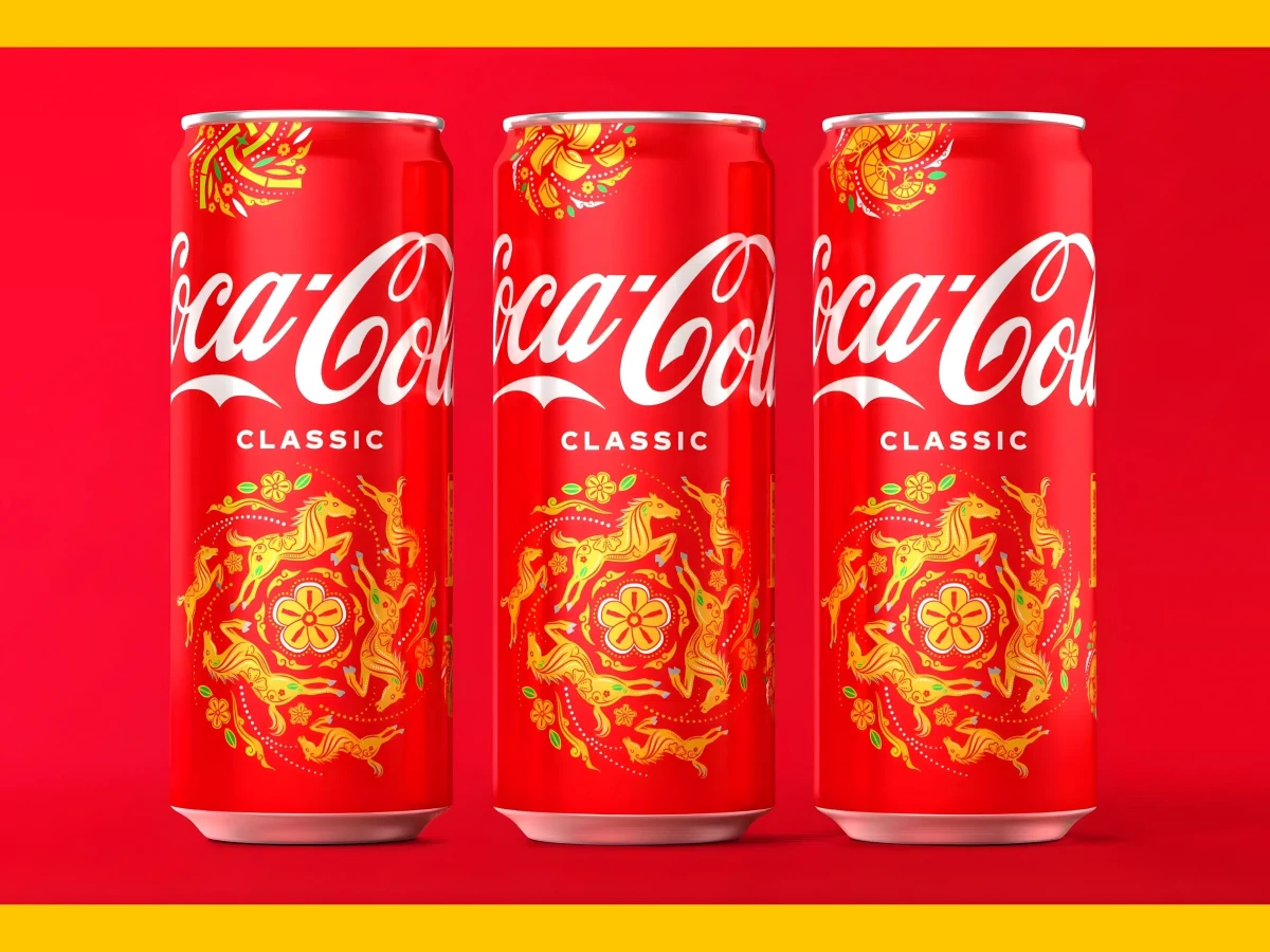
Coca-Cola's Lunar New Year beverage packaging design has to do something most seasonal designs don't: work across three markets with different cultural references while still reading as one campaign. Elmwood designed a system for Vietnam, Singapore, and Malaysia that holds together visually without flattening the regional differences.
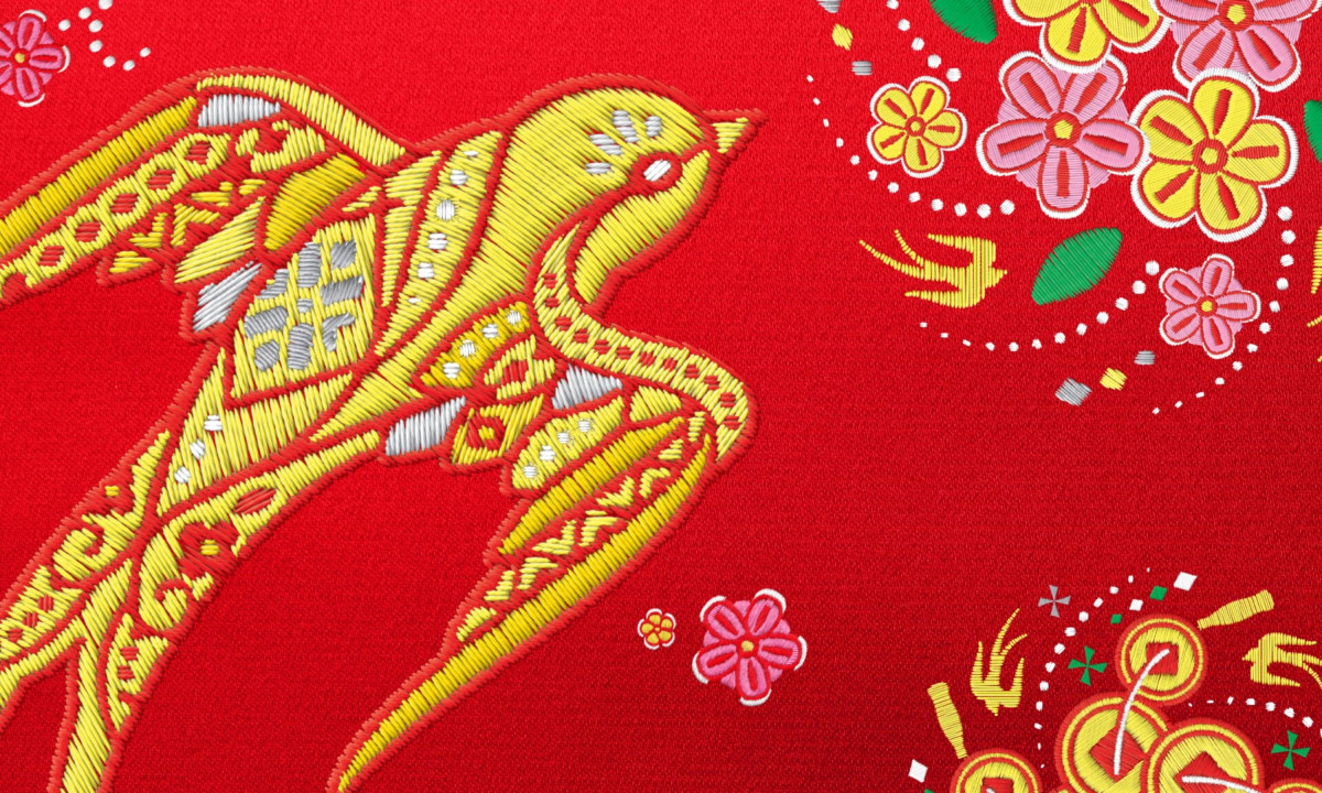
The surface design draws from traditional Asian embroidery. The illustration style mimics the layered texture of handcrafted textiles, with dense patterns that give the flat surface of a can or bottle a sense of physical depth.
That material reference sets the beverage packaging design apart from the usual foil stamps and red-and-gold gradients that dominate Lunar New Year retail shelves.
Regional motifs handle the localization. Golden swallows and spirit horses appear as culturally specific icons woven into the standard Coca-Cola palette.
Each market gets symbols its audience recognizes without the packaging losing visual cohesion across the campaign. The system solves the hardest version of a multi-market brief: local enough to feel authentic, consistent enough to feel like one brand.
The palette stays anchored in Coca-Cola red but shifts its supporting tones to accommodate the embroidery textures. Golds, warm whites, and deep reds carry the festive register without competing with the brand's primary color. Elmwood kept the logo placement and can structure standard while letting the illustration system do all the seasonal work.
Elmwood built a Lunar New Year packaging system that respects regional identity without fragmenting the brand. For a product sold by the billions, that balance between global consistency and local specificity is the entire design problem. The embroidery concept solved it.