Standout Features:
- Shimmering holographic foil
- Soft pastels and clean typography
- Crystal-themed branding
When you're trying to sell something unique like Crystal Tea — tying organic teas to crystal properties and the art of setting intentions — the packaging itself has a big job to do. Prism + Fleur Design Studio took on designing a look for this Australian family business, aiming for something soft and elegant yet still cohesive for their whole product range.
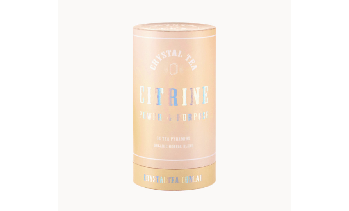
The first thing that catches your eye is how the products use holographic or iridescent foil on the cylindrical canisters. Applied to the particular tea name and its tagline, this gives it a shimmer reminiscent of actual crystals catching the light. Such a premium finish gives the product a tangible personality and solidifies the whole crystal tea idea.
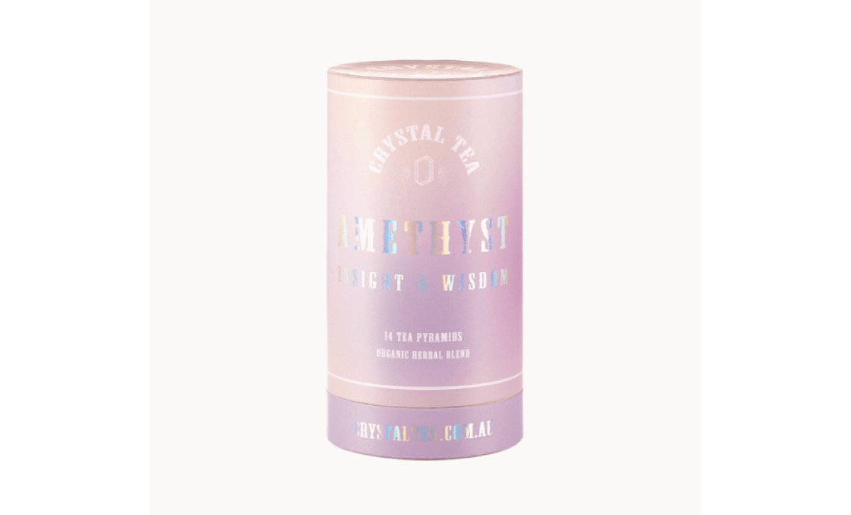
Plus, that shimmer contrasts nicely with the soft, muted pastel colors used for each tea type (like pale peach for Citrine or gentle lavender for Amethyst). This color system helps tell the teas apart, yes, but it does work to keep the overall look soft and cohesive. Clean, light sans-serif fonts that are used consistently everywhere contribute to this effect too.
Overall, the packaging does a great job communicating its unique brand idea. Tying the tea names explicitly to crystals and adding intention-focused taglines connects the idea of tea + crystal energy = mindfulness. The holographic foil sells this clever branding too. Pair that with consistent design elements, and you get a well-integrated approach.
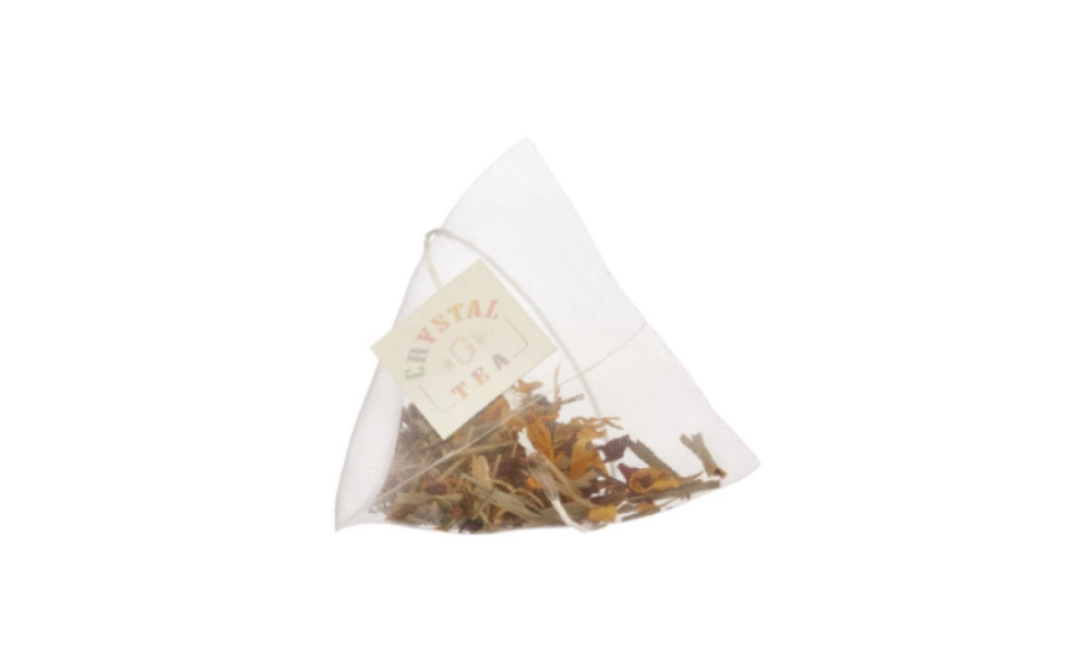
Prism + Fleur absolutely made sure the tea packaging design’s colors, fonts, foil effects, even down to the style of the tea bag tags, work together consistently across the entire product system — and to great effect. It builds a strong, instantly recognizable identity (that’s also very quirky) from the main product canister down to the smallest details.


