- Agency: Howl Creative
- Client: Cultured Yogurt
- Category: Packaging Design — Food & Beverage
- Location: Vancouver, Canada
- Project Brief: Develop a packaging identity for Cultured to elevate yogurt from a commodity product into a culinary experience, appealing to culturally curious consumers while clearly differentiating each global variety within a cohesive brand family.
Many food and beverage packaging relies on literal product photography, but Howl Creative adopts a more illustrative, storytelling perspective.
Cultured Yogurt succeeds by using cultural references to build a visual style that frames global flavors as modern, premium staples.
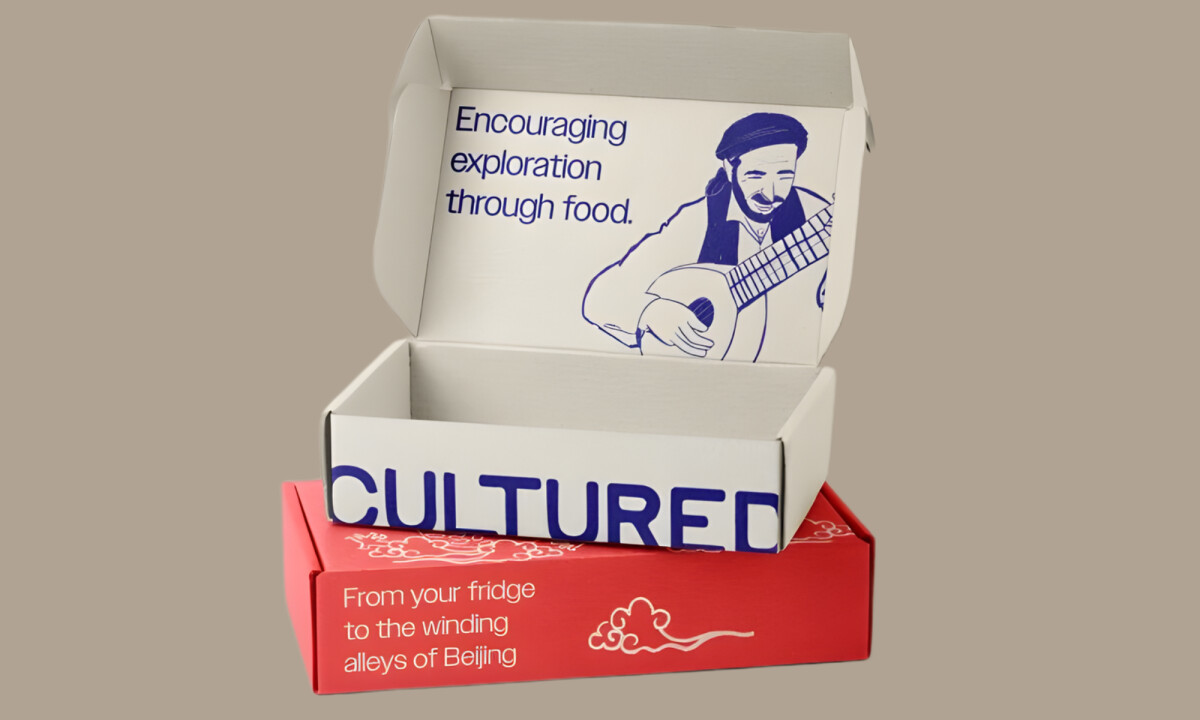
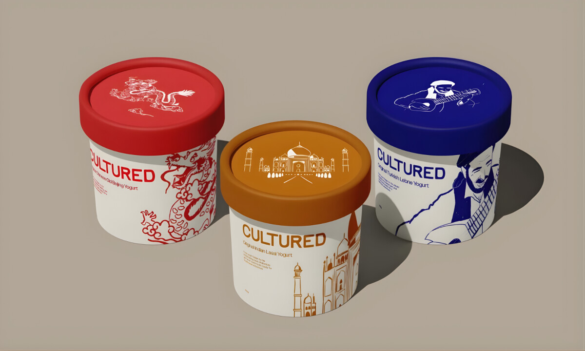
- Cultural Illustration: Each variety uses region-specific illustrations of dragons and architecture to anchor the product in its cultural origin. I find this approach transforms the packaging into a narrative device that invites consumers to explore food traditions rather than just a flavor.
- Typographic Restraint: The wordmark and supporting type are intentionally minimal to allow the complex illustrations to carry the emotional weight. I believe this balance keeps the visuals refined and prevents cultural references from feeling like overstated decoration.
- Color-Led Differentiation: Bold palettes distinguish each variety while maintaining a consistent structure across the entire product line. I think using color as both a navigational tool and an emotional cue effectively reinforces a sense of variety at the shelf level.
- Premium Shelf Impact: Clean layouts and generous negative space elevate the container above typical dairy packaging standards. I appreciate how this positioning rebrands the product as a culinary ingredient rather than a routine grocery staple.
What Brands & Designers Can Learn from Cultured Yogurt
1. Use Cultural Illustration to Add Meaning, Not Noise
Region-specific illustrations turn packaging into an invitation to explore heritage and tradition. When culture is expressed through structure and craft, it adds depth without feeling decorative or forced.
2. Balance Expressive Visuals with Typographic Restraint
Minimal wordmarks allow illustration to carry the emotional narrative. Restraint in type keeps complex cultural references feeling refined and premium.
3. Elevate Shelf Presence Through Simplicity
Generous negative space and clean layouts reposition the product as a lifestyle ingredient rather than a commodity. Premium perception often comes from disciplined composition, not excess detail.