Packaging Designed by
Katie Rou Design, LLC Katie Rou Design, LLC

Dillinger Brewing

Dillinger Brewing Packaging by Katie Rou Design
Dillinger Brewing’s can designs celebrate bold flavor and local character through vibrant illustration and high-contrast color palettes. Each release is crafted to stand out on crowded shelves while staying rooted in the brewery’s Tucson identity. The evolving label system balances playful storytelling with consistent brand recognition across the lineup.
Rich color blocking differentiates seasonal releases
Tropical illustration amplifies bold flavor cues
This website uses a colour palette of 4 colours
  • #D34446
  • #E99648
  • #165044
  • #B1AE52
Technologies & Tools
Description
Team Behind the Design
  • Agency: Katie Rou Design
  • Client: Dillinger Brewing
  • Category: Packaging Design — Food and Beverage
  • Location: Tucson, Arizona, United States
  • Project Brief: Develop distinctive, scalable food and beverage packaging for a local craft brewery, creating illustrated can designs that reflect individual beer profiles while maintaining cohesive brand recognition.

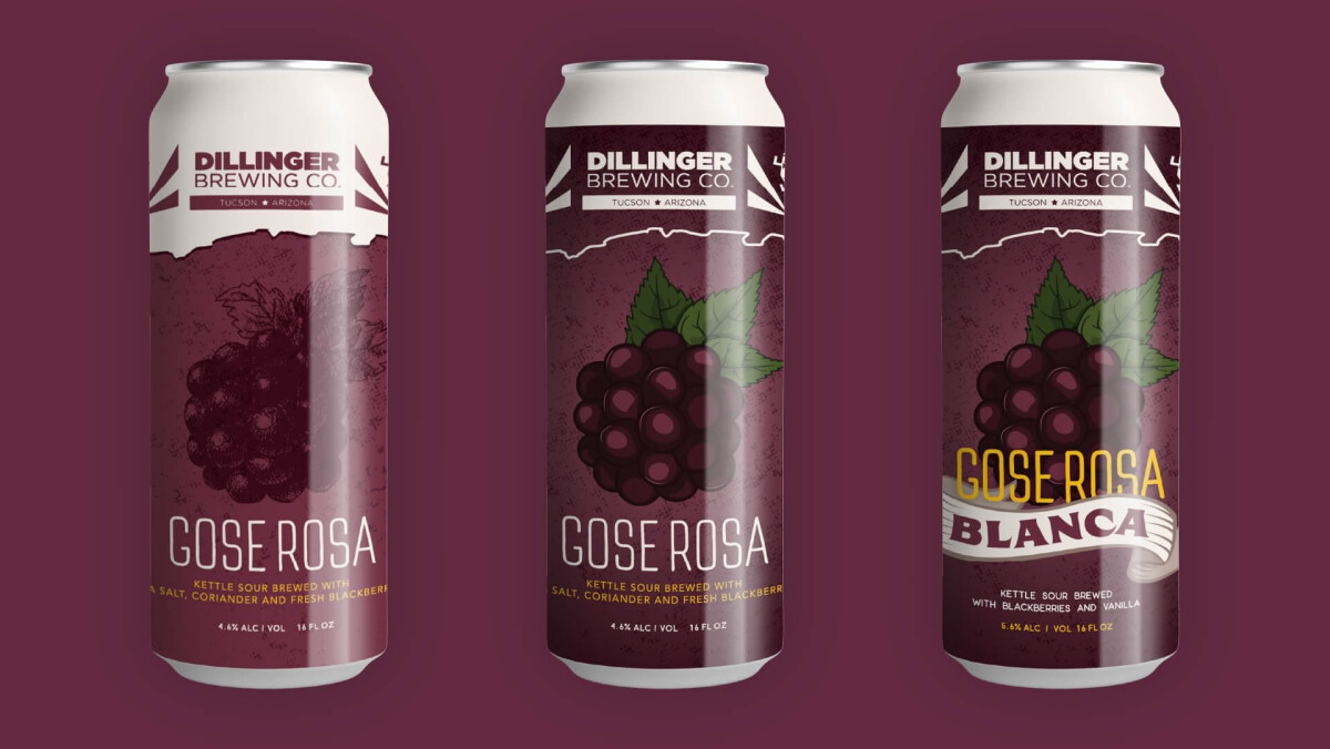
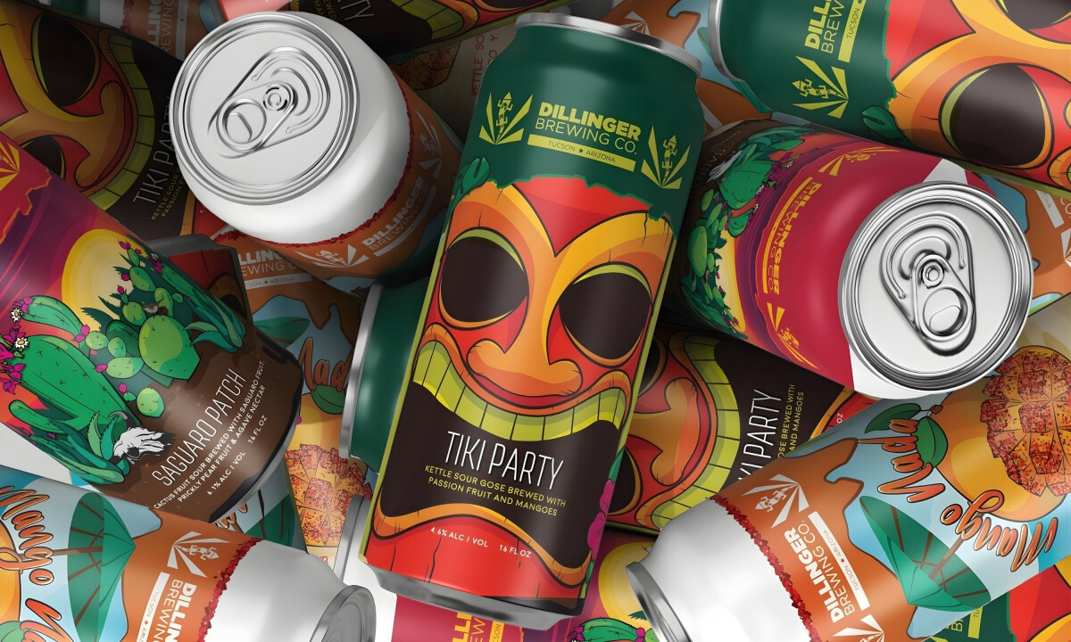
Standing out in the craft category requires fearless food and beverage packaging. Dillinger Brewing’s bold compositions, tropical motifs, and high-impact color palettes ensure instant shelf presence and memorability.

Ready to elevate your designs?