Packaging Designed by
Studio Marie Marie Studio Marie Marie

Father Carpenter

Father Carpenter Coffee Packaging Design
Father Carpenter’s packaging balances craft and character, translating Berlin’s specialty coffee culture into a tactile, approachable system. Through elegant typography and playful illustrations, the design captures both quality and warmth — positioning the brand as refined yet unmistakably human.
Father Carpenter Coffee Packaging Design
Elegant cup design highlights refined coffee identity
Father Carpenter Coffee Packaging Design
Bold serif typography creates strong shelf presence
This website uses a colour palette of 4 colours
  • #D5D3D2
  • #7AA5CC
  • #1D2C56
  • #1D4638
Technologies & Tools
Description
Team Behind the Design
  • Agency: Studio Marie Marie
  • Client: Father Carpenter
  • Category: Packaging Design — Coffee
  • Location: Berlin, Germany
  • Project Brief: Develop a bespoke coffee packaging system and refreshed identity that reflects Father Carpenter’s reputation for quality while maintaining its welcoming, neighborhood café spirit.

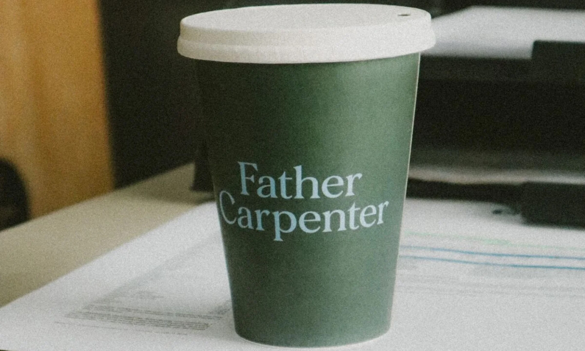
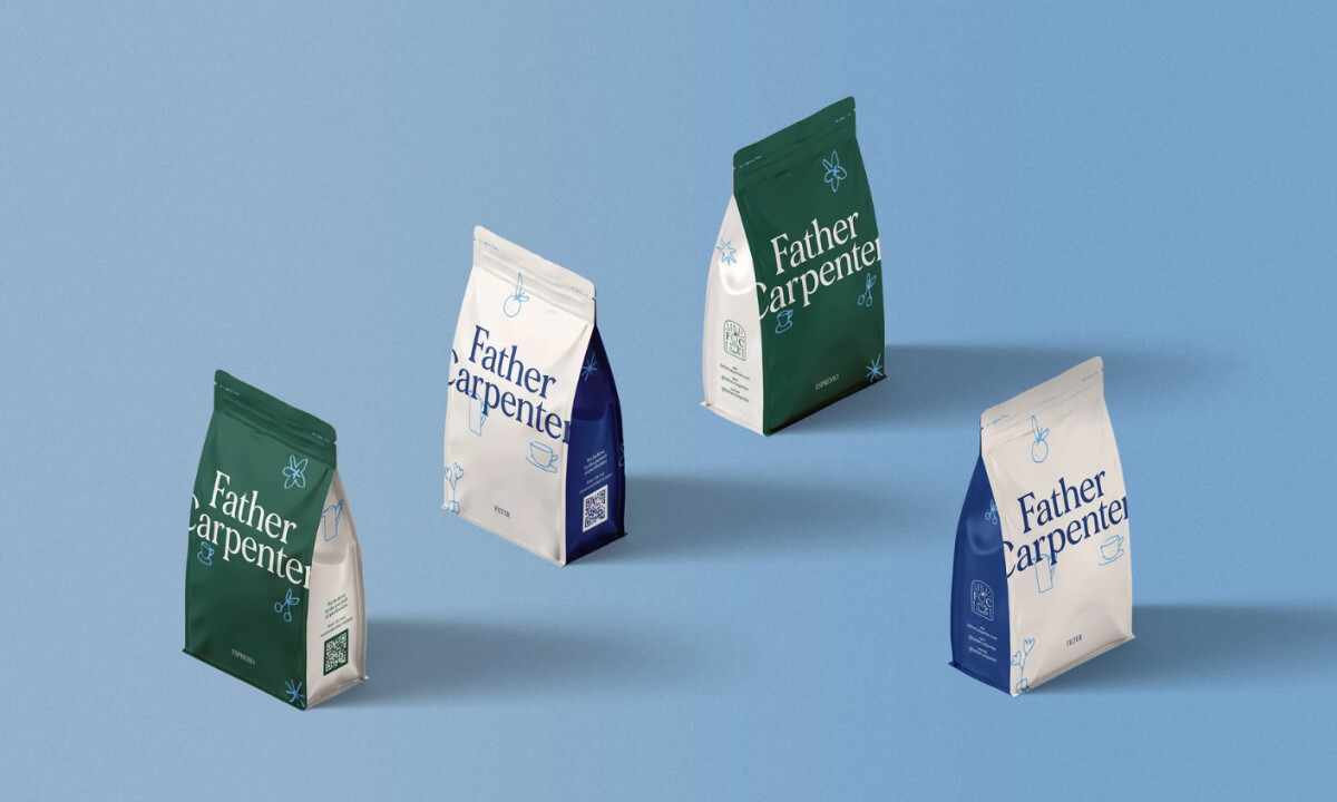
Coffee packaging designs succeed when restraint merges with personality. The typographic system in Father Carpenter's packaging design signals craftsmanship and premium quality, while its oversized application creates strong shelf presence and immediate recognizability. 

Ready to elevate your designs?