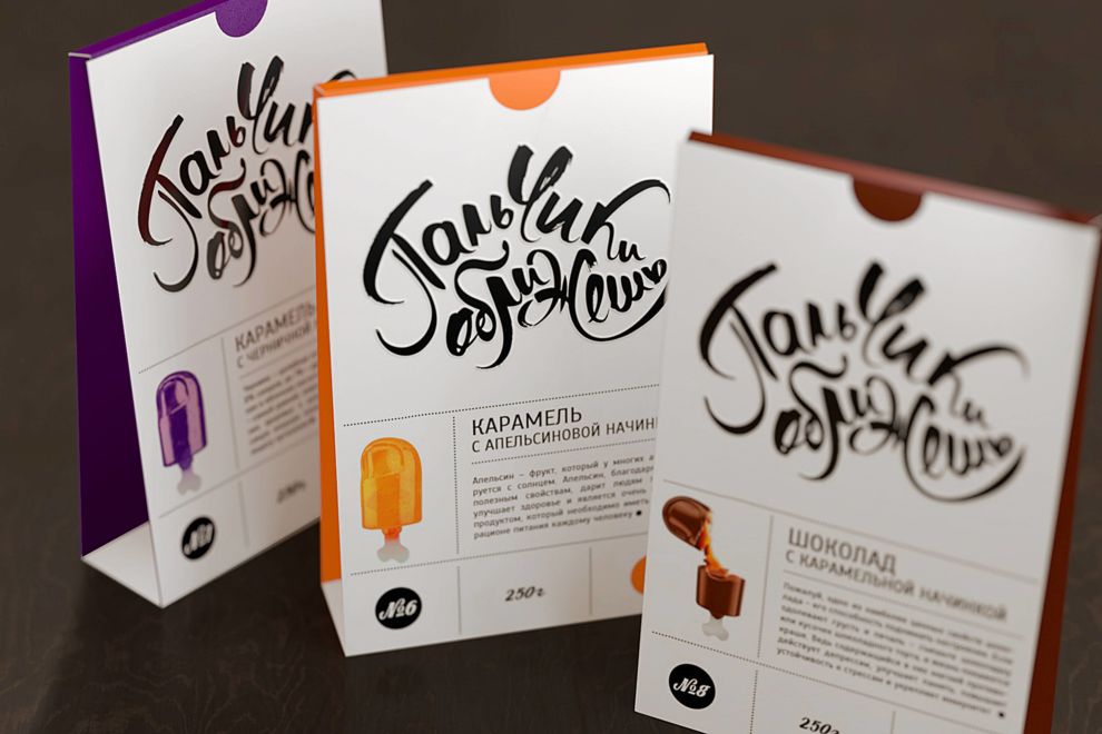
These finger-sized sweets couldn't have a better name, and come in neat, appealing, and fun packages that really users' your attention.

With black-on-white elements -- accentuated by colors on the side that differentiate the type of chocolate -- make the package smart and direct.

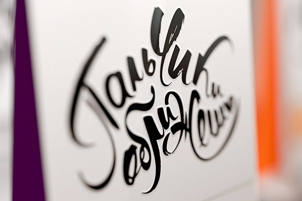
All of these elements combine with strong typography and iconography -- making eating these treats the only thing left to do!

A small yet important photo of the product is on the front of the packaging. This image repeats again on the back, but is broken apart to show the delightful filling. The back of the package also has a assortment of hand-drawn animal characters eating the "sweet-fingers."
The packing is very unique and unpretentious. The brand logo and name occupies most of the real estate, and acts as the main element in the front of the package, setting a whimsical mood for the whole design.
Finger Licking is an illustrated packaging design in the Food & Beverage industry.