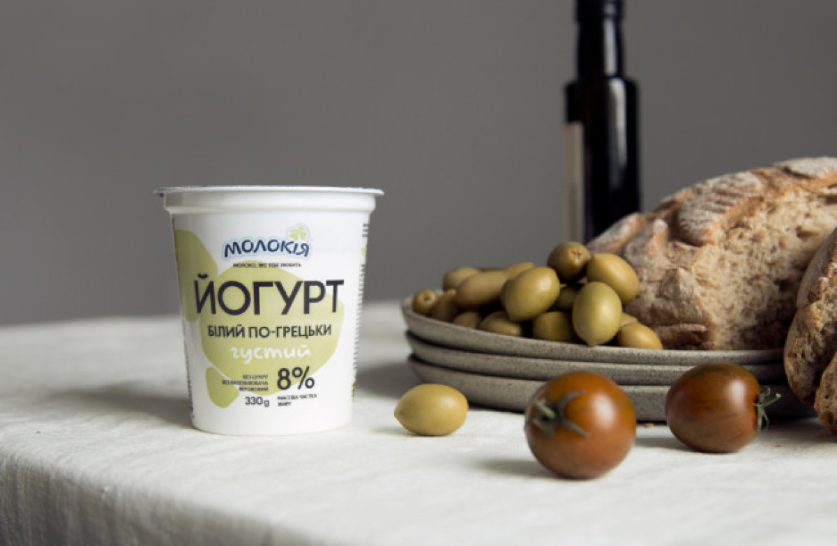
Standout Features:
- Minimalistic
- Blobby, relaxing illustrations
- A lovely mix of sans serif and cursive typography
Molokiya is one of the leaders in the Ukrainian dairy market, with over 20 years of providing healthy dairy products. Physical health is one thing, but the brand also wanted to show its awareness of the importance of mental health. Understanding that modern life is chaotic and fast, they asked Molto Bureau to help them create a packaging design for white yogurts without fillings.
The idea was to remind people that they should take their time to enjoy a healthy meal and slow down for a moment. The design brings it to life by omitting unnecessary elements that usually take place on a similar package.
This minimalistic design features a simple blobby illustration at the center of the cup. Above it, you'll find the relaxing Molokiya logo written in a custom font resembling a cursive-type style. You'll see the product name in sans-serif on the blobs below the logo. As sans serif is capitalized, the ratio is balanced by a cursive one-word description of the product variant.

-preview.jpg)


-preview.jpg)
-preview.jpg)
-preview.jpg)