Standout Features:
- Botanical illustrations with delicate linework
- Minimalist typography emphasizing brand name
- Eco-conscious, recyclable packaging materials
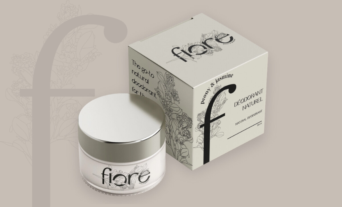
Fiore, a natural deodorant brand, merges botanical aesthetics with sustainable values in this refined packaging concept by Keelin Tassy. Positioned as “the go-to deodorant for the modern woman on the run,” the product strikes a balance between visual serenity and ecological responsibility.
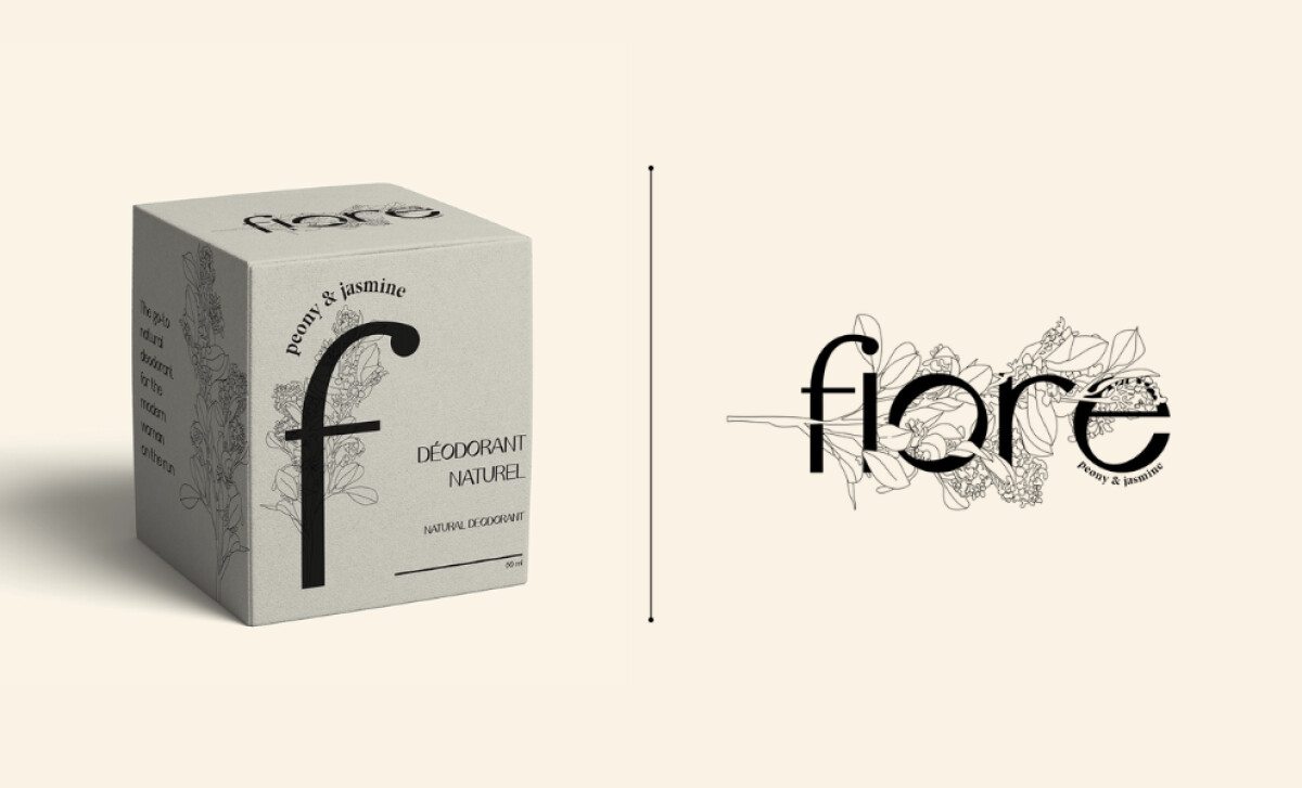
The packaging’s most striking element is its floral linework that wraps around the product’s typography. These elegant illustrations of peonies and jasmines visually reinforce the product’s fragrance profile and natural composition. They also add a handcrafted intimacy to the brand, inviting users to associate the deodorant with purity and care.
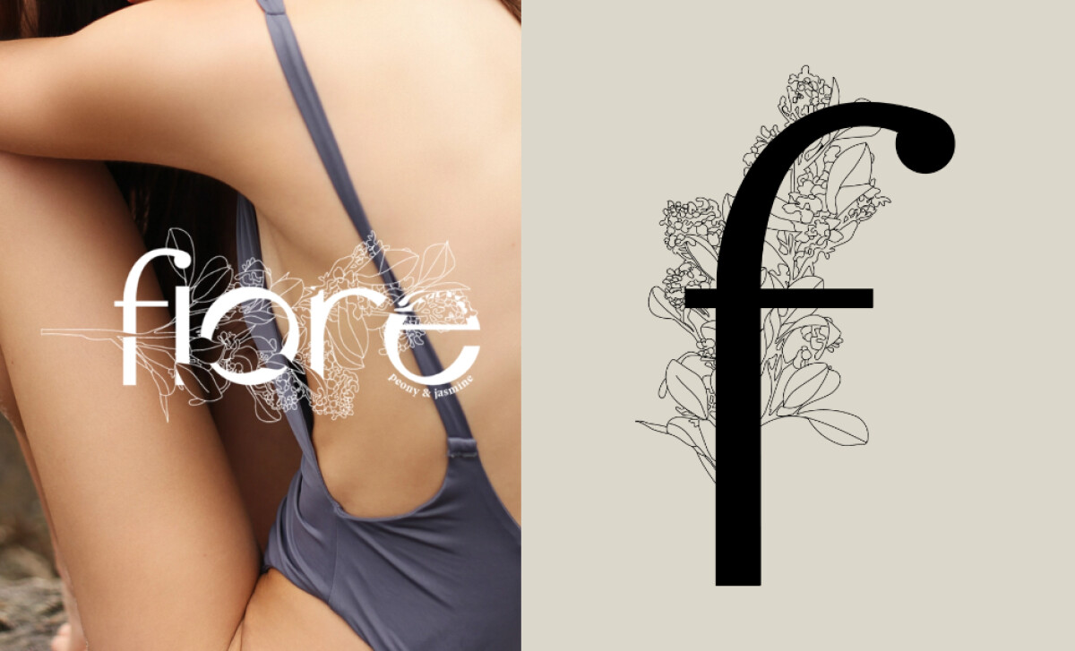
Fiore’s logotype utilizes a sleek, geometric sans-serif with elegant curves and soft joins, allowing the "f" to stand out dramatically. This simplicity draws focus directly to the brand name, ensuring memorability on shelves and health and wellness online stores. Paired with ample negative space, the design’s calm visual tone mirrors the calming properties of its botanical ingredients.
Keelin Tassy’s design goes beyond visual appeal with a commitment to sustainability. The paperboard box uses minimal ink and recyclable materials, which aligns with the eco-aware mindset of its audience. This choice lowers the product’s environmental footprint while making it lighter for shipping and aesthetically suited to modern, clean beauty trends.
Fiore’s packaging design is a case study in how elegance and ethics can intersect beautifully. Keelin Tassy proves that minimalist branding doesn’t have to be sterile, it can evoke calm, connection, and conscious living.


-preview.jpg)