- Article by
- Jermaine Dela Cruz

#C52084 #016295 #8550A0 #A4CA3F
- Agency: CityState
- Client: Aloha
- Category: Packaging Design — Health & Wellness
- Location: New York City, New York, United States
- Project Brief: Design packaging that enhances shelf appeal and brand recognition while supporting retail expansion.
A health and wellness packaging system for a brand moving into retail must command attention in a saturated market.
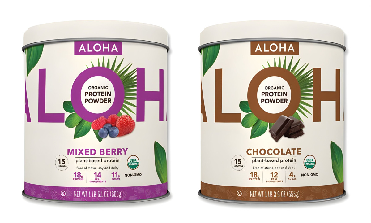
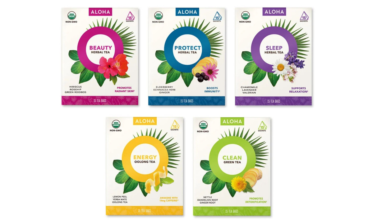
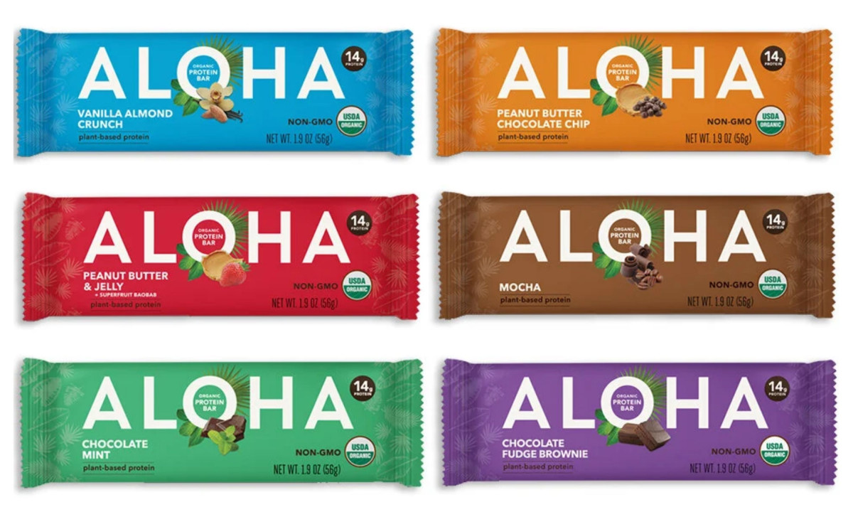
Aloha built its audience online. Moving to retail shelves meant the packaging had to do what the website used to: explain the brand, differentiate the flavors, and earn trust in about three seconds. CityState designed a system that works across protein powder tubs, protein bars, and herbal tea boxes without looking like three different brands.
The visual identity logic fuses Hawaiian roots with sharp, modern minimalism. Botanical illustrations set against sterile backgrounds allow the design to signal both organic purity and professional-grade nutrition simultaneously.
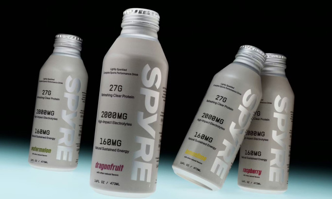
A strategic color palette guides the consumer. Assigned saturated hues for each flavor profile ensure the product range is easily distinguishable from a distance in a crowded retail aisle.
Typography prioritizes immediate legibility and brand recognition. Bold, rounded letterforms evoke a sense of friendliness and "aloha" spirit, while the structured layout of nutritional benefits provides the transparency retail shoppers demand.
Structural decisions prioritize a seamless transition to national storefronts. This cohesive system safeguards the brand's heritage while expanding its visual influence to resonate with a broader demographic.
Discover more from CityState LLC

Coda Signature
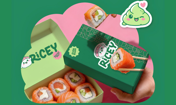
Ricey
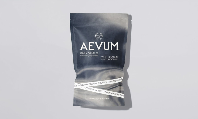
AEVUM
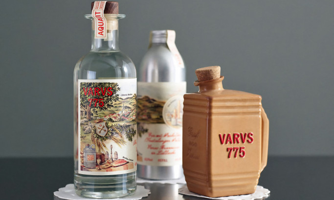
Varus 775
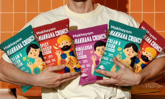
Makhyam Crunch
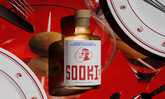
Sooki
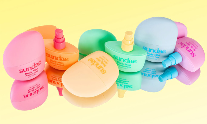
Sundae Body Mist