Food Lion Packaging Design
Food Lion’s packaging redesign brings consistency and clarity to its private label products through a cohesive visual system. Vibrant food imagery, clear labeling, and structured layouts create a unified look while making products easier to identify across categories.
Unified packaging system across diverse grocery products
Coast-inspired coffee packaging increases shelf presence
This website uses a colour palette of 4 colours
  • #E7EAE8
  • #D22729
  • #859848
  • #163B26
Technologies & Tools
Description
Team Behind the Design
  • Agency: The Jordan Studio
  • Client: Food Lion
  • Category: Packaging Design - Food & Beverage
  • Location: Salisbury, North Carolina, United States
  • Project Brief: To develop a packaging design that strengthens brand consistency and enhances shelf appeal by aligning private label products with Food Lion’s in-store experience.

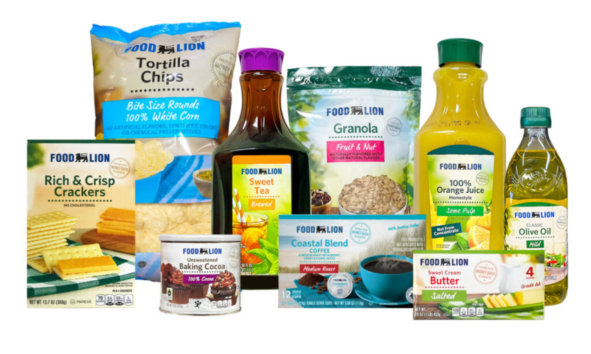
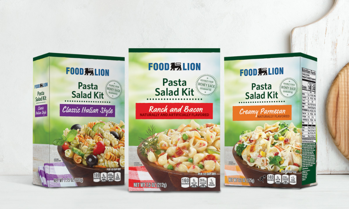
Food and beverage packaging at scale requires a system that holds together across many SKUs. Food Lionuses consistent branding, color differentiation, and clear hierarchy to keep the range organized and recognizable.

Ready to elevate your designs?