- Article by
- Jermaine Dela Cruz

#7F3D3F #F5B3B4 #009F49 #E7F6E1
- Agency: Motyw
- Client: Fooshi
- Category: Packaging Design — Beverage
- Location: Warsaw, Poland
- Project Brief: Create beverage packaging that strengthens brand recognition and communicates a fresh, modern identity.
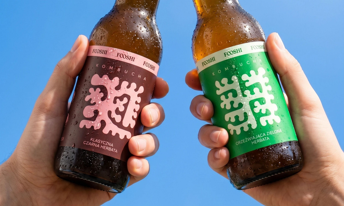
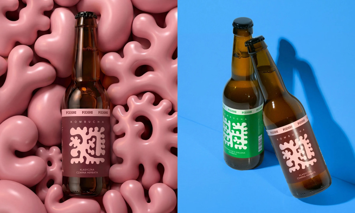
Good beverage packaging earns shelf space by making the product feel like it belongs to a specific world. Fooshi's kombucha label does that by building its identity around a single organic form that mirrors the fermentation culture inside the bottle.
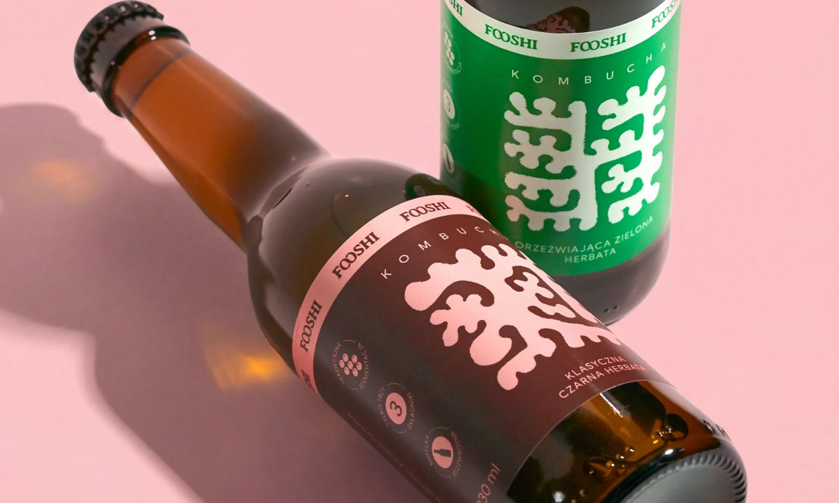
The biomorphic shape doubles as a brand mark. It is abstract enough to be distinctive and biological enough to feel honest about what kombucha actually is.
The label system keeps its structure consistent across flavors and lets color do the differentiation. Pink for classic black tea, green for green tea. Each reads as a different variant without the label changing anything else.
"FOOSHI" repeats three times across the label band in a tight horizontal lockup. That turns the brand name into a pattern rather than a logo, which is a small typographic decision with a big effect on shelf presence.
The amber glass bottle does quiet work throughout. It gives the label a warm tonal base that makes the pink and green colorways read as saturated without tipping into synthetic, keeping the overall feel grounded in something natural.
Moctezuma

Fooshi
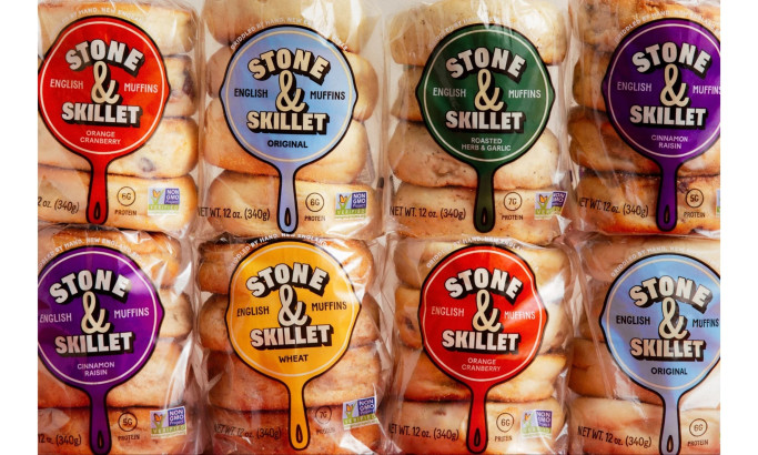
Stone & Skillet
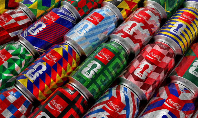
Coca-Cola FIFA World Cup 26 Collectible Country Cans
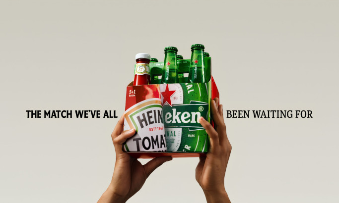
HEINZ x Heineken® Limited Edition Six-Pack

Coors Light Tallerboy
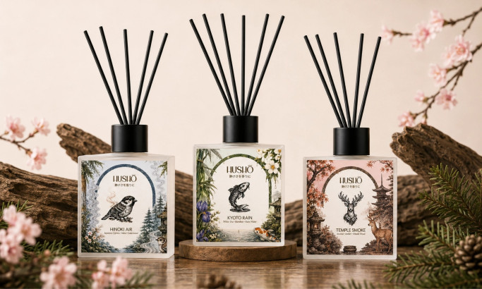
Hushō

Mật Mã Gift Set
