- Agency: Oveja & Remi Studio
- Client: Fortín Rum
- Category: Packaging Design — Bottle Label
- Location: Colorado, United States
- Project Brief: Design rum packaging that enhances shelf appeal and brand storytelling through distinctive visuals and premium detailing.
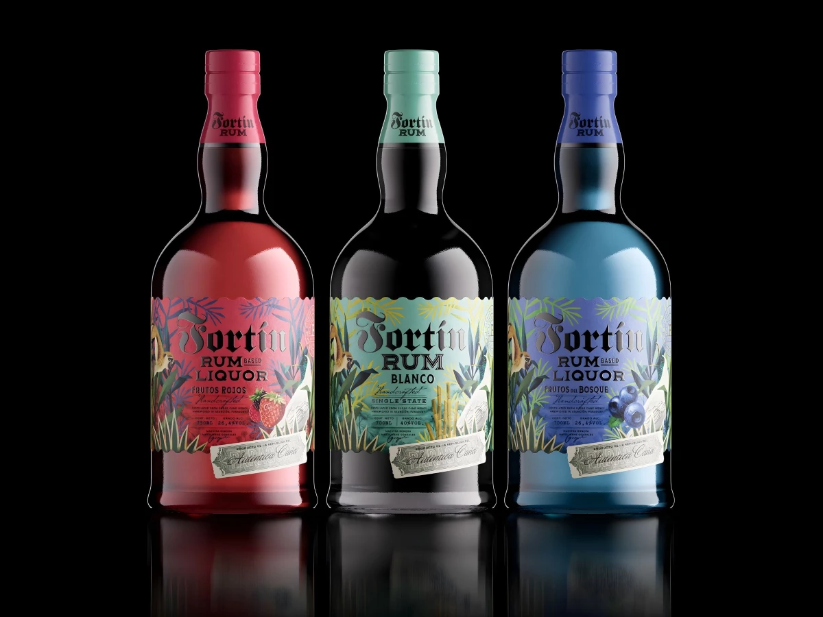
This bottle packaging design project functions as a visual bridge between Paraguayan warrior heritage and the vibrancy of modern spirits. Fortín Rum honors the historic grounds of Piribebuy by transforming a legacy of courage into a high-end celebratory experience.
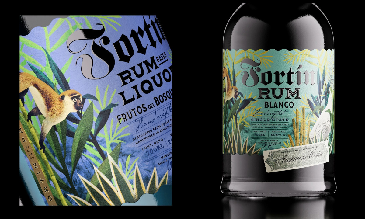
The illustrative composition captures the spirit of the Piribebuy cane fields. It blends dense, vibrant jungle foliage with meticulously detailed depictions of local fauna like monkeys and tropical birds, creating a multi-layered narrative that feels as deep and complex as the rum's own heritage.
Tactile production details ground the brand in historical authenticity. The label utilizes high-texture stocks, scalloped die-cut edges, and an integrated "stamp" seal to evoke the feeling of a rediscovered artifact from a storied land.
The graphic framework establishes a striking contrast between raw nature and structured heritage. Bold blackletter typography anchors the fluid, colorful botanical backgrounds to communicate a sense of historical authority. This tension allows the bottle to command attention on a premium shelf while telling a story of survival and celebration.