Standout Features:
- Simple, precise typography as a core design element
- Monochrome minimalism with high-touch material details
- Editorial-inspired sample kit with poetic, experiential messaging
Frau Tonis Parfum, a high-end perfume atelier from Berlin, emphasizes bespoke scents and minimalist storytelling. Its packaging and visual identity, created by Contacto Studio, adhere to this philosophy. The design is deliberate, elevated, and understated, ensuring the focus remains on the fragrance.
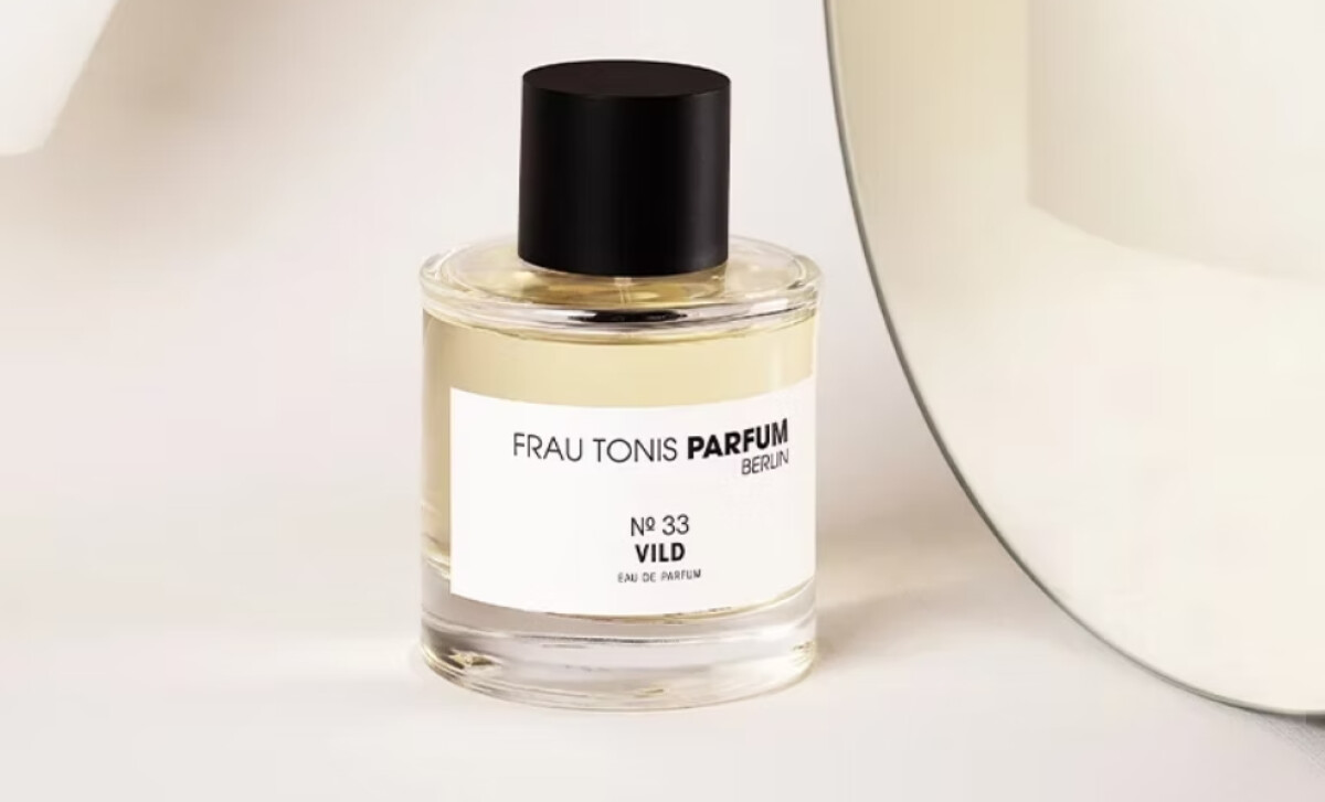
Refined typography is central to Frau Tonis’ branding across all elements. The brand name, in an uppercase sans-serif with selective bolding on “PARFUM,” creates subtle rhythm. Supporting text uses all caps or thin serifs in deep black. This modernist restraint with editorial poise makes typography the brand’s primary expression.
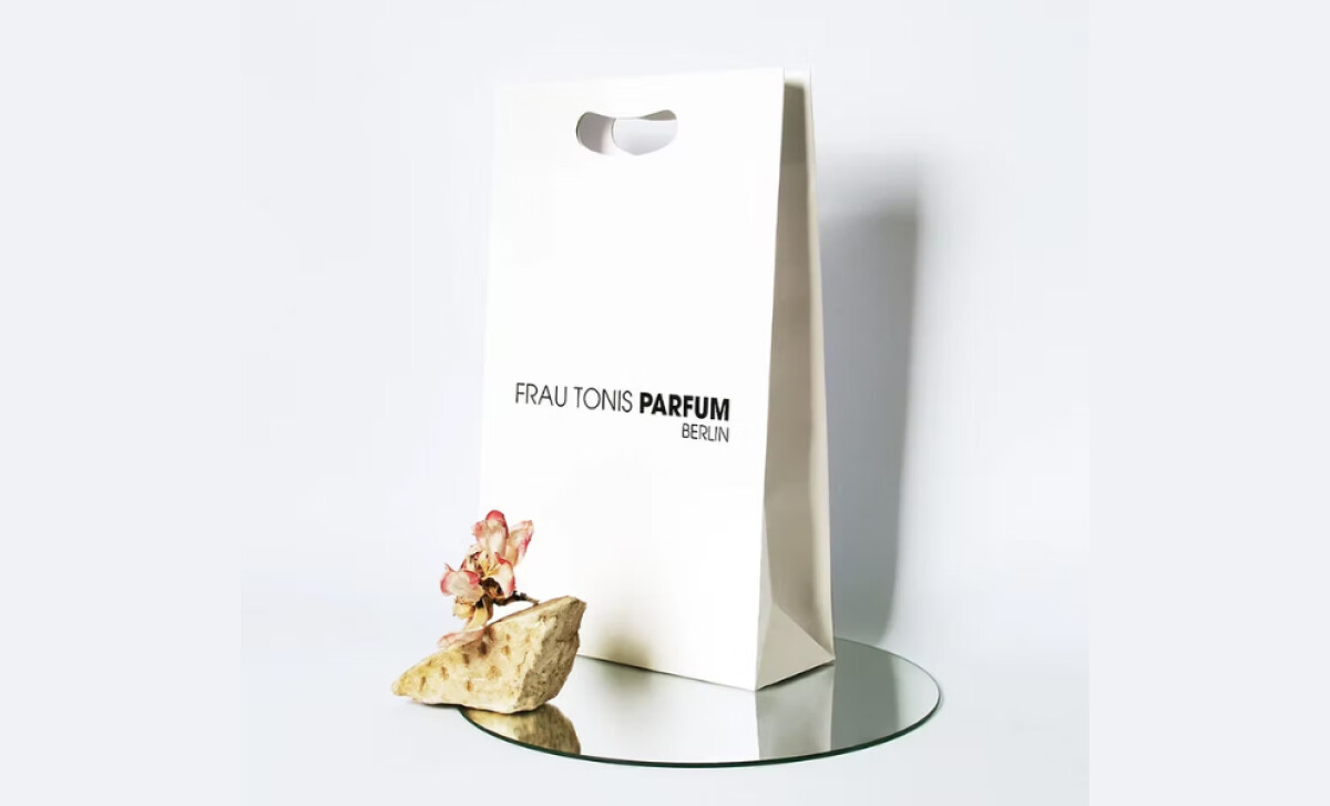
The luxury packaging design adheres to a strict black-and-white color scheme, with the perfume’s own color providing occasional warmth. Bottles are clear glass with black caps; boxes are white with sharp black type. This minimalist approach ensures the fragrance itself, rather than overbearing branding, remains the focus.
This aligns with findings from a 2024 Georgia Southern University study, which indicates that for personal care, simpler packaging can foster an upscale image and suggest higher product quality.
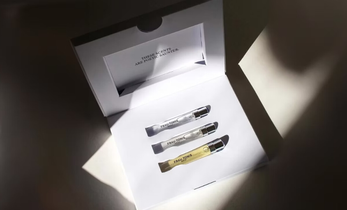
The perfume sample set is thoughtfully designed. It arrives in a clean white box with a stark interior where three vials are meticulously arranged. A small card includes the evocative phrase: “These scents are poetic saunter.” This reframes sampling as a refined, artistic offering, setting a tone of exclusivity.
The design for Frau Tonis Parfum underscores that a timeless visual system, built on minimalist principles and typographic sophistication, can effectively communicate individualized luxury. For brands aiming to appeal to a design-literate audience, this approach fosters a sense of enduring quality and considered craftsmanship.


