Standout Features:
- Nostalgic, old motor oil package aesthetics
- Powerful, extra bold typography
- Retro, blue and red colors
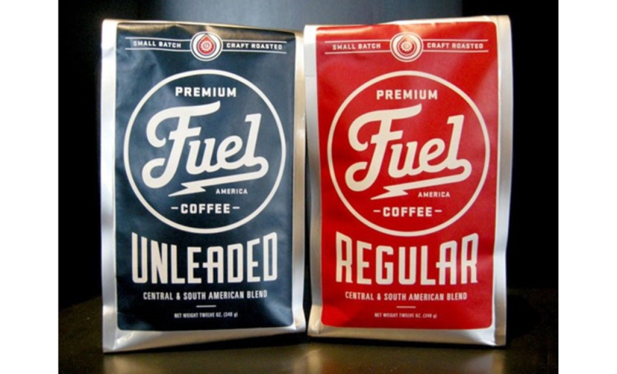
Fuel Coffee’s packaging design is a bold tribute to American grit and vintage charm. Drawing inspiration from the nostalgic aesthetics of old motor oil packages, the design captures a rugged, industrial vibe reminiscent of classic Americana.
At the heart of the design lies powerful, extra bold typography. Each letter is crafted to command attention, delivering a strong, unapologetic statement that mirrors the robust nature of the coffee inside. The striking lightning bolt element beneath the brand name adds an extra jolt of energy, symbolizing the spark that fuels your day.
Enhancing the overall impact is a retro color palette dominated by vivid blues and reds. These colors pay homage to mid-century design and create a dynamic contrast that makes the package stand out on any shelf.
Roasted in small batches, Fuel Coffee’s packaging doesn’t just promise a quality brew — it tells a story of craftsmanship, energy, and an enduring American spirit, delivering both nostalgia and a powerful kick-start to your day.