Mojoes Drinks Packaging Design by Phelps Design Studio
Mojoes Drinks packaging blends vintage-inspired typography with rich textures and warm tones to create a distinctive, premium presence. The cohesive system extends from cups to retail boxes, building a recognizable brand experience across touchpoints. Thoughtful detailing and bold identity cues help the product stand out while reinforcing its confident, crafted personality.
Consistent packaging system unifies retail and takeaway touchpoints
Premium typography and textured finishes enhance perceived quality
This website uses a colour palette of 4 colours
  • #B58A53
  • #DBC7AE
  • #A49688
  • #333332
Technologies & Tools
Description
Team Behind the Design
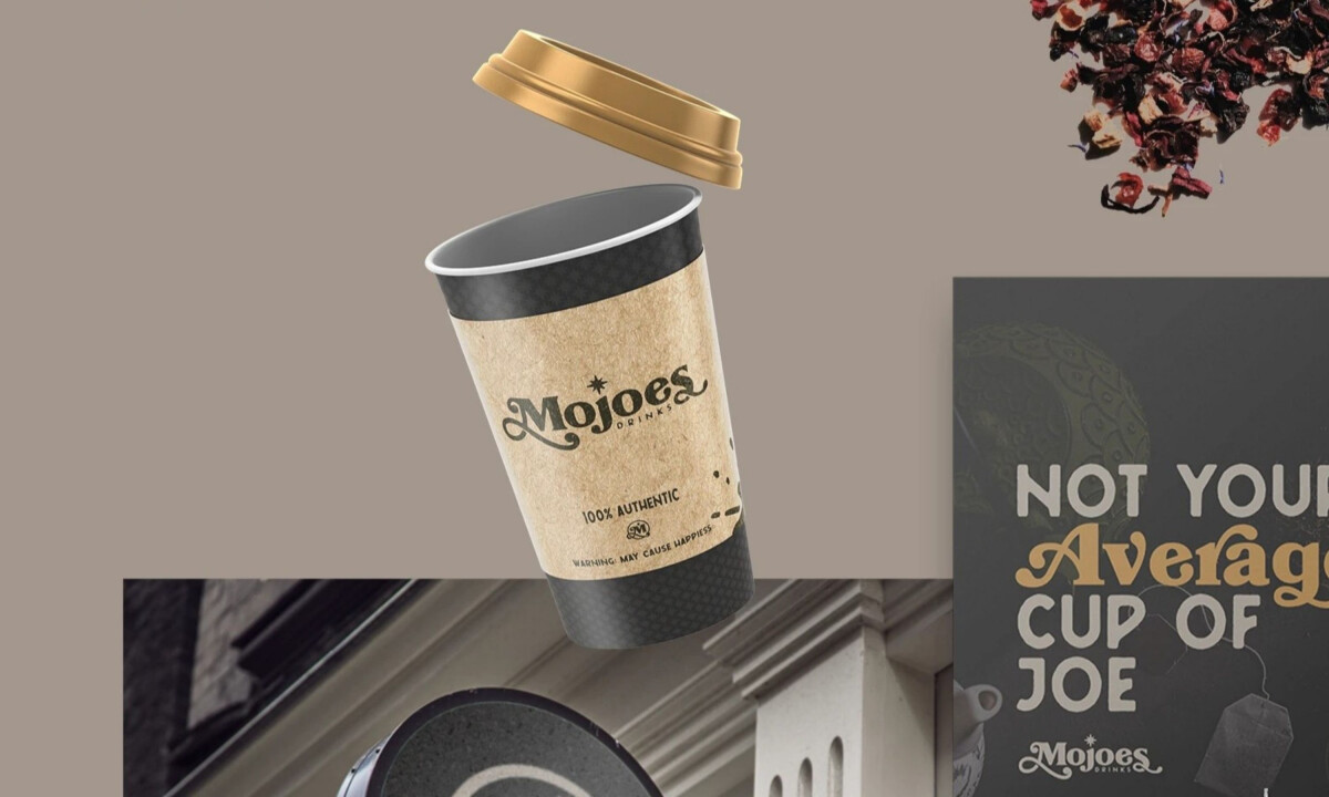
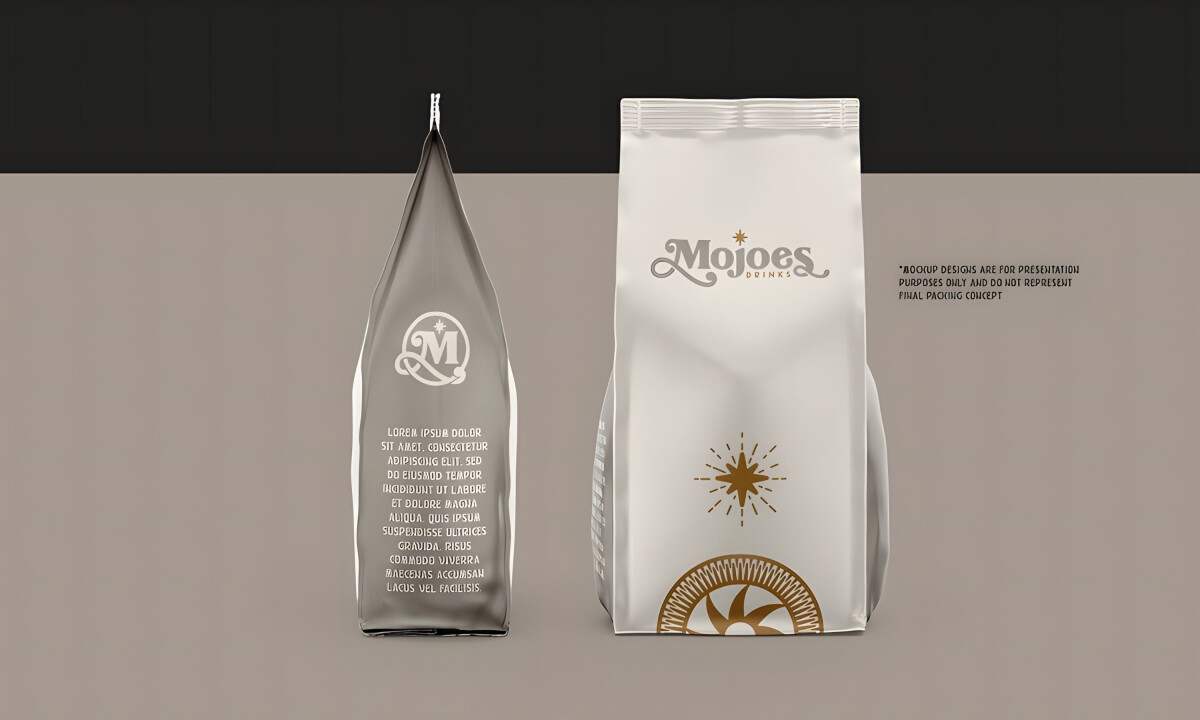
  • Agency: Phelps Design Studio
  • Client: Mojoes Drinks
  • Category: Packaging Design — Food and Beverage
  • Location: Memphis, Tennessee, United States
  • Project Focus: Develop a cohesive beverage packaging system that builds strong shelf presence while unifying logo design, product identity, and packaging execution into a complete brand experience.

Effective beverage packaging communicates personality at first glance. Mojoes Drinks embraces vibrant graphics and cohesive brand storytelling to deliver a memorable shelf presence that feels confident, modern, and unmistakably unique.

Ready to elevate your designs?