Standout Features:
- Colorful patterns
- Framed and overlaid text
- Simple and uniform typography
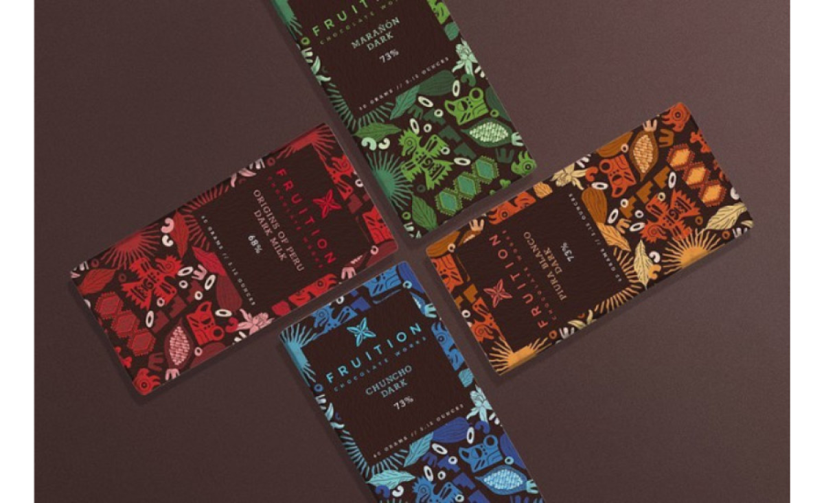
Fruition Chocolate Works rolled into summer with two new flavors and a variant made for Pride Month. Fresh drops are an excellent opportunity to get creative with packaging, and that’s precisely what Gudulab did for this stunning project.
The designers wrapped the chocolate bars in vibrant blues, greens, yellows, and pinks for that perfect summertime vibe.
The brand’s artisan quality and craftsmanship are seen beautifully through hand-drawn visuals of the cacao tree. It envelops the whole thing from front to back, almost like an art piece on its own.
It’s one of those maximalist designs done right!
The framed text block balances the whole ensemble. It contains the brand name, product descriptions, and essential details such as the cacao content. A single sans serif font is the icing on the cake, keeping everything clean and simple.


-preview.jpg)