Standout Features:
- Vibrant gradient color scheme
- Minimalist, clean typography
- High-impact product placement
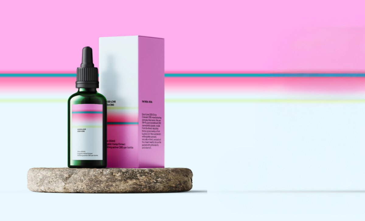
Good Love CBD’s packaging, designed by George Bangs Studio LLC, stands out in the competitive health and wellness market. The design integrates bold, vibrant colors and minimalist typography, offering a fresh, premium look. This innovative approach makes it instantly recognizable and appealing to its target audience.
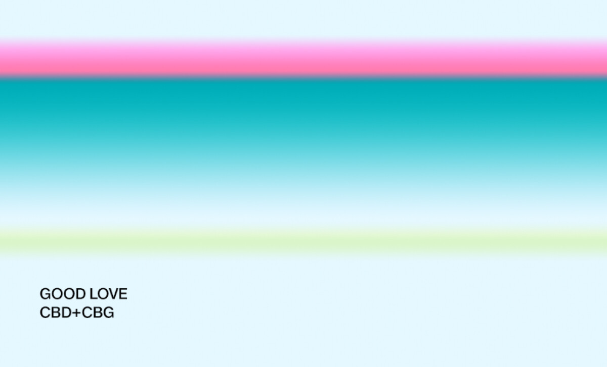
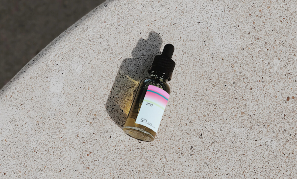
The packaging’s vibrant gradient, from pink to teal to green, creates a dynamic and refreshing look. This fluid color transition not only captures attention but also evokes feelings of calm and wellness, perfectly aligning with the product’s purpose.
The typography is simple, modern, and legible. With clean sans-serif fonts and ample white space, the design avoids clutter while enhancing readability. This minimalist approach boosts the brand’s image as clear, trustworthy, and approachable.
Strategic product placement in the images, such as the bottle on a stone pedestal, elevates the design. This simple yet effective choice highlights the product's vibrant packaging while conveying a sense of sophistication and purity.
Good Love CBD’s packaging design is a modern, visually captivating example of wellness branding. Its use of color, typography, and strategic placement sets it apart in a crowded market. For brands aiming for standout designs, understanding the best packaging design principles is essential to elevating their products.
-preview.jpg)
-preview.jpg)