- Agency: Wats
- Client: Immortal
- Category: Packaging Design — Wellness
- Location: Eugene
- Project Brief: Create a cohesive packaging system for a mushroom-centered product line that communicates potency, transparency, and holistic wellness while appealing to lifestyle-driven, sustainability-conscious consumers.
In terms of wellness packaging, many brands attempt to over-explain its benefits through dense text and literal imagery, yet Wats adopts a more confident, minimalist perspective.
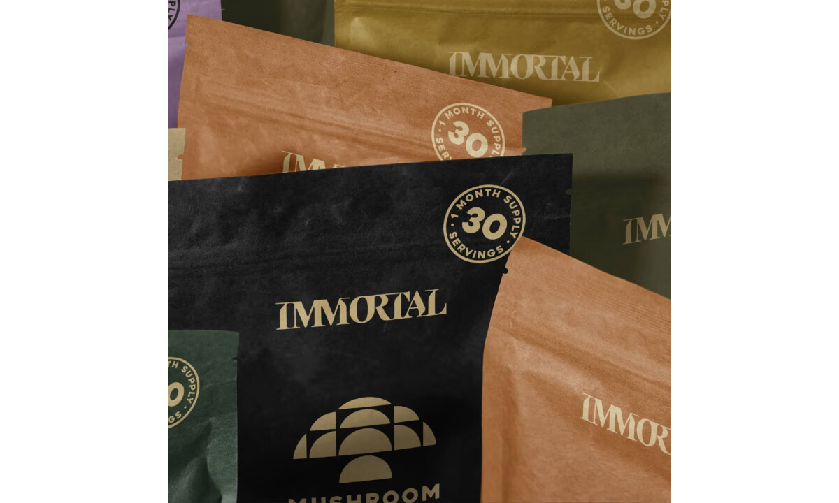
Immortal's packaging design succeeds by stripping away the noise, using structural typography and earthy textures to position the brand as a sophisticated, long-term wellness practice.
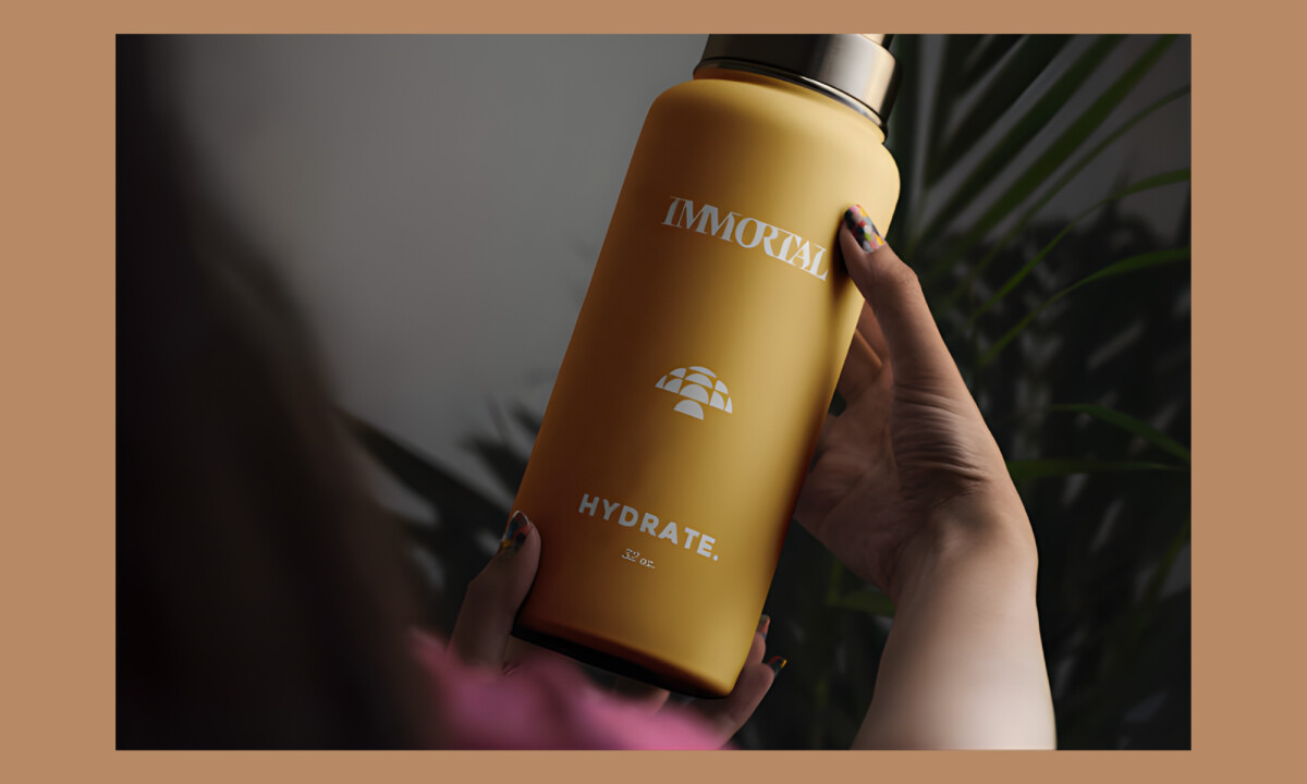
- Materiality & Tactile Presence: Matte finishes and earthy substrates reinforce a connection to nature. I find this material-forward approach effective in signaling product integrity and an artisanal apothecary feel.
- Typography & Visual Restraint: Minimal typography and quiet hierarchy allow functional benefits to surface without noise. I believe this restraint positions the brand as a considered wellness ritual rather than a high-energy product.
- Color & Emotional Tone: Muted palettes of charcoal and soft neutrals evoke forest environments without literal imagery. This choice successfully communicates longevity and grounds the brand in a "slow wellness" philosophy.
- Storytelling & Ritual: Understated symbolism and repetition suggest a daily practice rather than aggressive marketing. I appreciate how this invites intentional engagement, reinforcing long-term wellness over quick fixes.
What Brands & Agencies Can Learn from Immortal
1. Let Materials Signal Trust and Origin
Natural finishes and tactile substrates immediately communicate authenticity and sustainability. Material choices can reinforce ingredient integrity without relying on explanatory graphics.
2. Use Typographic Restraint to Balance Science and Lifestyle
Utilitarian, confident type builds credibility while remaining culturally relevant. Clear typography helps wellness products feel trustworthy without becoming clinical.
3. Build Cohesion Through System Logic, Not Visual Noise
Consistent labeling structures and color logic unify diverse products into a clear family. Strong systems allow brands to scale while maintaining transparency and long-term relevance.