
Standout Features:
- Nature-inspired illustrations
- Earthy and organic color palette
- Minimalist, modern typography
With a strong heritage in organic farming, Gram Slot needed a packaging design that would reflect its values of authenticity, sustainability, and high quality. Inno Reklamebureau delivered a solution that merges rustic illustrations with clean, modern typography, ensuring a premium yet approachable brand presence.
A defining element of the design is the nature-inspired illustrations, which depict fields of grain and wildflowers. These delicate, hand-drawn visuals reinforce the brand’s connection to organic farming, creating an immediate association with fresh, natural ingredients. The soft, sketched style adds an artisanal touch, making the products feel both high-end and crafted with care.
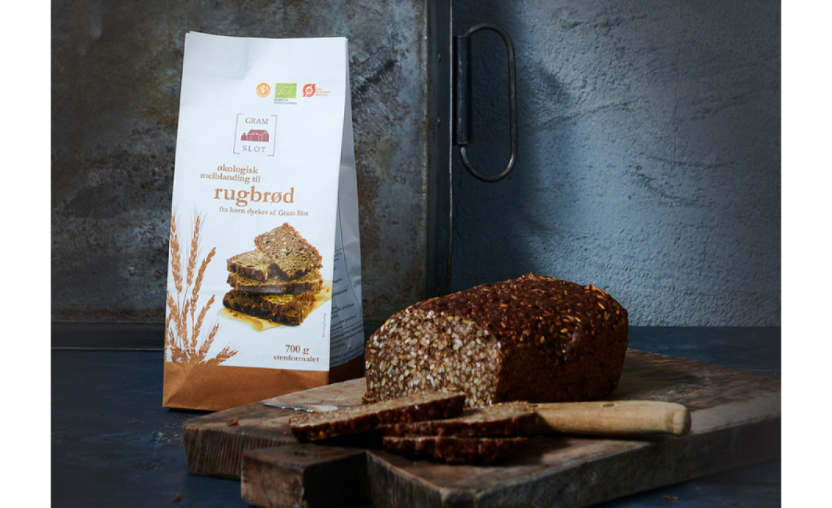
The color palette enhances this organic feel, using muted tones of brown, deep green, and soft blue. These reflect the natural ingredients used in Gram Slot’s food and beverage products while also creating a warm, inviting aesthetic. The color coding across different product categories ensures clear differentiation while maintaining a cohesive brand identity.
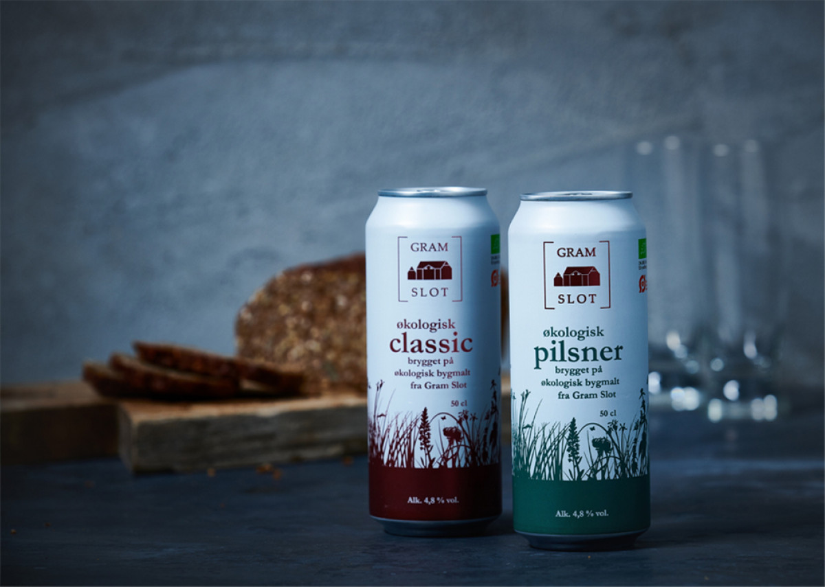
Complementing these elements, the minimalist typography keeps the packaging modern and easy to read. The clean serif font for the product names alongside the sans-serif brand name strikes a balance between tradition and contemporary design, making it suitable for both heritage-driven and eco-conscious consumers.
Through its thoughtful combination of rustic visuals and modern branding, Gram Slot’s food and beverage packaging design successfully communicates its commitment to organic quality and sustainability. Inno Reklamebureau’s design approach ensures the brand remains both visually appealing and deeply connected to its Danish farming roots.


-preview.jpg)