Standout Features:
- Vibrant colors that correspond with its natural ingredients
- Modern type
- Fruit icons reinforcing its natural benefits
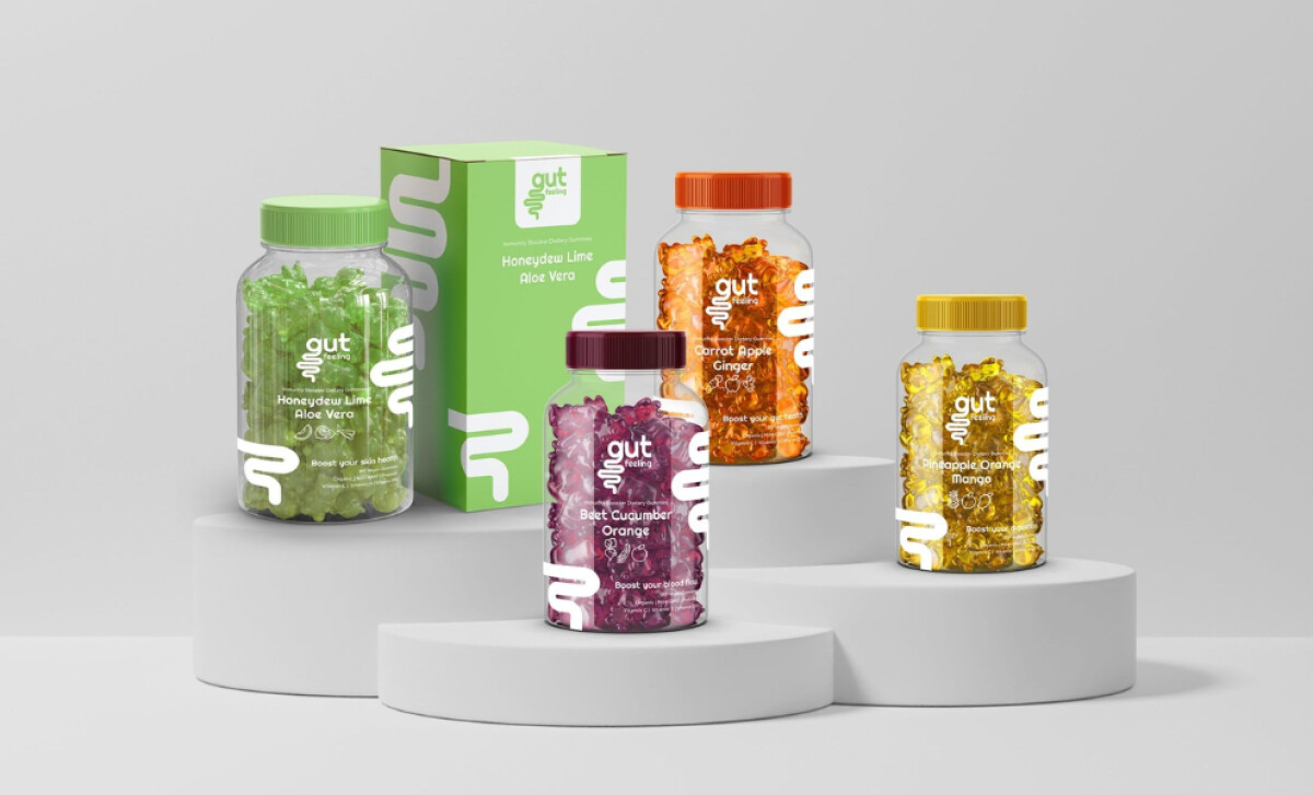
Many people seek enjoyable ways to support their digestive health. Gut Feeling, a probiotics company, answers this with vitamin-boosting gummies made from organic, vegan ingredients. Their packaging, created by TNT Graphic Design, vibrantly communicates these benefits from the first look.
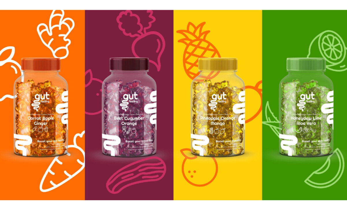
Each Gut Feeling gummy flavor bursts onto the scene with packaging in a bold color that mirrors its main ingredients. For instance, you'll find "Pineapple Orange Mango" in a bright, sunny yellow, while "Beet Cucumber Orange" uses a rich purple. These are directly linked to the natural, fresh qualities of the fruits and vegetables inside the gummies.
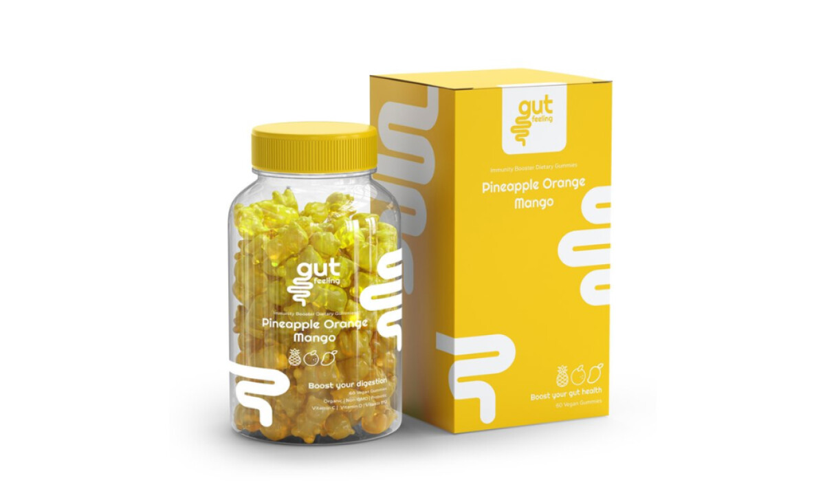
The typography is clean, contemporary, and very easy to read. The brand name "Gut Feeling" stands out in a bold sans-serif font, making it memorable. Supporting text, like "Boost your digestion," is presented in a simpler, clean font that complements the main branding. This ensures key health messages are quickly understood by busy shoppers.
You'll also spot subtle yet effective graphic elements on each label. These include charming line drawings of fruits and vegetables, such as pineapples or beets, corresponding to each flavor. These icons reinforce the product's natural ingredients and health benefits, while also adding a touch of organic appeal and visual interest.
Gut Feeling’s packaging successfully delivers on making health support enjoyable and attractive, just as the brand intends for its organic gummies. Its vibrant design and clear messaging by TNT Graphic Design turn a supplement into an appealing choice. This shows how health & wellness packaging can make healthy options feel inviting and accessible.