Standout Features:
- Emerald green marbled texture
- Clean typographic hierarchy with hexagonal seals
- Tiered color system with luxury gold foil finishes
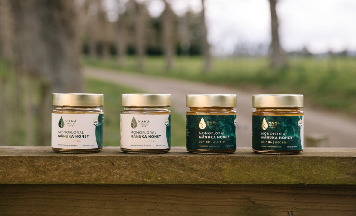
Jess Wilson Design crafted the packaging for Hana Manuka Honey, a brand whose identity is deeply tied to its pure, potent New Zealand origins. The design communicates this through a sophisticated and calm visual system. It turns each jar into an object of desire, reflecting premium quality and natural integrity.
A rich emerald green marbled pattern serves as the main graphic element. Applied to the labels and packaging, its organic, stone-like texture provides a unique and ownable visual identity. It feels simultaneously luxurious and earthy, elevating the product and connecting consumers to its pristine origins.
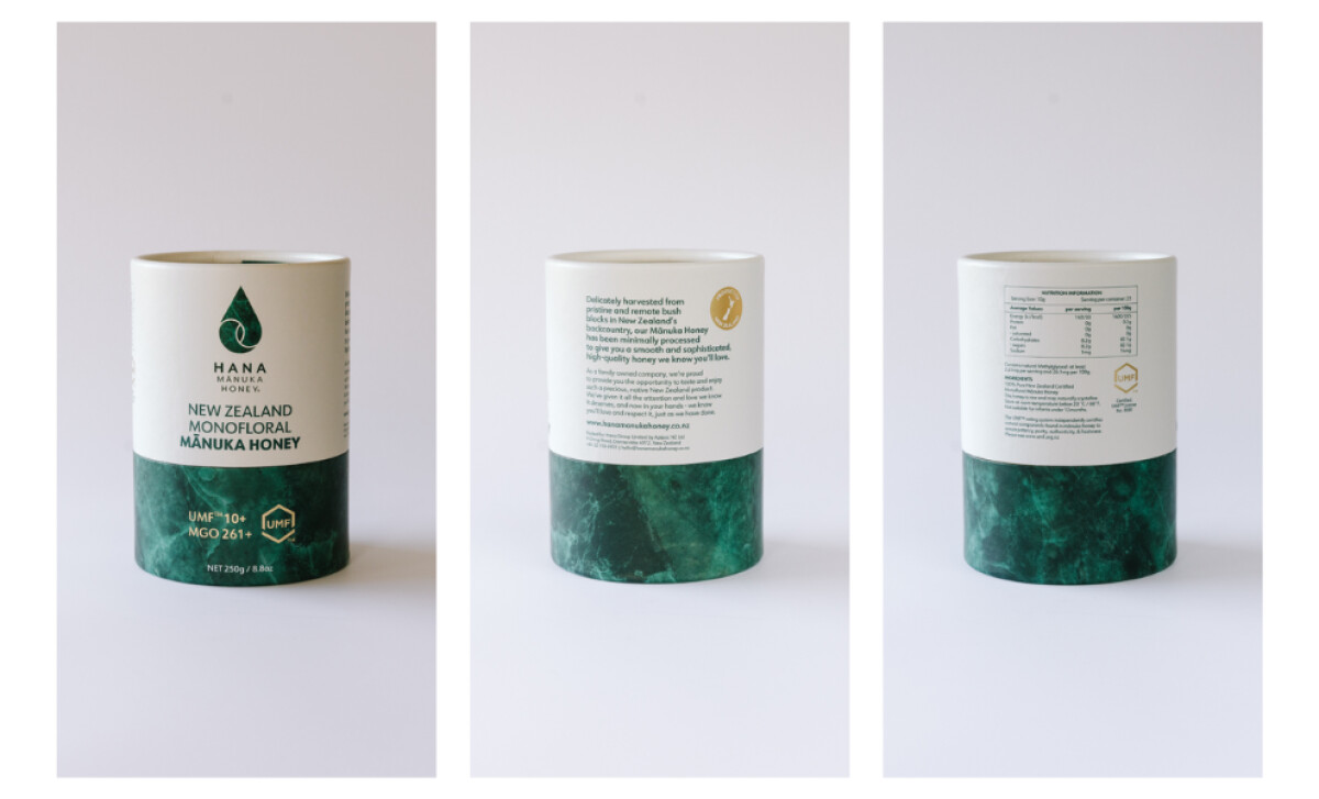
The typography is well-ordered, allowing consumers to easily navigate product features and grades. A modern sans-serif and a clear hierarchy are used, with Manuka honey metrics featured prominently in hexagonal seals. This clarity is crucial for a product with a tiered system of potency and price, reinforcing its quality promise.
This emphasis on clear, upfront information is a key driver of consumer trust; indeed, reports show that 89% of shoppers feel nutrition facts are important when deciding what to buy.
Product differentiation is achieved with a tiered color system. A clean, cream-white background is for the standard offering, and a deep, dark teal for higher-potency versions. This color-coding, combined with reflective gold foil on the lids and seals, is a classic visual shorthand for premium quality in the wellness market.
Hana Manuka Honey’s seamless blend of natural aesthetics with clinical clarity reinforces the product's integrity, offering a compelling model for other premium food and beverage brands.