Team Behind the Design
Packaging Design Analysis

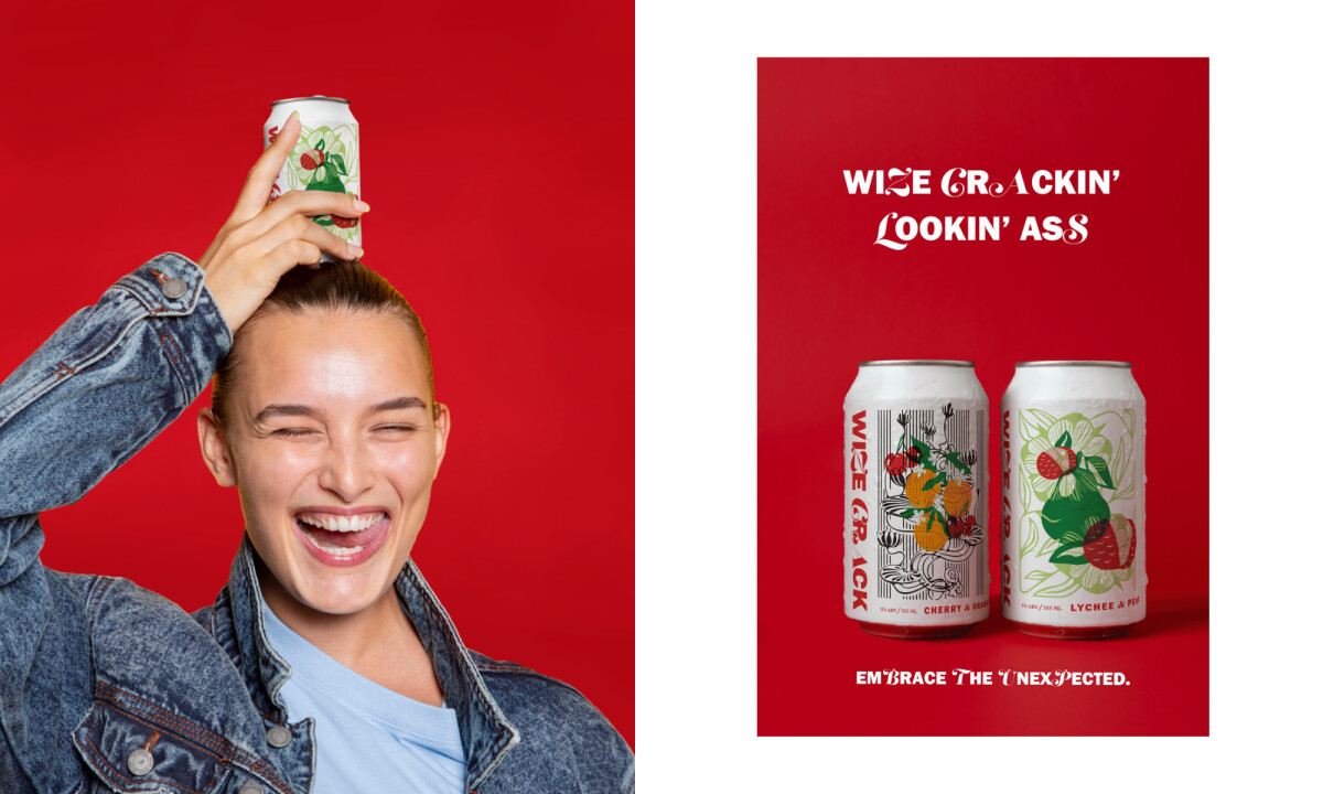
In food and beverage packaging, I pay close attention to how design choices influence both first impressions and perceived flavor experience.
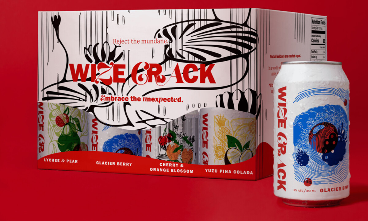
Wize Crack uses striking artwork and intentional typography to break away from generic seltzer branding, creating a pack that feels bold, fun, and unmistakably unique.
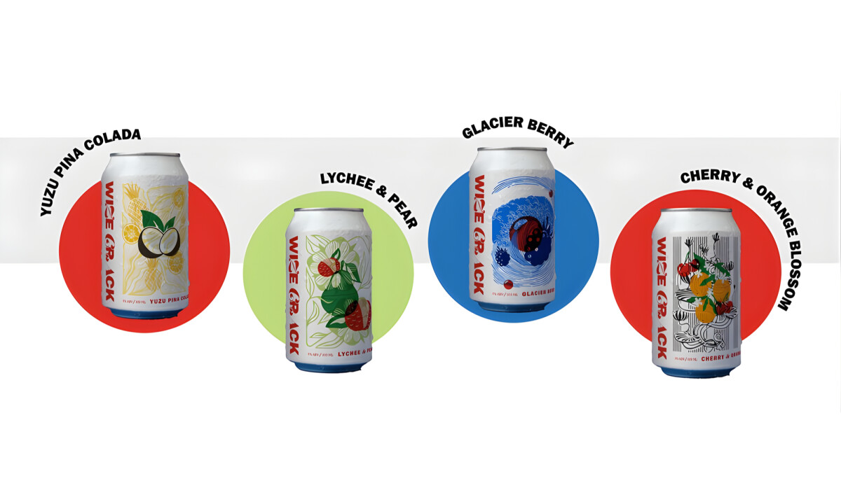
- Illustration System & Visual Language: The hand-drawn illustrations bring immediate character to each flavor while maintaining consistency across the lineup. I appreciate how the line work feels expressive and energetic, giving each can its own personality without fragmenting the overall system.
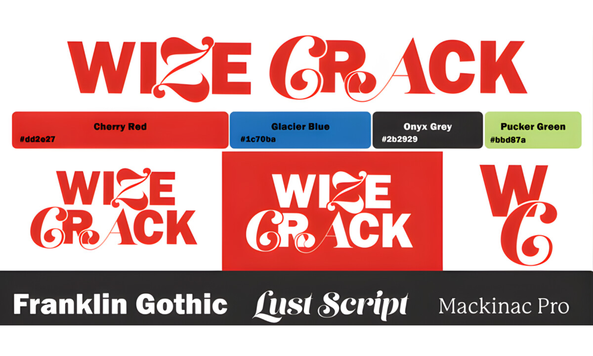
- Typography & Brand Voice: The typographic pairing balances bold structure with playful ornamentation, reinforcing the brand’s irreverent tone. I find the contrast between strong letterforms and decorative flourishes effective in making the logo and flavor names instantly recognizable.
- Color Palette & Flavor Differentiation: High-contrast colors create strong shelf presence while clearly separating each flavor variant. I like how the palette feels intentional rather than trendy, allowing the illustrations to remain the focal point without visual competition.
- Packaging System & Cohesion: The variety pack design ties the individual cans together through consistent layout and graphic rhythm. I see this as a well-resolved system where each element supports both standalone impact and collective brand recognition.
What Brands & Designers Can Learn from the Wize Crack
1. Build Personality Through a Consistent Illustration System
Expressive, hand-drawn illustrations give each flavor character while staying visually unified. A strong illustration style allows variety without fragmenting brand recognition.
2. Let Typography Reinforce Brand Attitude
Bold structural type paired with playful details communicates tone instantly. When typography reflects brand voice, it becomes as memorable as the imagery itself.
3. Use Color to Differentiate Without Competing
High-contrast colors clearly separate flavors while supporting the overall system. Intentional palettes ensure shelf impact without overpowering key visual elements.
About DesignRush Featured Designs
At DesignRush, we review hundreds of agency projects each month. The featured designs stand out for creativity, relevance, and execution.
Many go on to be recognized as winners of our Monthly Design Awards.
Explore more creative work here:
- Best Packaging Designs
- Best Website Designs
- Best App Designs
- Best Logo Designs
- Best Print Designs
- Best Video Designs
For a full list of design agencies and related services, see our Agency Directory.

-preview.jpg)