Happy Place Functional Beverage Packaging Design
Happy Place blends functional wellness with emotional storytelling through bold gradients and expressive naming. Designed by Emily Norris-Jones, the packaging captures both flavor and feeling, using color transitions and clean typography to position the brand as a refreshing, mood-boosting beverage for everyday balance.
Happy Place Functional Beverage Packaging Design
Gradient palettes signal mood and flavor
Happy Place Functional Beverage Packaging Design
Playful naming enhances shelf impact
This website uses a colour palette of 4 colours
  • #428654
  • #A9753D
  • #A03751
  • #DDDBDA
Technologies & Tools
Description
Team Behind the Design
  • Designer: Emily Norris-Jones
  • Client: Happy Place
  • Category: Packaging — Food & Beverage
  • Location: North Vancouver, Canada
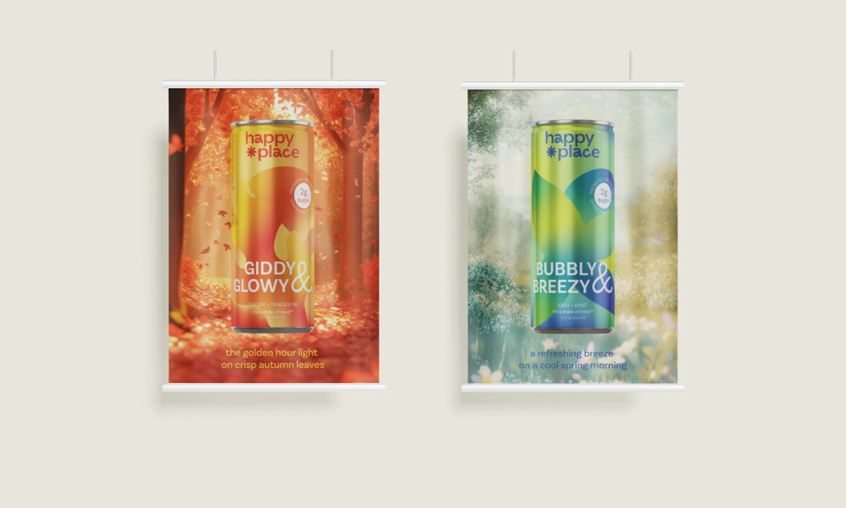
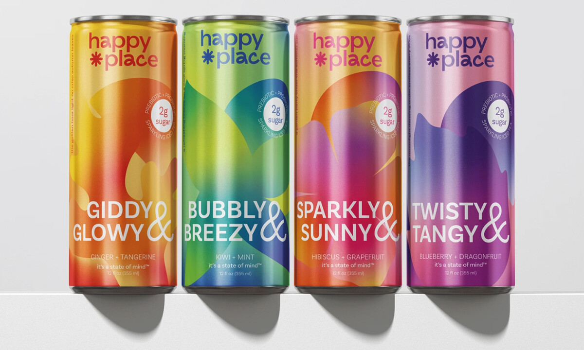
  • Project Brief: Develop a vibrant, wellness-forward packaging system that communicates both gut health benefits and emotional uplift through expressive color, playful flavor naming, and strong shelf visibility.

Effective food & beverage packaging must balance health credibility with emotional appeal. Happy Place achieves this through fluid gradient compositions, high-contrast typography, and flavor names that communicate both ingredient clarity and aspirational mood states, creating immediate shelf impact without sacrificing approachability.

Ready to elevate your designs?