- Article by
- Jermaine Dela Cruz

#C82922 #FFFFFF #C40006 #006900
- Agency: LePub
- Client: HEINZ x Heineken®
- Category: Packaging Design (Food and Beverage Packaging Design)
- Location: Milan, Italy
- Project Brief: Design a limited-edition package that celebrates the long-standing connection between HEINZ and Heineken® through a memorable consumer experience.
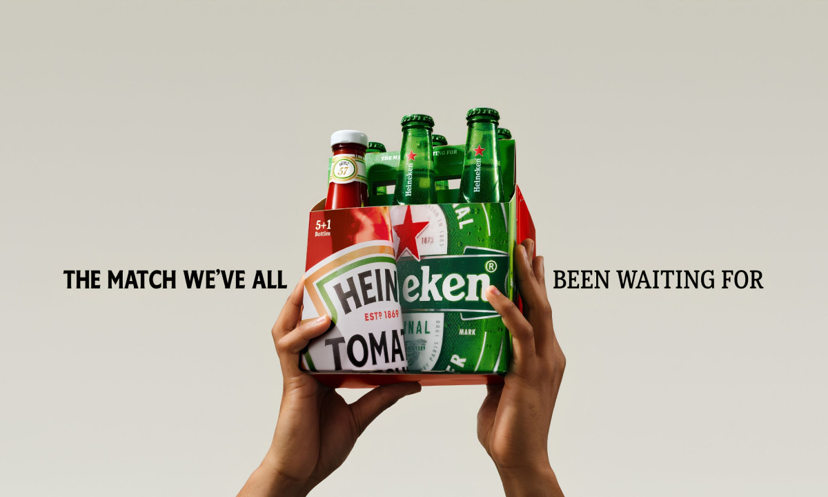
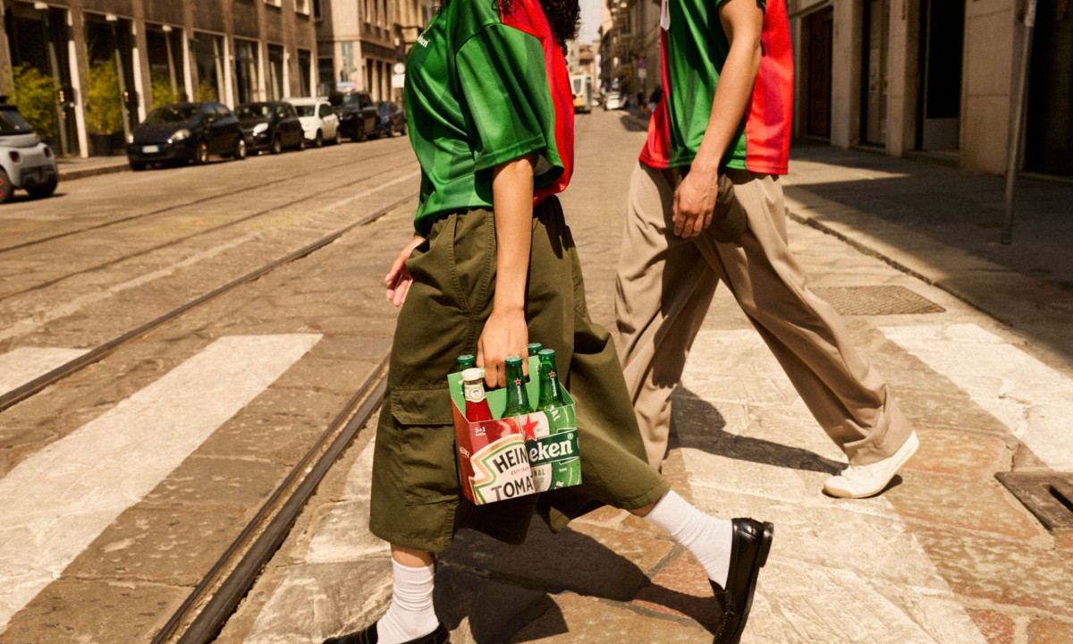
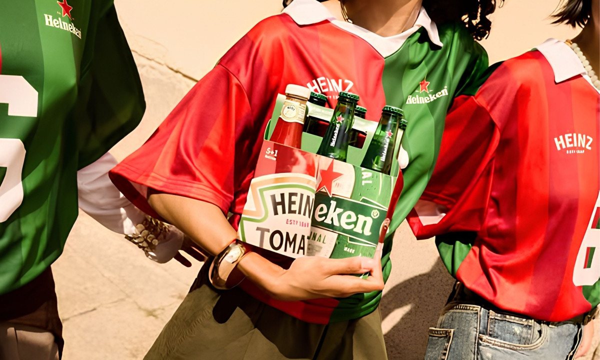
Two iconic brands sharing shelf space for 150 years without ever officially acknowledging each other is a better brief than most agencies get handed, and LePub turned it into a six-pack. The limited edition food and beverage packaging puts five Heineken bottles and one Heinz Tomato Ketchup in the same carrier, and the joke lands the moment you see it.
HEINZ x Heineken® Limited Edition Six-Pack's structural concept does all the heavy lifting. Merging the Heinz label's red with Heineken's green into a single split carrier creates a package that reads as both brands simultaneously, which is harder to execute cleanly than it looks.
The "5+1 Bottles" callout on the carrier is the detail that makes the whole thing work as packaging rather than just a stunt. It treats the ketchup bottle as a sixth unit with a straight face, which commits to the bit without explaining it.
The two wordmarks collide across the front panel so "HEIN" from Heinz runs directly into "eken" from Heineken, creating a single fused logotype that belongs to neither brand alone. That typographic merge is the packaging's strongest design decision.
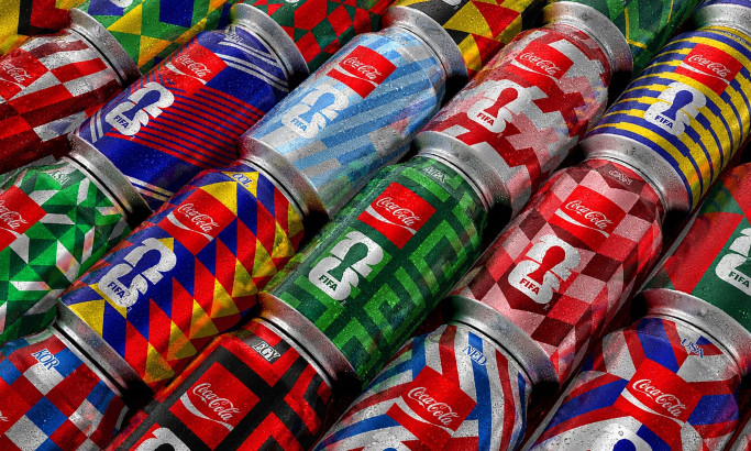
Coca-Cola FIFA World Cup 26 Collectible Country Cans

HEINZ x Heineken® Limited Edition Six-Pack
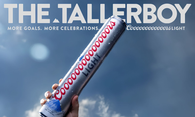
Coors Light Tallerboy
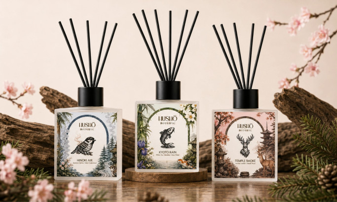
Hushō

Mật Mã Gift Set

I AM ITALIANO