Standout Features:
- Energetic warm colors
- Clear info layout
- Realistic chili icon
How does a heritage brand known for innovation stay relevant on crowded retail shelves today? Hot Chillys, creators of the original performance base layer, faced this with their recent packaging update. Found Brand Agency tackled this challenge, delivering a design that energizes the brand’s identity while clearly communicating its functional benefits.
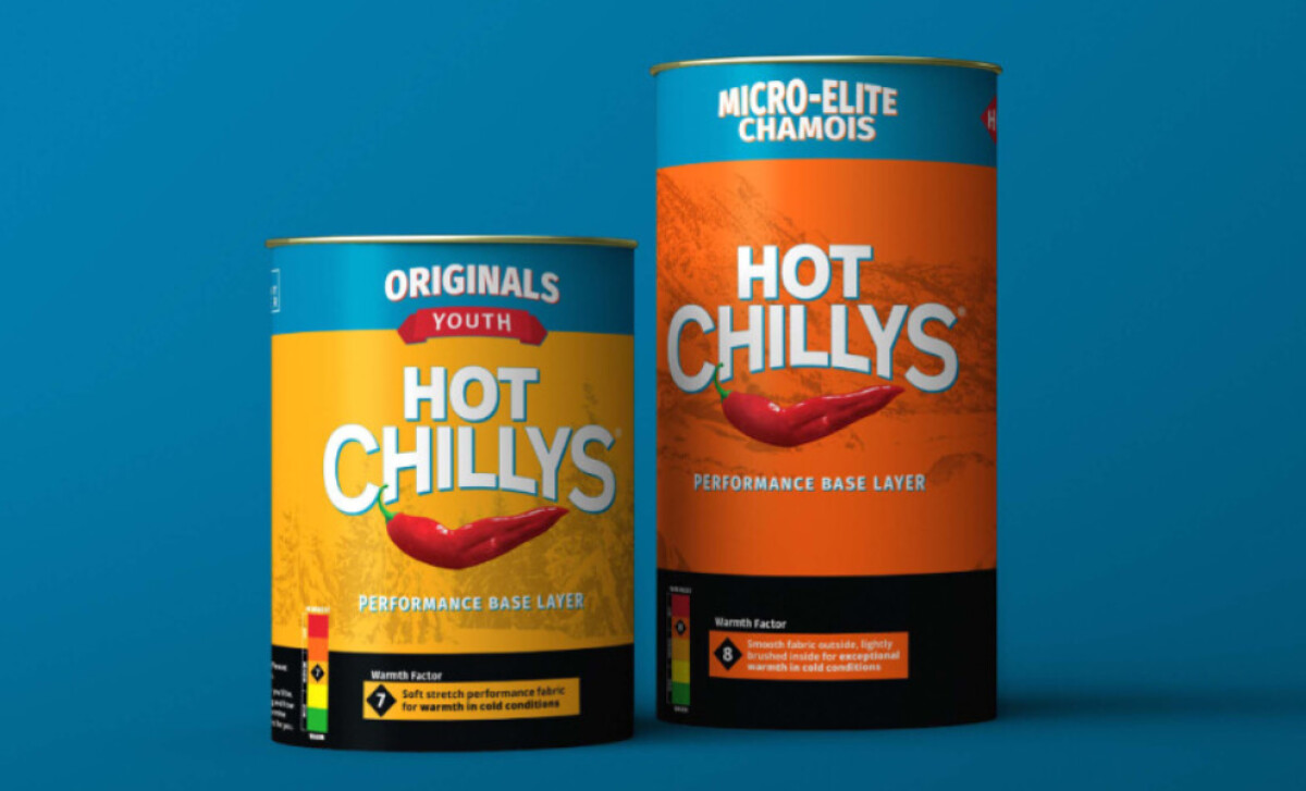
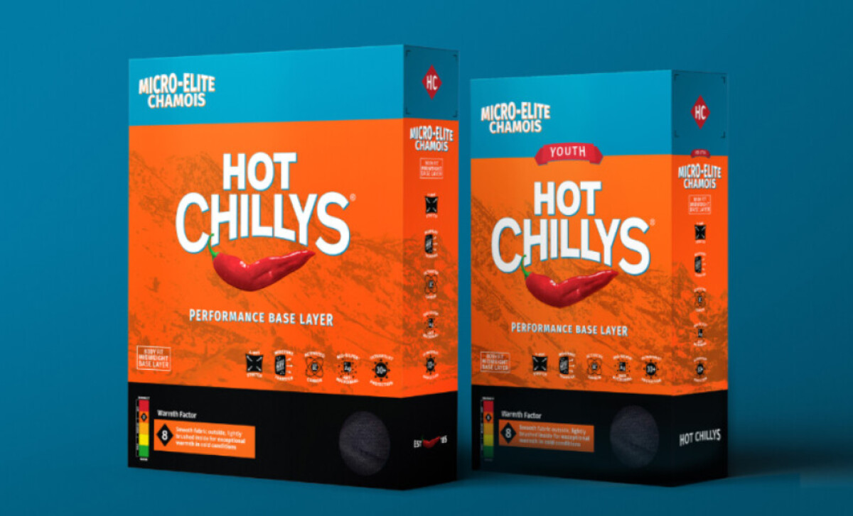
The refreshed packaging immediately grabs your attention with its bold, high-contrast color scheme. You'll see vibrant oranges and yellows, often set against deep black elements, making the products truly stand out. These warm colors are not just eye-catching; they effectively signal the thermal protection Hot Chillys is known for.
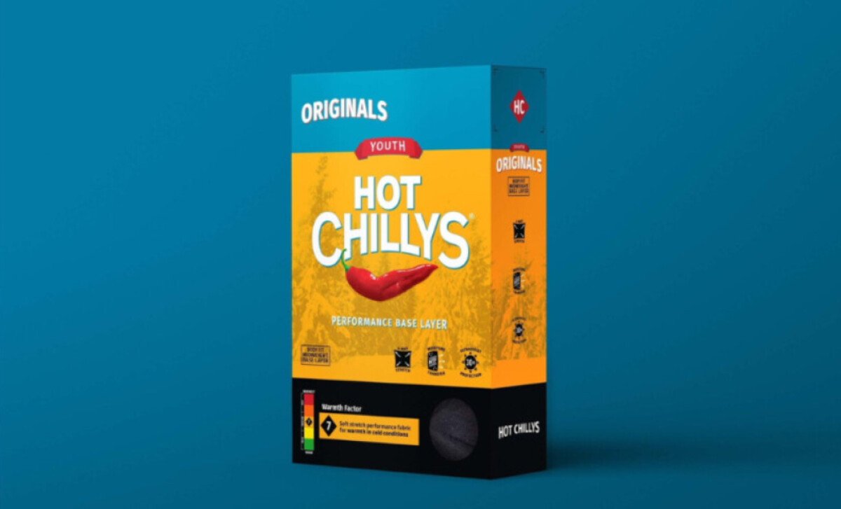
Clear information layout and iconic branding are also central to this design. The Hot Chillys logo is prominently displayed in a modern, bold font. A key feature is the "Warmth Factor" scale, which uses a color-coded system from green to red. This gives you a quick, easy-to-understand visual cue about each product’s insulation level.
Of course, the instantly recognizable chili pepper icon remains a star. It’s featured clearly on the packaging, acting as a playful, potent visual metaphor for heat. This graphic is smoothly integrated into the overall design by Found Brand Agency. It reinforces the Hot Chillys name and core function, ensuring the brand is memorable and its identity distinct.
Hot Chillys shows how a fashion packaging refresh can honor a rich legacy while energizing a brand for today’s market. By modernizing visuals but retaining core identity elements like the chili, they kept the brand recognizable. This is a key insight for any established company looking to update its packaging design effectively.