- Agency: Baghira Design
- Client: Jammed
- Category: Packaging Design - Food
- Location: Bremen, Germany
- Project Brief: Design packaging that transforms jam into a bold, music-inspired experience, using visual rhythm and expressive branding to enhance shelf impact.
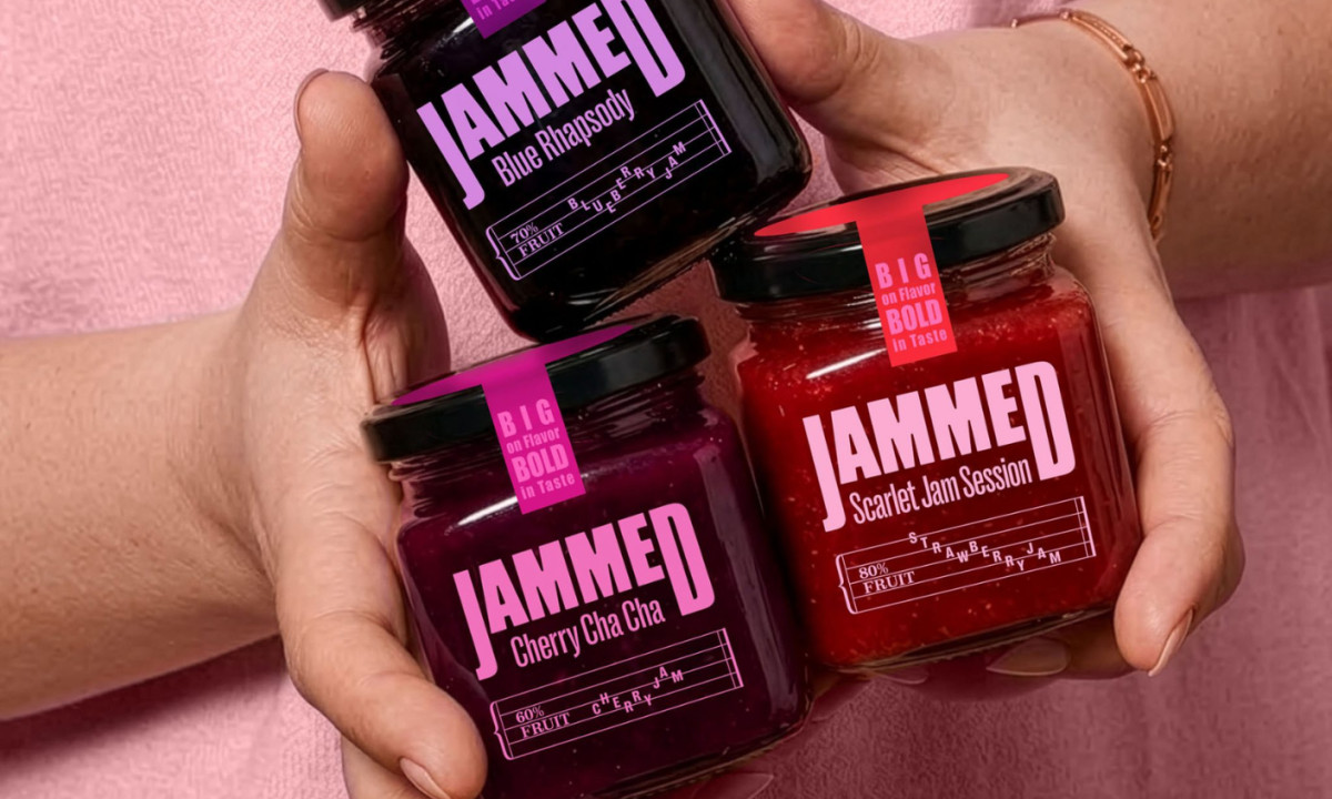
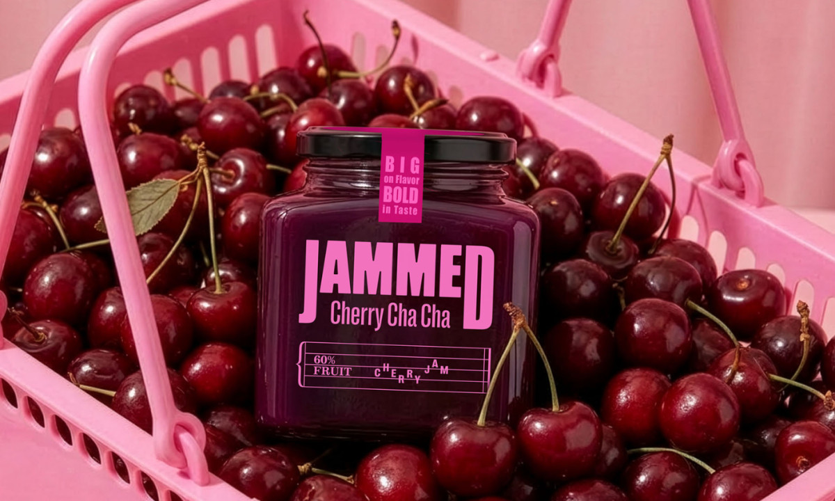
Food packaging design often leans on familiarity and comfort cues. The Jammed takes a different approach, using jazz as a conceptual layer while relying on bold, graphic execution to stand out on the shelf.
Typography leads the composition. The oversized, condensed letterforms create immediate impact, echoing the intensity of music posters while ensuring strong visibility and brand recall.
Color builds both differentiation and emotion. Each flavor is expressed through a saturated palette that reflects its character, helping products stand out individually while maintaining a cohesive system.
Graphic elements reference music through subtle notation details. These act more as brand cues than structural guides, reinforcing the concept without overwhelming the layout.
Composition stays tight and controlled. Clean, centered layouts keep the focus on product and type, allowing contrast and scale to carry the energy.
The result links flavor with attitude. Rather than translating taste into rhythm directly, the design uses boldness and clarity to create a memorable, high-impact presence.