Standout Features:
- Minimalist, elegant design
- Earthy color palette
- Clear, informative labeling
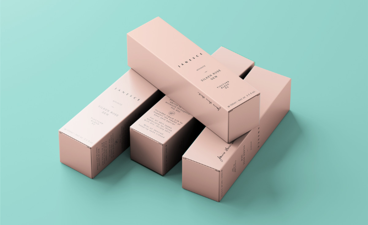
Janesce is a certified organic skincare brand founded in the 1980s in the Adelaide Hills. The brand’s commitment to holistic beauty and the healing power of nature is perfectly captured in its packaging design by Sarie Tardif. The clean, simple design elevates the brand’s core values, creating a visual identity that speaks to both luxury and sustainability.
Its simple, clean lines, with only essential details like the brand and product names, allow the product to shine. This simplicity enhances the perception of purity, reflecting the natural ingredients inside. By avoiding excess decoration, the design reinforces Janesce’s ethos of refined elegance, focusing on the quality of the skincare products.
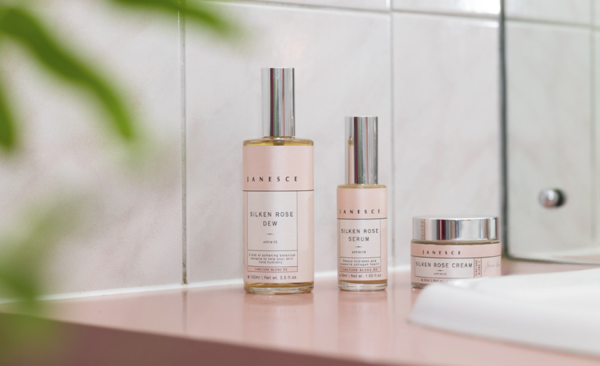
Soft pinks and neutral tones give the packaging a calm, soothing appearance, evoking the natural beauty of the ingredients. This color choice not only reinforces the brand's commitment to organic, biodynamic principles but also creates an emotional connection with customers who value sustainability.
Each product includes easy-to-read information about ingredients and their benefits, helping to educate consumers. The botanical illustrations alongside ingredient breakdowns highlight the brand’s transparency and emphasize the organic nature of the products. This instills confidence in the consumer while reinforcing the brand’s credibility.

Janesce’s skincare packaging design reflects the brand’s dedication to purity, nature, and sustainability. The minimalist design, earthy colors, and clear labeling combine to create an experience that feels both luxurious and approachable.