Standout Features:
- Clean and minimalist structure
- Soft color palette
- Delicate illustrations
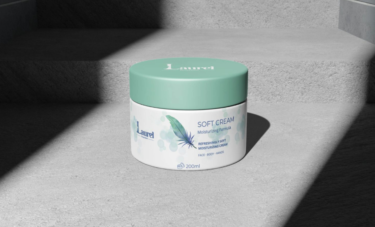
Pure, minimal, soothing — the same adjectives used to describe the Laurel Cream product can be said about AOUS Digital Agency’s packaging design. All its design elements, especially its gentle colors, emphasize the product's soft, moisturizing, and natural qualities.
At its core, the packaging comprises a round jar with a screw-on lid and a simple, cylindrical container with smooth, rounded edges. This unadorned form is simple yet functional. But most importantly, it embodies the softness and simplicity that the cream promises.
The Laurel Cream packaging also uses a soft, muted color palette of light teal or mint green paired with white. The color choices are deliberate: this particular green suggests the product's ability to soothe and rejuvenate the skin. On the other hand, white is associated with purity and cleanliness, mirroring the product's gentle cleansing properties.
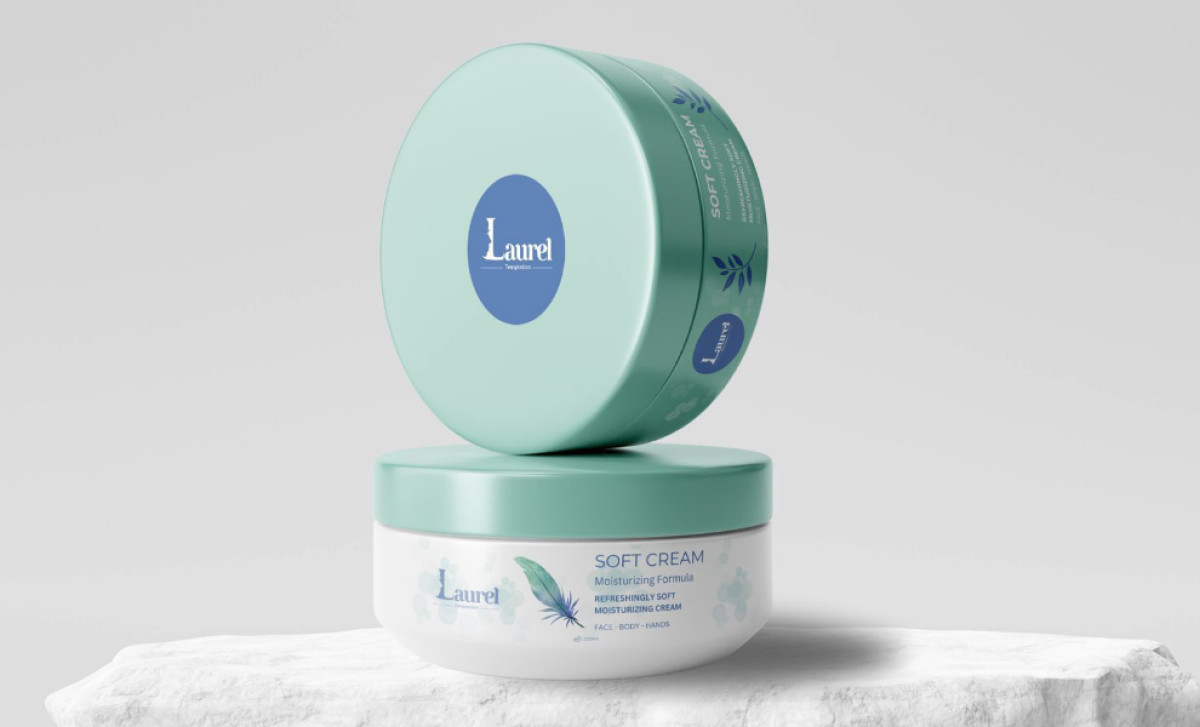
Furthermore, the skincare packaging features a subtle yet elegant depiction of a feather and leaf element. The former represents lightness, softness, and a gentle touch, while the latter emphasizes the product's natural ingredients and plant-based formulation of laurel leaves. Small touches like these are what amps a product's perceived quality.
What this packaging highlights is the effectiveness of subtle design choices in conveying your vision. The soft colors, natural motifs, and simple form all align with a customer’s expectations of what a natural and soothing product should be. It demonstrates that impactful design doesn't always require boldness; often, subtlety speaks volumes.