Standout Features:
- Stunning color gradients
- Heart symbol integration
- Subtle but elegant typography
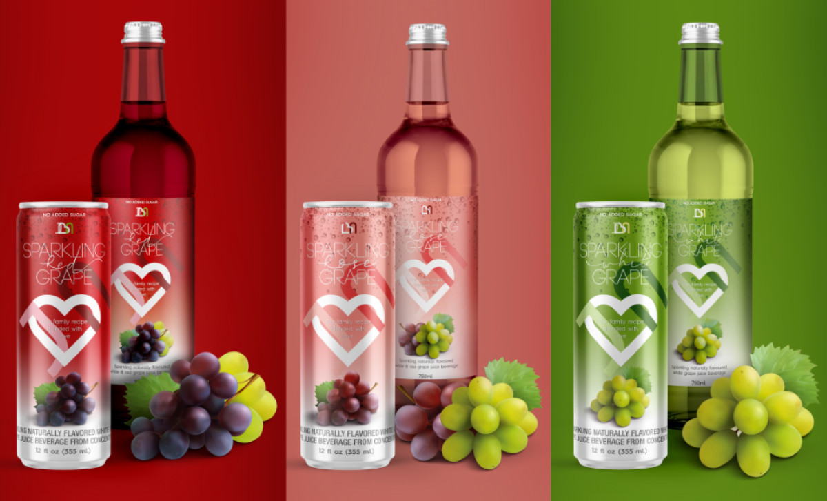
JBN, a new brand entering the market, sought to create an eye-catching and memorable packaging design for its refreshing beverage. Partnering with creative agency Cosanostra Design, they developed a package that energizes consumers and leaves a lasting impression.
Starting with a bold color palette that immediately captures attention, each variant of the JBN beverage has a distinct color. Deep reds, lush greens, and soft pinks differentiate the flavors and call to mind the freshness of the product. The gradient design makes the product more noticeable and appeals to a broad consumer base.
However, the most stellar element is the JBN monogram with a heart emblem. The heart shape is versatile across different color backgrounds while maintaining brand consistency across product lines. At the same time, it conveys the idea of love and passion put into creating the beverage, connecting with consumers emotionally.
As a finishing touch, the subtle yet elegant typography enhances the packaging's sophistication and the brand's premium image. This modern, clean font allows the vibrant colors to shine while ensuring readability. Not only does it elevate the design's aesthetic, but it also reinforces the brand’s identity as a provider of high-quality beverages!
-preview.jpg)